
| Attachment | Size |
|---|---|
| Pic unrelated. | 264.3 KB |
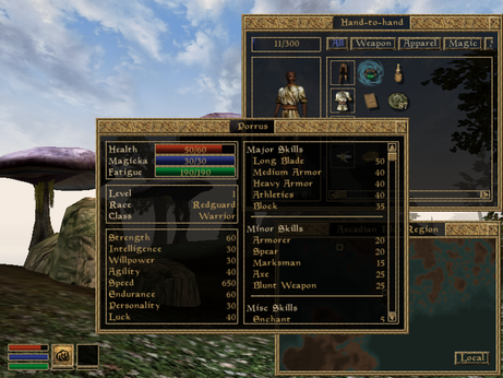
I have been watching some playthroughs of Skywind lately and on some of the earlier versions of the mod, the font was different than the standard Skyrim typeface. It was not a very good-looking font, which is (I assume) why it has since been changed back. Maybe it is because of the fact of the font's unsightly appeal, or they thought that the original font was better. Maybe a little bit of both.
The original Morrowind game's UI featured a century gothic font, simple round characters with a lack of serifs. We should not use the original UI though, for if the game is to be updated 12 years, the UI cannot be left back in 2002. Skyrim's font (I'll just call it Futura Condensed) is a perfect match for the Skyrim's atmosphere. Many outdoor color schemes in most parts of the province are snow-covered or white, and even when not in these areas the font still matches, due to its neutral color scheme (or lack thereof).
Morrowind's landscape has a more colorful palette with different biomes and environments in the game world. Even though Skyrim's UI is adaptable to a certain extent, Skywind is not within that extent. Skyrim's UI was tailored specifically for that game, and not really anything else. I'm not saying "use this font!" or "use that font!" but Skywind needs some appropriate UI, something other than what it currently has.
Whether we should change the UI / what we should change it to (if yes to the previous) is up for discussion.
Don't assume anything on this
Don't assume anything on this at this point on the UI. That is all I"m going to say.