[External image]
I was bored again, and I did this. Oblivion symbol inserted to Morrowind logo. What do you think?
EDIT: I fixed the writing a little:
[External image]
Last edited by Darth South on 8 May 2011 - 09:59.
[External image]
I was bored again, and I did this. Oblivion symbol inserted to Morrowind logo. What do you think?
EDIT: I fixed the writing a little:
[External image]
ok so when we have logo... is there a way to change loading screens ;P ?
Nice logo Iceburg! But I was thinking we should make the Morrowind logo part slightly less faded.
We definitely could! I feel though that if we fade it less it obscures the text more, so that its harder to read (and already it isn't super easy), but if a lot of people think so, then I could definitly do it and see what we all think. :)
I know this is the least of our concerns presently, but I was poking around with the gimp and figured I'd share.
I wanted to see if I could squeeze the Skyrim logo and title into our logo, and this is my first prototype. I played around with combining names differently (Morroblim, Morroblivim, Morroblivyrim) and settled on Morroblivyrim as the title for the logo since it has an evenly balenced 4 to 5 letters from each game, and sounds like a child trying to say "Morroblivion."
It's just concept from toying around, just wanted to share. :D
Looks good Ice, no doubt! But I was thinking kinda like two separate projects: Morroskyrim - dealing with Morrowind to Skyrim, and Oblivionsky or Skyblivion - dealing with Oblivion to Skyrim.
Here's mine for Morroskyrim:
Man, I need your skills Ice! I'm using Photoshop, but from looking at yours, I can tell I need to transition better in the middle. Maybe I need to use a blur effect or something.
Edit: Obviously, I have no intention of this replacing the current Morroblivion logo we have up since this only represents Morroskyrim.
What would be nice is if you clicked a Morroskyim topic, it would transfer you to a subsite like morroblivion.morroskyrim.com or something, where that particular part of the website is dedicated to Morroskyrim. Then do the same thing with Oblivionsky/Skyblivion.
But that's just daydreaming for right now :)
Those are both awesome pictures. :D
Now my belief that Morrowind was meant to be put in the Skyrim engine is confirmed. I almost forgot that the symbol for Skyrim was also included within the symbol for the original Morrowind. Now how could we not merge the two games together?
Shadow: Straight up agreed.
Clint: Wow man, I can't believe I'm saying this, but I think your symbol looks a lot better! So much cleaner and gold and silver instead of a mess of colors. I second the idea of having a 'subsite' where the logo would change. And I'd wholeheartedly approve you're icon over mine. I also like the idea of "Morroblivion" and "Morroskyrim" instead of mergeing. Man, talk about a good post!
Haha thanks for the compliment, I'm actually using the gimp.... so yeah. You should try keeping the entiraty of both text titles, then add alpha masks, then do a white to black gradiant so they'res a smooth blend from there to not there (on the O). (Make sure you do the underline too. I make that a seperate layer and blend it a lot more / over further distance.
But man it looks stellar. Where did you get the golden triangle symbol and other high res images?
Ramms! I am loving that! I actually like "Skywind" more than "Morroskyrim." It rolls off the tongue better, plus it's more elemental: sky and wind.
Edit: The only thing that looks weird to me is the W which is simply the M upside down. Any way you could make that look like a more normal W? Maybe enlarge the v's and cross them over? (just an idea, not sure if that'd work)
Edit 2: And it might look a little better if we did the cross over effect. The left half of the logo looks like it came from Morrowind and the right half of the logo looks like it came from Skyrim.
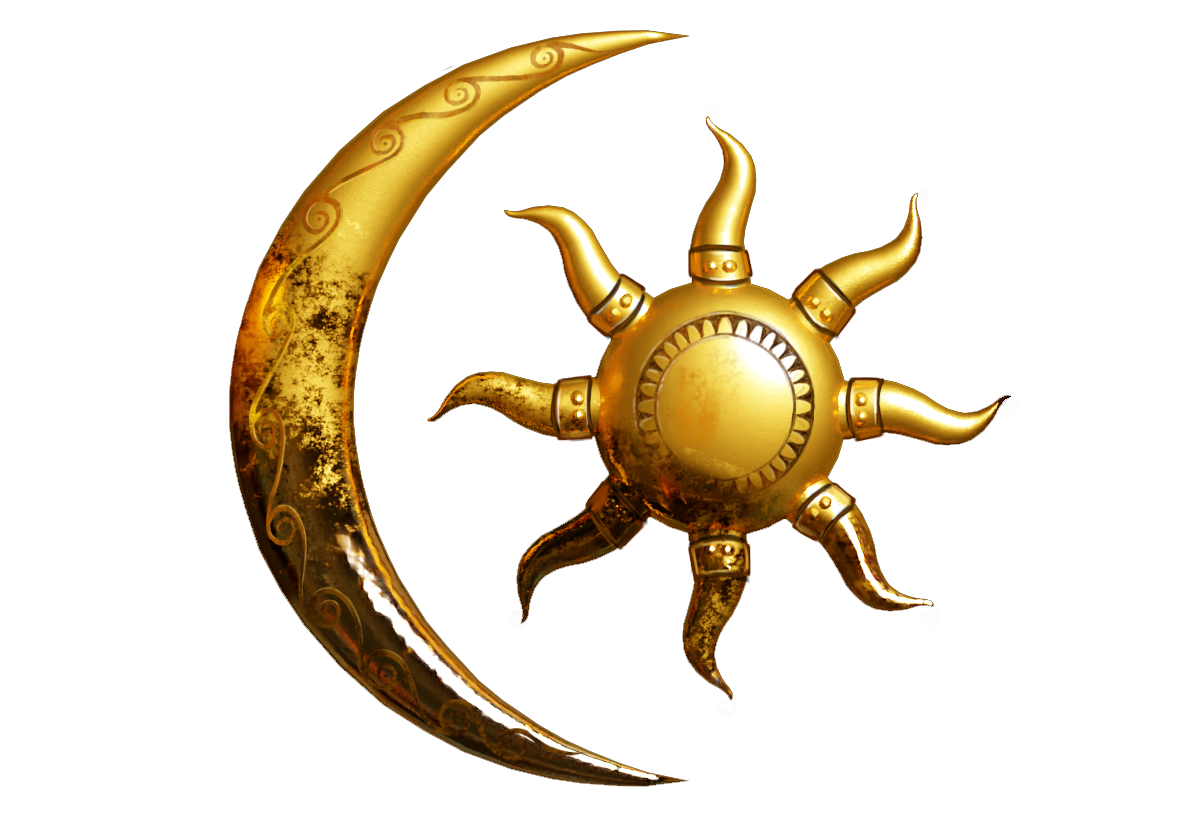
Edit 3: Man, I still think the Sign of the Dragon fits better than the Moon and Star since both Morrowind and Skyrim have these on their logos.
Again, these are just my ideas, but really, that looks awesome!
Yes))) I think exactly about the W, so here we go
[External image][External image]
hmmm, about crosseffect
AMAZING :D
Hmmm I thought I would like the cross fade, but I'm still liking the first one the best. It's just a simple clean design.
ClintRamms! I am loving that! I actually like "Skywind" more than "Morroskyrim." It rolls off the tongue better, plus it's more elemental: sky and wind.
Agreed! Skywind for the skywin! Heh.
I actually do kind of like Skywind, but I also like Morroskyrim. Maybe we should put it to a vote? Also, Ramms, that is a sweet logo, and I think I like the original without the crossover the best. Though like Clint, I think the dragon sign should be put in. It is in the original logo for both Skyrim and Morrowind. It just makes sense that it would make it into the project logo.
Mmmm... i really like Skywind aswell, just seems more, well professional to me
I agreed guys, first simple logo looks better than others.
I'll make dragon logo, however, as a professional logo designer I can say, that it'll be not good for the following reasons:
1) Logo should be easily recognisable, that why I choose Moon and Star, if even person doesn't know about Morrowind, he will remember combination of hte Skywind and Moon and Star Silver. With Dragon we've got a problem: person look at the logo and see weird skkyrim's dragon and it'll be very hard recognisable, espicially for people who do not play in morowind and don't know their dragon, which very similiar to Sky's, and they will think that it's a simple weird Sky-logo
2) Creating a dragon logo means to create many details which will make them different from simple Skyrim's dragon logo, it means a hard perception of this details and logo in a whole. It can make people feel annoying and disturbing
Personally i think the first logo for Skywind (just the silver one) is ace, perfect for the job.
Here we go, some quick sketch
[External image][External image]
p.s We can use several logos such as was in original morrowind. 1 logo for big pictures with high detalization and 1 "big-content" logo with bigger picture for small logo, which will be easily to see and recognise
Wow, your really good at this. :)
Hey Ramms looks good, I'm liking it! Could you try making the first and last letters bigger? and then put "SKYWIND" over the logo. This for reference:
I'd be interested in how that would turn out?
Man, I love the silver Moon and Star Skywind. That is so sick! Totally awesome!
great job Ramms!
I'll take one of each.... Really Ramms, they are both great. :)
Perhaps you could add some gold to the dragon sign one to make it look a bit more different from the default Skyrim one?
Thanks guys =)
Today-tomorrow I'll make your requirements ;-) And we can see where it lead us
Here is link for the Silver Moon HD wallpapper? looks good on my 24`- http://www.mediafire.com/?y8aiyaatdxq5nov
hm some new one... I think, it looks like a sh*t)))
[External image][External image]
ps. need to work with colours
Looking interesting. :)
It's certainly getting there :)
1 min and it will be done
However, I think, it'll be weird))
[External image][External image]
Smaller DR:
[External image][External image]
DR with the moon up a head
Yeah, that gold and silver looked a bit strange. That last one you did looked kind of cool though.
My favorite is still this one:
[External image]
I think it's powerful because it's simple. It uses Icon's that are secondary- they don't scream the games unless you've played them, you know? Like it just feels higher class to me. Like we're not trying, we just are boss. Like, the Moon and Star instead of the big Morrowind Triangle,and the silver equalling Skyrim. I think it's just perfect. That's my vote. :D
working on
conception of animated logo
snow animation just for understanding that there will be snow
RammS, that looked great. The Morrowind bit at the beginning with the gold logo I think looked best. If you have some spare time could you make a gold moon and star logo with "Skywind" in the Morrowind font. I feel like that might make the project's logo more Morrowind-esqe.
Stone or paper? )))
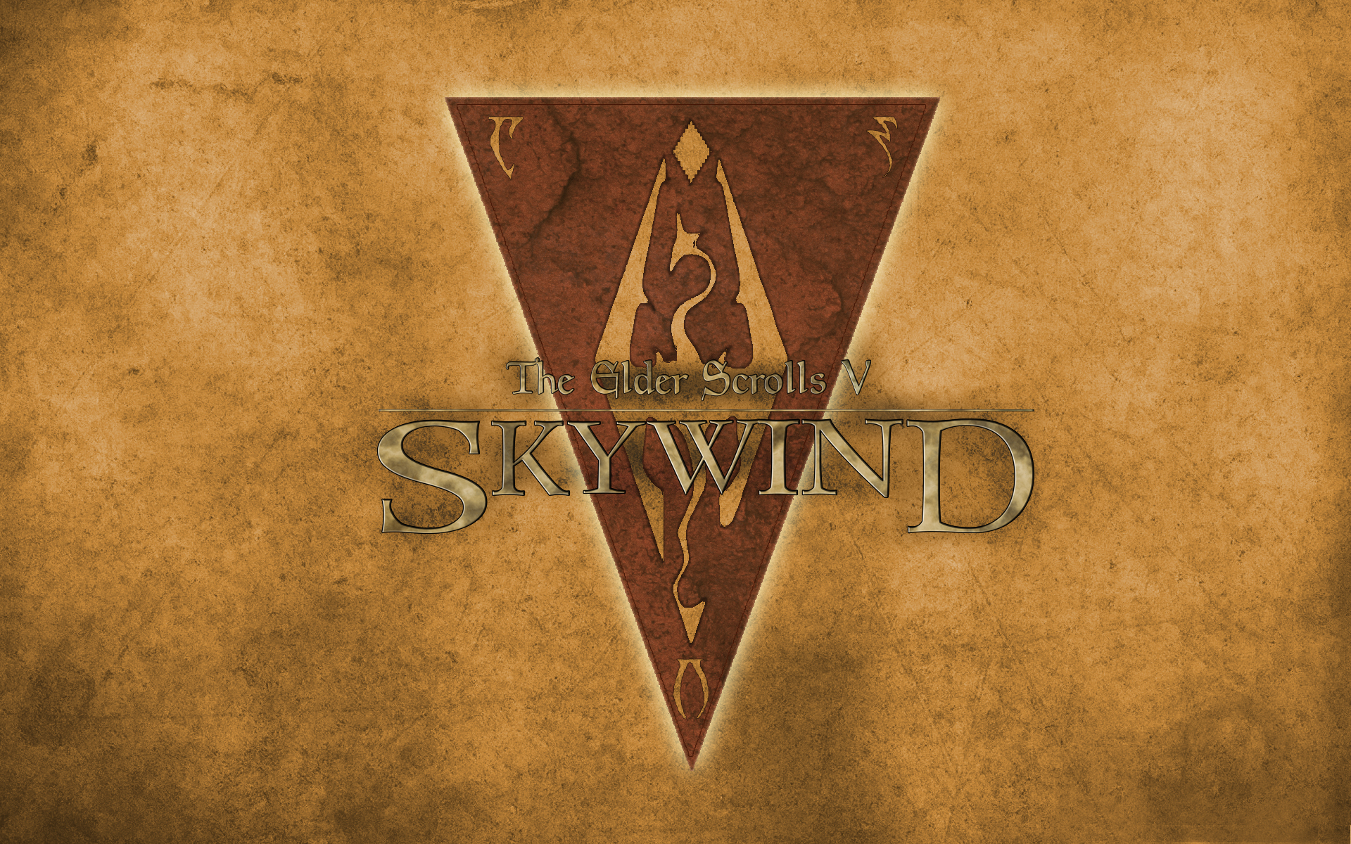
I think paper. This way people who may not immediately think 'morrowind' from the name will instantly think it from the logo.
np)) i like when people like) and i think you are more closer to original:

I can create the next version:
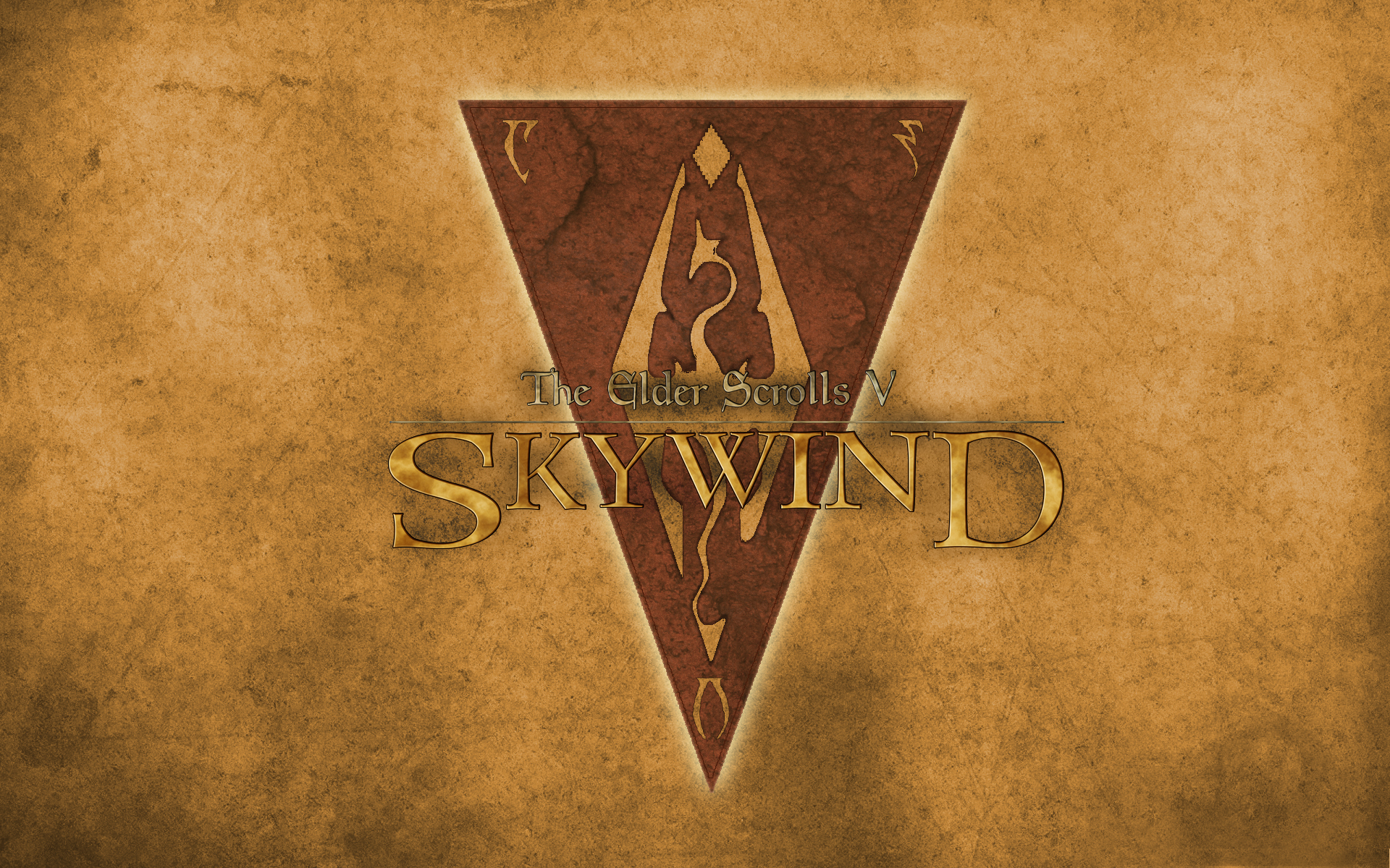
alexanderbhmmm can u like make the lines around the lettering like in the original and also can u make it look as crumpled up as the other did?
Its hard, but ill try.


Thanks Robert!
Thanks Robert!