Logo-Fu

Submitted by Point Squash on

Hey all

Inspired by marin.maltaric's sweet (seriously, super sweet) wallpapers, I've been tooling around my own design. He went with a design based on Morrowind's box, so I figured I'd take the opposite route and do some work in the style of Skyrim. Here's what I've come up with:

First, a new version of the Nerevar Moon and Star logo:
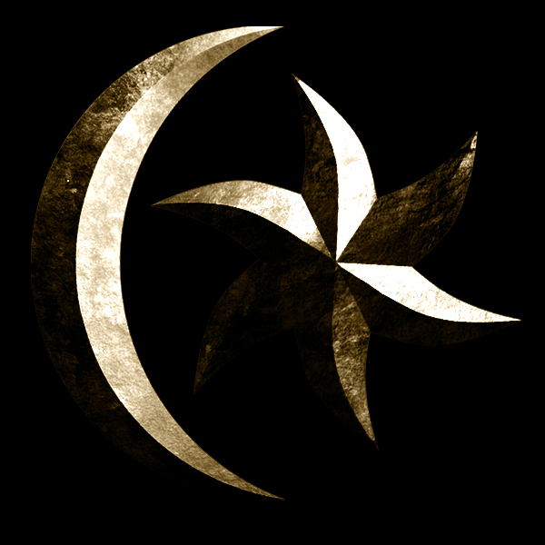
I took a crack at the title text too, in desktop wallpaper form! :D

Thoughts?

(Use all this however you want, if you want.)

Karma: 0 (0 votes)
Last edited by grumpycat on 14 Mar 2014 - 20:45.

I would say place the Moon and Star above the text, and maybe brighten everything a tiny bit.

The main reason the M&S should be above the text is because of the lighting, the M&S is brighter than the bottom of the "Skywind" text, which confuses the eye into thinking there are two light sources.


Karma: 0 (0 votes)

I think it looks fantastic but I agree with SheepDog about the placement and lighting sources. Also I'd personally prefer a silvery colored logo instead a brassy/golden one but that might be just personal preference. :) Great work anyhow...

Karma: 0 (0 votes)

Dude, that's bloody insane, keep up the sick work!

Karma: 0 (0 votes)

and yeah i agree with sheepdog's first comment.

Karma: 0 (0 votes)

I lightened everything up and moved things 'round on the poster.

And just for Josie, there's one in silver. smiley

How's it look this time?

Attachments

Karma: 0 (0 votes)

Much better. And I'd say the gold/bronze would be better than the silver. Yellow is a very important color in Morrowind.

Karma: 0 (0 votes)

Perfect.

Karma: 0 (0 votes)

Yes, perfect! And I still definitely prefer the silver but indeed it's just a matter of taste. ^^ Either is fine of course and in the end it's either your decision or vote. :P

ED: Okay so I think the reason it looks off for me in bronze/gold is because it clashes with the black background. Also it'd be accompanied with white menu texts and such so I feel like the silver one fits better with the surrounding colorless and cold Skyrim theme. Also I like the continuity between Skyrim and Skywind, while it still looks Morrowindy enough. While I understand that brown is a very Morrowindy color, this logo isn't actually brown, it's more greenish gold. Then again changing it any other warm color wouldn't look metallic, so it wouldn't fit. Thus -> Prefer the silver one. :P

Karma: 0 (0 votes)

Josie

While I understand that brown is a very Morrowindy color, this logo isn't actually brown, it's more greenish gold. 

I agree,

could you try to make it look a bit more bronze? Like an orange shade of gold.

Karma: 0 (0 votes)

Very Very Nice i love it!!

Karma: 0 (0 votes)

I like the logo above because its more related to the nerevar than the big empire logo
Karma: 0 (0 votes)

Totally agree. I really like the combination of the modern Skyrim main menu logo with the Azura/ Neravar aspect of morrowind.

Karma: 0 (0 votes)