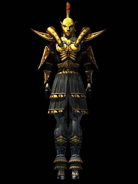
So apparently I am going to attempt to remake the Ordinator armor for Skywind. I will be posting WIPs here for feedback and criticism.
Ordinator WIP 1:

Last edited by grumpycat on 14 Mar 2014 - 19:22.

So apparently I am going to attempt to remake the Ordinator armor for Skywind. I will be posting WIPs here for feedback and criticism.
Ordinator WIP 1:
I feel like he should look more angry. The masks in the original morrowind looked a little more intimidating. The eyes should be tilted more, so it looks more elven than human as it does now. And the overall shape should be a little taller and pointier, again to resemble elves more than the shorter, rounder skulls/heads of humans. These weren't made for outlanders, after all. Oh, and the ears are super important, but I imagine those would be added afterwards.
.
Also those pauldrons could be a bit longer and facing a bit more higher.
It's looking good so far, but I would, as Sipso said, angle the pauldrons slightly higher and longer, though not to the degree in that picture, which is a bit overkill. I'm also not sure about the hanging fabric on the helmet. Perhaps I just need to see it textured, but it seems a bit out of place to may the moment.
I'll post in my repaint, in case you didn't save it:
[External image]
I've also had a go at the bust:
[External image]
Also, together with the gents we had an idea, to give the four different Indoril Orders a bit of differentiation in their gear. We're not yet settled how much we want them to differ, and if we want to do this at all, but here's a sketch I just rushed:
[External image]
Order of the Watch - Regular city watch, to enforce law and order in Vivec cantons. Mask - calm and confident
Order of the War - Fierce warriors, who take the fight to Daedra Worshippers and the Sixth House. Mask - furious
Order of the Inquisition - They find and punish heretics, who do not follow the Temple's doctrine. Mask - disgusted and suspicious
Order of the Doctrine - Templar warriors - scholars, who study the words of Almsivi and preach it's glory to the common peoples. Mask - merciful and deeply thinking
Phenomenal idea. Puts more work on our modelers but it will go a long way to make Vivec into the holy bastion that it was meant to be. I cannot wait to see the results!
When you make the helmets, remember that the face has to transfer the deep character of the phrase "We're watching you. Scum."
If the helmets complement the phrase well, consider it a success :)
Having the different variations would be amazing. A great idea.
The concept is great and variety is always for the best. I think that an overseer's mask from Dishonored would make a good reference for the Order of the War helmet:
Hah, wow...didn't realize wow close there were (minus the mohawk)!
VileGeckoThe concept is great and variety is always for the best. I think that an overseer's mask from Dishonored would make a good reference for the Order of the War helmet:
Dayum, there's an uncanny resemblance between our concept for the Order of War mask and this!
By the way. I just got this idea. That "Iroquois" on the helmet. How awesome would it be if it was animated to move with wind? It's not completely rigid, is it?
SipsoBy the way. I just got this idea. That "Iroquois" on the helmet. How awesome would it be if it was animated to move with wind? It's not completely rigid, is it?
In case it will ever come to this, this mod may be a starting point: http://www.nexusmods.com/skyrim/mods/47000/?#
Update

Hey Nate, here's my review of the armor so far.
Starting with a question! Which Ordinator faction armor are you making right now? I'll be criticizing assuming you are going for the Order of the Watch.
The mask should be a little more gaunt/have a bit more cheekbones going for it to really nail the structure of the original. The upper portion should also be a little less square and don't forget to add the ears! They were a prominent feature of the Ordinator mask which really characterized them as Dunmer and currently that is missing from the model. The eyes should also be hollow instead of full - gazing into the pitch black eyes of the Ordinators was intimidating for that very reason; you could never tell where or when they were looking.
The shoulder pads should be set further apart and extended. The lower plate should almost act as an arm protector until it slightly curves away from the body whilst the upper plate should follow the same design parallel to the shoulders of the wearer. There should also be a ring folding over the shoulder plates and connecting to the chest-piece. One of the most noticeable/iconic features of the armor was it's pauldrons so it's important to get those right.
The detail of the chest piece ressembles what we saw in Morrowind, but the different sections were layered over one-another. Think that the lowest abdominal plate is touching the skin of the wearer, while the pectorals are protruding forward. The detailing was also a little less streamlined - fewer diagonals and more horizontals to give it a distinctive skeletal look.
You're improved the poofy-looking tasset in my opinion. I've got nothing to add for the lower portion mainly because I don't even remember what the boots should look like. In fact, weren't Ordinators wearing some sort of mix between eastern greaves and tabis?
Also, SHOW US A BACK-VIEW. We need to see that ass.... scum :p
From what I remember of the Morrowind Indoril armor, (at least the ones in Vivec - not sure about the Hands of Almalexia) only the helmet was made from metal, and considered 'heavy armor'. The rest of the outfit was ornate gilded chitin plates overtop several layers of intricate cloth and padding, similar to some Japanese armors.
That's not to say this current look wouldn't be good as a look for one of the subtypes mentioned earlier in the thread. And I'm starting like the idea of different helmets reflecting different 'temperaments'.
I quite like the wider jaw, maybe a compromise - slightly smaller but not too much.
From what I can tell, the front is one or two plates attached by purple cloth to the scaled spine piece. There are no grieves and the boots are rather fancy and frilly. I'm not sure where you got chitin from, as it appears to be metal to me.
It was actually medium armor
as far as I know it was the best set in the game for medium armor users
looks like chitin, definately not like a metal of some sorts
We'll have to come to a consensus as to the material the armor uses as it will be critical for the model.
Since the helmet is definitely a gold-like metal, I'd be inclined to say the armor should be as well. They are the sacred protectors of the temple - their honor and duty should be represented in the armor they wear and I feel that the tribunal would not resort to using simple chitin to adorn their holy warriors. The craft and the detail could make it seem like it was inspired from traditional Dunmer forgery, but the material should definitely be metal. Perhaps the reflection pattern should be a little more diffused than specular as it does seem the armor has a sort of matte finish to it overall.
I always operated under the assumption that it was metal (gold) plated chitin/bonemold, or at least forged to look as though it was chitin or bonemold.
I am sorry but i don't like the helmet at all :/
It's the same problem than the one in TESO, the face is too large, when in morrowind the nose and the chin were really thin. I think your design looks too human. The original design gave it a more "elvish" look. It is also what made them so special and a bit frightening. But it's just a personal opinion...
In my opinion, the armor is gold-plated bonemold, possibly with a few gold-plated chitin components. Vivec himself wears a mix of bonemold and chitin, so it wouldn't surprise me if the Ordinators wore something of a similar make.
As for the helmet, I agree it is the weakest part of the model so far. The face doesn't capture that awesome, menacing elven look of the original. It does look too human, and not only because the ears are missing. The nose and mouth are off.
The pauldrons aren't quite right, either. The uppermost pauldrons should run parallel to the shoulders, and they all need to curve upwards more at the end.
I would recommend keeping the model as close to the original Morrowind design as possible. It is still one of the coolest pieces of armor in that game.
I agree with the last two posts, the jaw is also too big.
SmitehammerFrom what I remember of the Morrowind Indoril armor, (at least the ones in Vivec - not sure about the Hands of Almalexia) only the helmet was made from metal, and considered 'heavy armor'. The rest of the outfit was ornate gilded chitin plates overtop several layers of intricate cloth and padding, similar to some Japanese armors.
That's not to say this current look wouldn't be good as a look for one of the subtypes mentioned earlier in the thread. And I'm starting like the idea of different helmets reflecting different 'temperaments'.
This is correct. The original concept was layers of insect chitin and resins, with a gold leaf overlayer. The mask is supposed to be Nerevar's face.
I think something that could be accomplished here, that the original game lacked the technology to pull off, is the overwhelming ceremonial nature of the armor: Bedecked with sacred cloths and talismans, a big white cape covered with daedric embroidery...
See Michael Kirkbride's original concept-

OrdoCorvusSmitehammerFrom what I remember of the Morrowind Indoril armor, (at least the ones in Vivec - not sure about the Hands of Almalexia) only the helmet was made from metal, and considered 'heavy armor'. The rest of the outfit was ornate gilded chitin plates overtop several layers of intricate cloth and padding, similar to some Japanese armors.
That's not to say this current look wouldn't be good as a look for one of the subtypes mentioned earlier in the thread. And I'm starting like the idea of different helmets reflecting different 'temperaments'.This is correct. The original concept was layers of insect chitin and resins, with a gold leaf overlayer. The mask is supposed to be Nerevar's face.
I think something that could be accomplished here, that the original game lacked the technology to pull off, is the overwhelming ceremonial nature of the armor: Bedecked with sacred cloths and talismans, a big white cape covered with daedric embroidery...
See Michael Kirkbride's original concept-
I definitely like this face-plate version of the helmet. The helmet seems thin and the ears look elven because only the face is covered. The face itself seems to have a serine and inscrutable expression similar to Vivec's. If these faces are supposed to represent Nerevar, perhaps they should keep the same face across all 'variants' after all?
As for the pauldrons and cape - I think the way they looked in Morrowind works better for most of the standard ordinators. The everyday guards would need something more practical. This look seems well suited for some of the more 'decorated' ordinators, as a sign of distinction, though.
SmitehammerAs for the pauldrons and cape - I think the way they looked in Morrowind works better for most of the standard ordinators. The everyday guards would need something more practical. This look seems well suited for some of the more 'decorated' ordinators, as a sign of distinction, though.
Maybe... Although, to argue from physics, the armor we saw, with those big, landing-stripesque pauldrons, would make for terrible armor anyways. The point of a pauldron is to turn a blow away, the ones the Ordinators wear would turn the blow directly toward the neck- that's why you never see a similar design on real armor.
Stats not withstanding, I always had the notion that the Indoril armor was more about pageantry than practicality. Vivec doesn't strike me as a particularly crime-ridden city, and even then, it's not as if the Ordinators are geared for war. The armor makes sense in that regard.
The Ordinators at Ghostgate, however, they are going to war... Giving them a heavier, more practically styled armor might be a cool touch.
I have posted this in the concept art forums and some argued it could be used for Telvanni robes, but since telvanni robes are not armor, maybe you guys could use it somehow, if only as inspiration to solve the pauldron discussion. I know that these also don`t make sense, but as a decorative thing, they might do well.
| Attachment | Size |
|---|---|
| vivec_armor_doodle.jpg (external) | 145.25 KB |
Those Asymmetric Arts looks really great, I vote for something like that andl a long skirt too 
+1 to a thinner mask more similar to Vivec's face style, and +1 to a longer skirt too : )
I would definitely give them capes, like in the concept art! It makes them look elite, in a praetorian guard kind of way. Don't know about white though. It's nice, but I always pictured them in dark blue capes for some reason.
I would absolutely give Ordinators a ceremonial cape as well with the proper white and sky-blue designs like in Kirkbride's concept.
Post some more screens :)
New screen of mask progress, havent done much with the rest atm.

See this is interesting because you made a very compelling Indoril set in the past. Your mask is too wide, and the shapes you are using are too angular and pronounced. The mask isn't enigmatic and impassable - it is outwardly imposing and angry. Look at the example to the right for reference; the shapes are more round, less obvious yet more sinister. This is what the Order of the Watch should look like. I feel like your mask would be more appropriate for another Indoril sect than the classic one we all know from Morrowind.
Taj I did not make that set, I ported it from oblivion. It was a fan made armor.
Taj, I agree with you about the mask expression being angry but as for the shape, we aren't copying Morrowind, we're rebooting it and I believe that using a wider, more intimidating mask would look great. It could still be slightly more gaunt-looking but other than that, I like the style.
You can have the wide helmet, but try to de-emphasize the jaw line and emphasize the cheeks and nasolabial area as a single piece. Here's a paintover.
| Attachment | Size |
|---|---|
| IndorilHelm.png (external) | 212.18 KB |
From what OrdoCorvus said, the helmet is supposed to represent Nerevar's face. Since this is the case, I think the reference image posted by Taj is a good look. Serene and unreadable - though certainly not a look of approval - much like Vivec. It's a tough appearance to nail down, but I think it will be worth it.
Everyone seems to have an opinion on this one. My thoughts are is that its a mask that covers a Dunmer face. So we want to see the Dunmer shine through. I think that what people find hard, is to imagine a more square mask fitting over a very thin face. Also the eyes need to be far set, that is a Dunmer trait.

But I've noticed that a lot of other peoples suggest/pics have almost a straight up painted face, which I disagree with. This is still a mask and I think the below concepts drawings reflect that there are hard edges as Natter has done. So personally I like the lines and edges of the mask, it just needs to be narrower.


Personally, I can't stand the ESO Indoril armor. But if people want to use it as a base, I will live.
I like the ESO helmet style but not the rest of the suit.
Keep it like the original Ordinator from Morrowind. Yours is nice but it doesn't really fit the Ordinators.
The TES:O helmet is what makes my eyes bleed. :P
The heads aren't as narrow in Skyrim as they are in Morrowind, generally.
From looking at all the examples, I've realized that a common factor in all Indoril mask impersonation was the brow-ridge and the eyes having soft, round shapes while the rest of the mask had more liberal interpretations. Since the eyes are a focal point for the expression of the Ordinator maybe if you softened that area it would bring your work in line with everyone's vision much better.
Agreed on all fronts about the helmet needing to be a little more narrow.
i always felt the dunmer (and most elves) had a much more narrow and gaunt look than the races of man with more angular, thinner features, that are still imposing in their own way. i personally would prefer the mask even thinner than it currently is (like happychappy said, almost as thin as a painted face), but perhaps there could be a model fitted for the orcs, beasts, and races of man that use a wider model like the current one.
![[External image]](http://i.imgur.com/jVrC9lj.jpg)
![[External image]](http://i.imgur.com/08C8jpk.jpg)
![[External image]](http://i.imgur.com/BmoD6oR.jpg)
![[External image]](http://static4.wikia.nocookie.net/__cb20130503083846/dishonoredvideogame/images/c/cf/Overseer_poseCloseUp.jpg)
![[External image]](http://images.uesp.net/7/76/MW-item-male-Indoril.jpg)
![[External image]](http://i5.photobucket.com/albums/y158/Botycare/indorilcritic_zps9fb8cccd.jpg)
Ordinator Armor WIP 1.5 Bust
Ordinator Armor WIP 1.5 Bust for sketches