
Started the initial block in. About 5 hours into this. I'll pick it up again tomorrow, its midnight now @.@...
Last edited by Mace on 7 Dec 2017 - 09:08.

Started the initial block in. About 5 hours into this. I'll pick it up again tomorrow, its midnight now @.@...
 thanks!
Trying a few different things with the texture. I figured I would do a small part of the model before jumping on the rest of it. I pumped up the light in the renderer so you could see the details better, but the actual texture is about 20% darker than this. This comes across as steel since I pumped the light up, but I promise its darker haha!
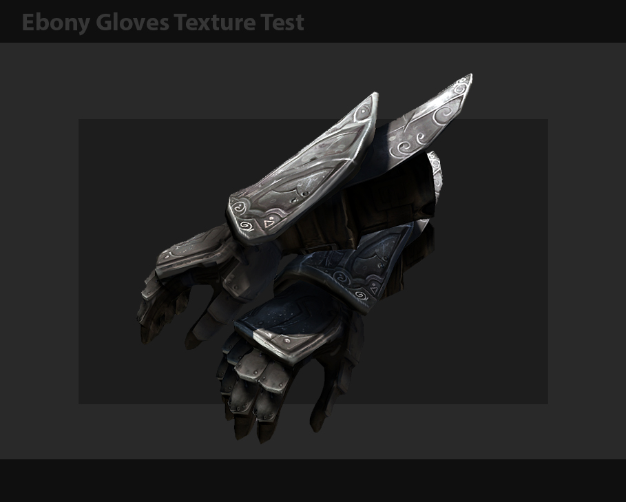
Honestly if the color ended up being like this I would be VERY okay with it.
This looks gorgeous.
Well, I'm glad it's actually darker than that. I mean, it's called Ebony for a reason. It should be violet-tinted black for the most part.
But anyway, it looks very cool so far.
Looks great, i say move forth with the texturing!
Do want.
Ok, tried something different. Wanted it more ebony. How's this?
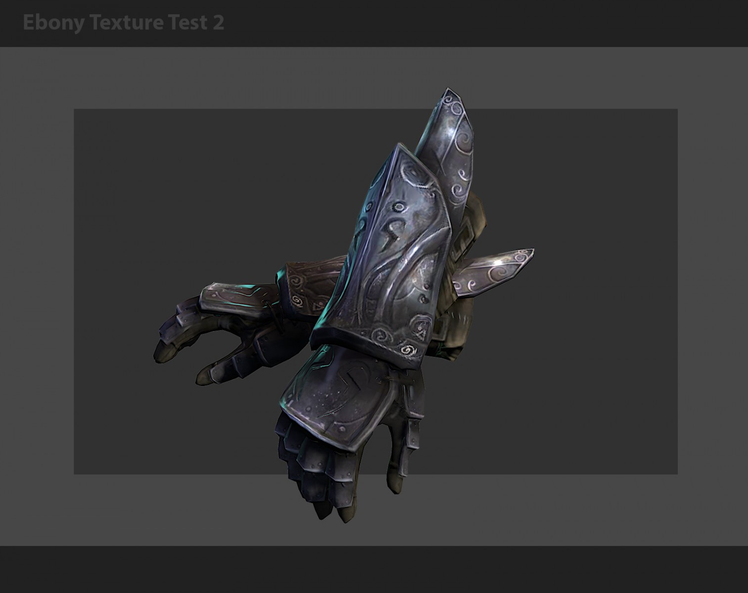
this is fine.
Feel free to play around a bit at your whim.
Whatever you do to the gauntlets, try to keep those settings saved to repeat across the other pieces of armour.
Those new colors look much more ebony-ish, can't wait to see some more.
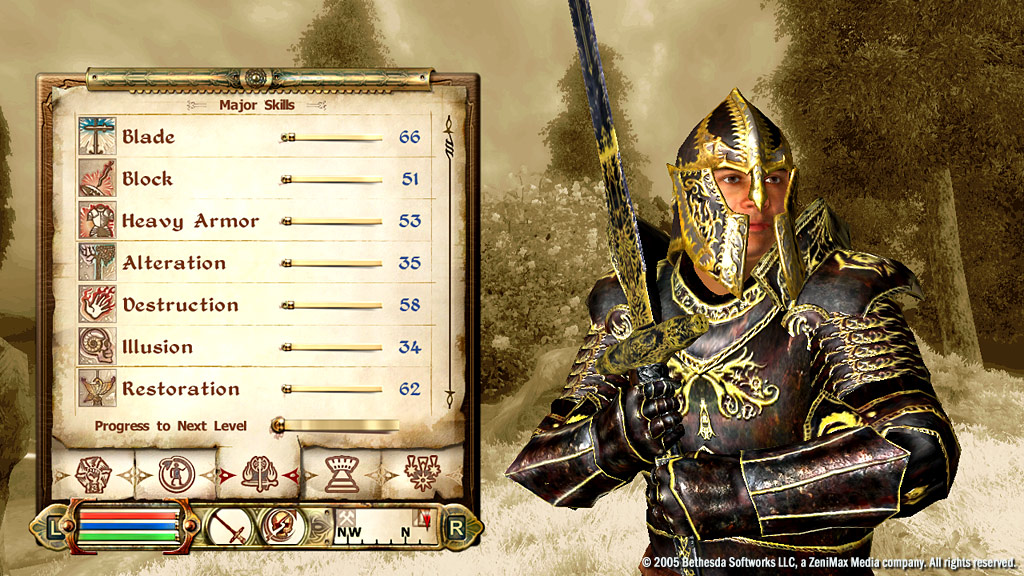
Love the model - the colors have it looking a bit metallic, though. I'd go darker with a bit more gloss, and some almost 'chocolate' undertones. Here's a piece of obsidian with some subtle dark browns. And here's the (albeit hideous) ebony armor from Oblivion, with some mottled browns mixed in. Though the textures are pretty awful, the colors are good, and you can tell they're more like a molded rock than a steel-type armor.
I actually prefer quite the opposite - to have a brighter textures like vanilla ones in all of the Bethesda games with a few exceptions. If you remember the original morrowind armors, they are mosyly quite bright.
It is moddes who prefer to make everything darker, more contrast, clean and glossy to show off little details on 4K textures and go for a cheap badass look.
My personal opinion is that better to aim for a lighter, ash covered and worn like materials on armors.
I personally like the color right where it is. It's dark enough to look like ebony, but light enough that you can make out all those delicious details.
I would go with the first version that you posted. Mainly because ashstorms and stuff. Either way it looks amazing though.
zilavI actually prefer quite the opposite - to have a brighter textures like vanilla ones in all of the Bethesda games with a few exceptions. If you remember the original morrowind armors, they are mosyly quite bright.
It is moddes who prefer to make everything darker, more contrast, clean and glossy to show off little details on 4K textures and go for a cheap badass look.
My personal opinion is that better to aim for a lighter, ash covered and worn like materials on armors.
Well, Morrowind's ebony had the bright yellow trim, but the ebony itself was essentially black. If you went too dark, you'd miss out on the details in this armor.
I guess more so than making it just 'really dark', I'd ask to add some obsidian-type hues to distinguish it from a grey matte steel.
The second colour scheme is better than the first. Looks perfect, really.
2nd :)
this is the 1k texture ?
In both cases I'd prefer it to be much darker (almost black with violet haze), but with high amount of specular that will bring out the detail. Refined Ebony should look like solid oil, while the examples you posted are more like metal, similar to what we had in Skyrim.
[External image]
[External image]
Having said that, I really like the second scheme, all it needs is some deep blackness and parts that are very shiny ;)
i'll say this again in case it hasnt already, the darker ebony sheen is achieved in the skyrim shader, not the original textures Rib has made. /end of issue.
tommythegunI would go with the first version that you posted. Mainly because ashstorms and stuff. Either way it looks amazing though.
but there is a plugin for the mod wet and cold named wet and cold ashes that gives the armor a dusty look. it would be cool if we could do something similar. Then when there is no ashstorm the armors will look clean/not shrouded in dust :)
http://www.nexusmods.com/skyrim/mods/31968/?
very strange proportions...
but textures style is perfect:)
Now that I've seen the model, it will definitely be the armor of my choice when it's released.
At long last I found a perfect reference for non-crystallic Ebony armour material :P The jet stone
[External image]
[External image]
[External image]
[External image]
It's basically a mid - form between graphite and a diamond.
Bonus - stone age Ebony Venus :P
[External image]
Like Ravanna said: the light shaders in-engine handle the "ebony sheen" for us. Not only do we not have to do the work, other than having a suitably dark texture, but fiddling with the shaders for the armor would just be one more stack of work for us to argue over, when as far as I'm concerned, this armor is exactly where it needs to be. And is probably the best armor in the game so far.
Iniquity: I like the low hips and bulky torso. Giving the native armors their of unique style is a must, and the more alien (while remaining logical) we can make then compared to the more traditional Imperial armors, the better we emphasize the strangness of Morrowind and the fact that the Empire is and occupying force; and outsider in a land of weird and ancient traditions.
Should we worry about the lower hips not matching well with other armors though? Players won't necessarily be wearing everything in full suits.
I personally hate the idea that we're mimicking the Morrowind equipment system, so I suppose I don't have a dog in that fight. Unless it leads to the armors looking like shit.
Yeah, I don't like Morrowind's armour system either, not sure why most want it because all it does it complicate things. That being said it's been decided already.
Now that I think about it, even skyrim's armor system has pieces meshing at the waist, so it is a valid concern. Should we set points where the armors meet and have everyone adjust their work to that reference?
LASentryYeah, I don't like Morrowind's armour system either, not sure why most want it because all it does it complicate things. That being said it's been decided already.
Wait, we're seriously going to recreate the Morrowind armor system? Did we vote on this?
That was decided very early on, if I remember correctly.
Problem has been adressed. We will work with Skyrim's system for now, and later on we will add more options for customization, a bit different from Morrowind - case closed. Talk Ebony now.
Thanks Drago, I was gonna say the same thing haha. Talk about the forum topic people!
Just so you guys know I didn't just disappear. These last few days have been nuts getting a few things out the door and prepping for class (starts in 8 hours). I am still alive though, finally got to touch the textures again today. Not done yet, have to finish the torso (its bigger than I thought XD), some cloth, and the legs. Then a lot of final touch ups.
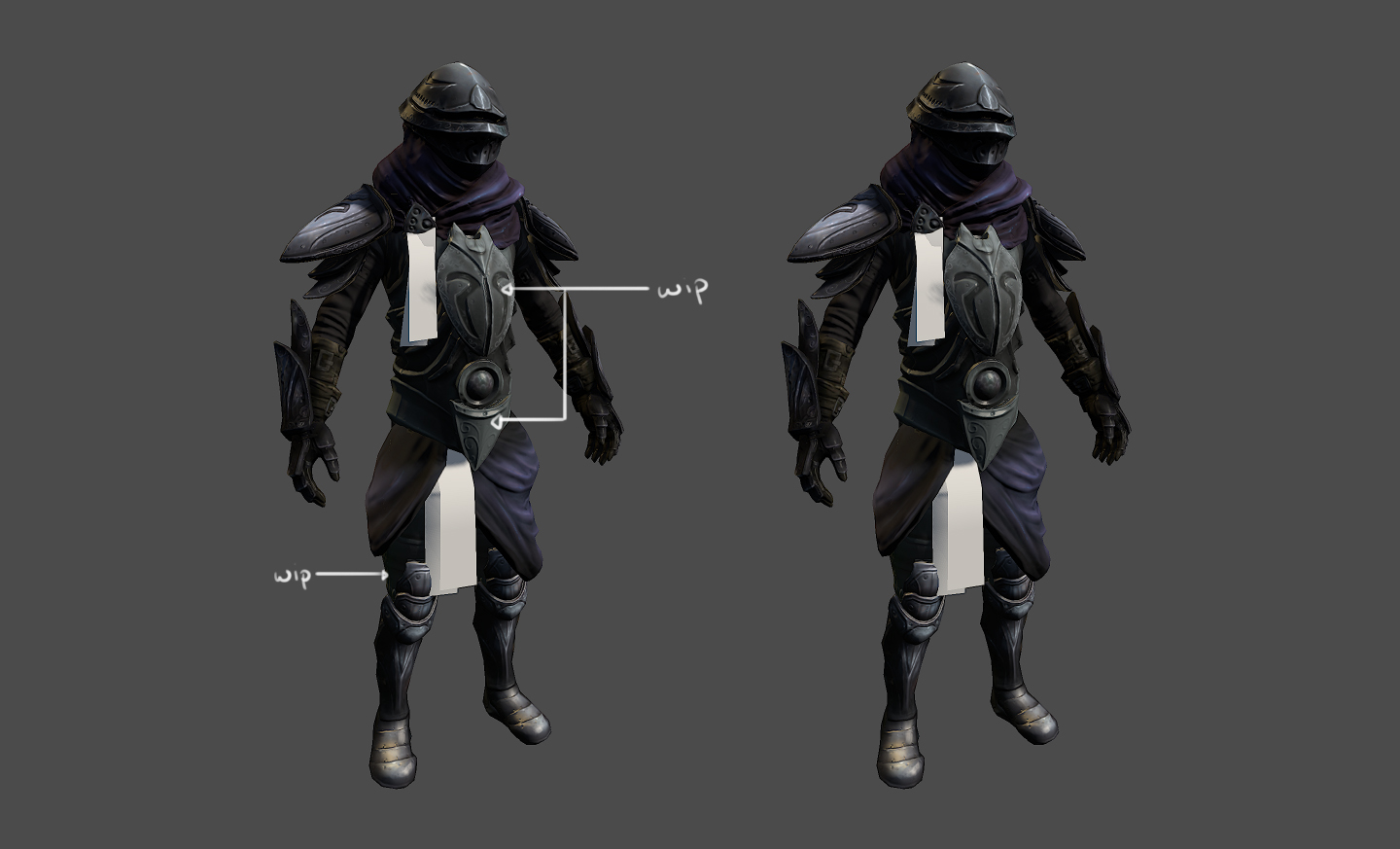
For some reason, it looks quite disproportionate, any idea why? (Serious question, love the actual model though).
I think it's because the stomach part is too big and the waist too down.
Just my personal opinion: i really like the somewhat disproportionate appearance (even if it might just seem that way due to perspective and stuff). It's reminding me of the alien, insectoid vibe pervading much of Morrowind. Plus, ebony must be horribly hard to shape, leading to a less form-fitting and more make-do appearance?
If I may, Firstly I think this armor is insane and coming along great! As for the proportions issue... I think that the proportions is spot on, the disproportionate illusion is created by the armor placement. Don't get me wrong it is really great but it seems that the middle cloth part should start at the belt area. Currently it may make the chest look longer and the legs shorter? Just my opinion. Would totally still wear it as is if you people disagree :)
hmm cant you load other armors and check/compare proportions ? that should solve most things imo.
I will work on the proportion a bit, I think I have a really fast solution to make everything fall into place better.
I believe proportions would look much better if the scarab was a little smaller and raised on the chest.
Yeah i think it's just that the top is too long/the waiste looks too low.
It's just awesome!
Just my 2 cents about proportions:
Helmet is to big, chest looks to small (thin) in comparison + as said before cloth should be closer to the belt
personally i like it the way it is, the crotch region being low is, IMO, the likeliest cause. the slightly disproportionate look reminds me of morrowind's armors, and i wouldn't change it.
Armour is looking great so far! As I havent done an update lately and before it was basically just Ravanna was doing modelling. I would like to use some screenshots of your work in a dev update video, but i would like to grab your permission first!
Update on the Ebony paint. classes just started so my time I am about to be really stretched thin here. I feel I addressed many of the issues talked about here. A shader will take care of the proper "sheen" when the model gets passed off to a TA. The proportions have been adjusted slightly to balance the design a bit better.
.jpg)
 Another shot without the poor man's spec from marmoset 1. Wanted to show off the diffuse map a bit more.
Hell yeah... jumping up and down.
perfect job. this set is really good
Holy shit...
That is some outstanding work there. :)

![[External image]](http://www.autogeekonline.net/nick/CarPro%20Tar%20X/labrea_tarbubble.jpg)
![[External image]](http://pulpbits.com/wp-content/uploads/2013/12/Black-Beetle.jpg)
![[External image]](http://dragonsreverie.com/Jet.jpg)
![[External image]](http://www.allipacha.com/store/images/p322.JPG)
![[External image]](http://gwydir.demon.co.uk/jo/minerals/pix/jet2.jpg)
![[External image]](http://www.rainbowcrystal.com/cgraph/jetsphere.jpg)
![[External image]](http://www.healingcrystals.com/images/Tumbled-Jet---Tumbled-Stones-04.jpg)
![[External image]](http://donsmaps.com/images2/venusneuchatel.jpg)
johnnybgoode wrote: this
A UV map is not a texture map, a UV map refers the to the coordinates on a 2D plane that guide the textures. I.E. the individual islands on the 2D map are created when you Unwrap (UV) a 3D object.