
Started the initial block in. About 5 hours into this. I'll pick it up again tomorrow, its midnight now @.@...
Last edited by Mace on 7 Dec 2017 - 09:08.

Started the initial block in. About 5 hours into this. I'll pick it up again tomorrow, its midnight now @.@...
Stunning![External image]
right now what is applied is a flat diffuse map and a normal map. The shader applied to it would give it a sheen to it that would mimic light reflections. As I am not a technical artist, I don't know how to make it. But I have heard rumors we have some pretty awesome people who can help with that.
realy nice looking what i am wondering nowe are u also gone do the shield and some weapons?
A extra green variant would be nice, I know it wouldn't really make sense lore wise but it would compliment the darkness of the armour nicely. Maybe make it a unique set or something?
I think the purple color is nice. It goes along the black & gold pattern of ebony armor very nicely, and we don't really have another set of armor whose color scheme includes purple in it. We already have glass for green and daedric for red. I think it was a very good decision to give this armor purple to distinguish it apart from the other sets we already have.
It's not Redoran armor, anyway. It's Redoran-inspired, but this is the ebony armor players will be finding/crafting for themselves, so there's license to go with what we like.
On the subject of getting the sheen correctly, one example of an actual armor set would be aMidianBorn Gold Ebony Armor by CaBaL120 on the nexus, his armor has the perfect lighting and looks great in-game.
| Attachment | Size |
|---|---|
| 37487-1-1371907579.jpg | 790.43 KB |
Made fat model for his ebony, gonna skin and set morphs!
| Attachment | Size |
|---|---|
| skinnyandfat.png | 548.92 KB |
Alex that is sweeeeeeeeet
Looking good Alex ;D
Absolutely love this, really amazing work. Any chance of there being a mod for this for regular Skyrim in the future?
Actually... that is a very good point. If Ribtibs doesn't mind, of course.
Just saw the video alexanderb uploaded, awesome job. Looks amazing ingame!
Seems just a tad bit too purple to me.
Also I'm not sure I understand the super-heated oil thing.
http://www.uesp.net/wiki/Morrowind:Raw_Ebony
https://www.youtube.com/watch?v=s-pVo8lxMP0
The model looks amazing, which makes my next point a bit painful to say because of how much I love the work that's been made but the armor is way too purple. The scheme shouldn't be so monochromatic - the plates should be black almost like the sword and shield in the video while the cloth would remain purple. Basically like in Drago's concept.
My thoughts too. I really like all the work that's been put into it, it's amazing; however, ebony needs to be more like pure night melded into armor - after all, daedric armor is just ebony + daedric heart/blood and that one is black.
It should be black with purple glimmers perhaps;
I hope this will be taken into consideration by the creators (by no means an underappreciation of your work guys!)
Purple ebony armor? No, just... No, it destroys the entire look.
If you have a soul, please remove the purple shade.[External image]
The purple ebony kind off kills all the reason for the fabrics to be purple...
the purple doesnt look to good. make it black purple -ISH but not just purple!
The model is stunning, but i think it is abit boring when the whole thing is the same color. And If the color will be true for Imperial armor for skywind that would also have purple cloth. So imho I think it's too much purple.. But again the model looks FANTASTIC!!
guis its rly purpl and it suks so bad wow so bad make a new 1 baddie. wow.
Chill out people. I'm sure it'll be changed from CLEAR popular demand. Just relax. We got a lot of other things to focus on and worry about.
?
Squally I don't understand why you're being sarcastic about the feedback that people have given in regards to the armor's color. It was hardly over-dramatic, or insulting towards the great work that people have already put into this. There is an obvious problem with the color scheme, which was put in because the artists believed it was a good direction to go and everyone explained their reasoning as to why they did not agree.
Having other things to worry about does not mean we shouldn't be free to review what is being done here, moreover as it is surely a piece of armor many of us are excited to try on our own characters once the time comes.
Cheers.
The armor looks great!
I think some people see the model as disproportionate because the legs look too thin, maybe its the angle but if the legs were increased by about 20% or so, i think it will look more evened out
Like others have said way too purple. I think either a purple tinted black or blackish silver would work better.
Amazing. I love that you guys are stylizing these to fit the culture.
Just one question though, was the gold trim from the original ever a consideration?
OcieeAmazing. I love that you guys are stylizing these to fit the culture.
Just one question though, was the gold trim from the original ever a consideration?
The gold trim will be on the Imperial version of this armor. This is the native Dunmer ebony armor. Dragomir's done concept art for both.
OcieeAmazing. I love that you guys are stylizing these to fit the culture.
Just one question though, was the gold trim from the original ever a consideration?
Ebony in the eyes of the Dunmer is both more beautiful and precious. Not for the Imperials though ;)
I actually very much like the effects on that, the square maps which make it reflect a lot like oil - that is great. If you make the base really black and only some slight hint of purple glow here and there it will be perfect. I posted reference photos of jet stone quite a few posts above. If you tried to achieve a similar effect with just a slight purple hint - the armour in my opinion would look even better.
Tajnarasha?
Squally I don't understand why you're being sarcastic about the feedback that people have given in regards to the armor's color. It was hardly over-dramatic, or insulting towards the great work that people have already put into this. There is an obvious problem with the color scheme, which was put in because the artists believed it was a good direction to go and everyone explained their reasoning as to why they did not agree.
Having other things to worry about does not mean we shouldn't be free to review what is being done here, moreover as it is surely a piece of armor many of us are excited to try on our own characters once the time comes.
Cheers.
nicely said! of course it is amazing work, thats why i stated that i like the purple tone, yet not as dominant as it is now. i guess it just needs to be toned down a bit, not redo the whole thing from scratch. also the sword and shield have a different color sheme than the armor currently has.
I'm with Dragomir on the jet. Though the way I understand the lore on it is that it's like a far less brittle, far more malleable obsidian, with a glass like texture.
"Raw ebony itself is an extremely hard, durable, black glass-like substance, said to be the crystalized blood of the gods."
"Ebony can only be worked when heated. It will develop small cracks that eventually shatter the material if hammered cold. Unlike most other armors, Ebony will not alloy with iron. It must be used pure."
Чётко. Внатуре класс.
| Attachment | Size |
|---|---|
| 1372188296888.jpg | 65.73 KB |
johnnybgoodethis looks really good mate.
I'm trying to understand the different maps at the moment.
specular map - how shiny something is
normal map - makes it look like high poly
diffuse map - color
but what purpose has the uv map?
The UV map is something else entirely. What it does is basically correlating points in a 2d image with the points in the 3d mesh. It "puts" the texture on the model. It's a bunch of triangles. U and V are the 2 dimensions.
Edit: Apparently that was a comment on the first page. For some reason the page numbers were not showing up, and I thought it was the last comment.
The final version of this will be... amazing like a Dwemer cog.
Black Metal, Purple Cloth.
That's all I'm sayin'.
[External image]
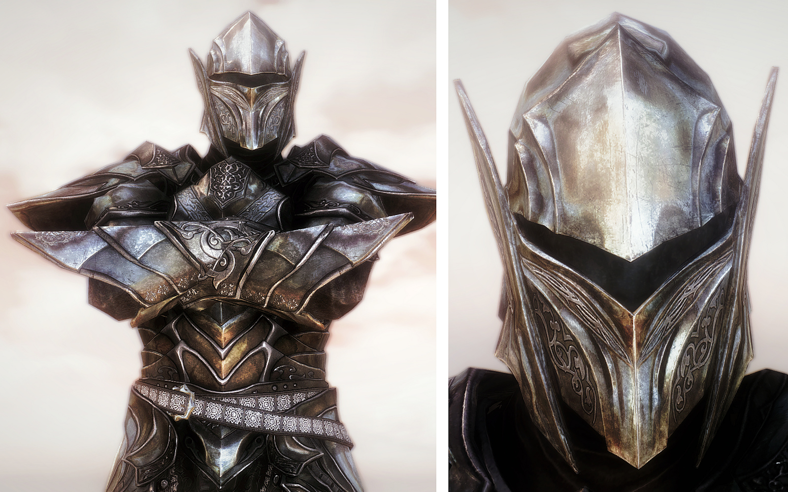
The gauntlets in last image look badly oversized. Also, I like the armor set on this thread overall, but prefer the original concept for the helm with broader back and dimpled, uninscribed rim. The shoulders seem slightly too broad like the pads are on upper arm. The torso looks too long. The belt rests on hips below waist and the cloth looks too large (puffy) imo around upper legs. This doesnt look well suited for combat although fat version does look better. It looks like the cloth has too much material, encumbers movement and is going to fall off the character's body.
So, i like the armor in general(modeling, color scheme, etc, ). but have issue with shoulder pad position, gauntlets and overly-long torso.
I don't think the size and positioning is that big of an issue. Remember that it's an imaginary material, and being volcanic in nature I would assume it has a higher carbon content, possibly making it extremely light, allowing for thicker plates, and more bulk in general. And as far as I know there's nothing official on the actual weight of it.
I love the design of the armor, but I'm going to jump on the bandwagon and say some of the dimensions are wrong, in particular the length of the chest piece- it is a little too long and doesn't make a very smooth transition to the lower part of the cuirass. Some division of plates down the bottom where it meets the fabric so as to allow movement but still protect the waist would be appropriate.
One thing that I don't think has been brought up but just strikes me as wrong is the front codpiece-shaped plate being over the fabric. If anything wouldn't it be underneath the cloth so as not to restrict movement or rib the cloth? Either that or moving it so theres one on each hip (like a fastening as well as protection from side-swipes) would be a better aesthetical choice in my opinion. I agree with Jorgen that we don't really need to worry about weight and density at this point, as ebony is unlike any real world material.
And I'm sorry everybody keeps throwing advice your way Ribtibs, but I hope you feel like all this criticism and other feedback is constructive :)
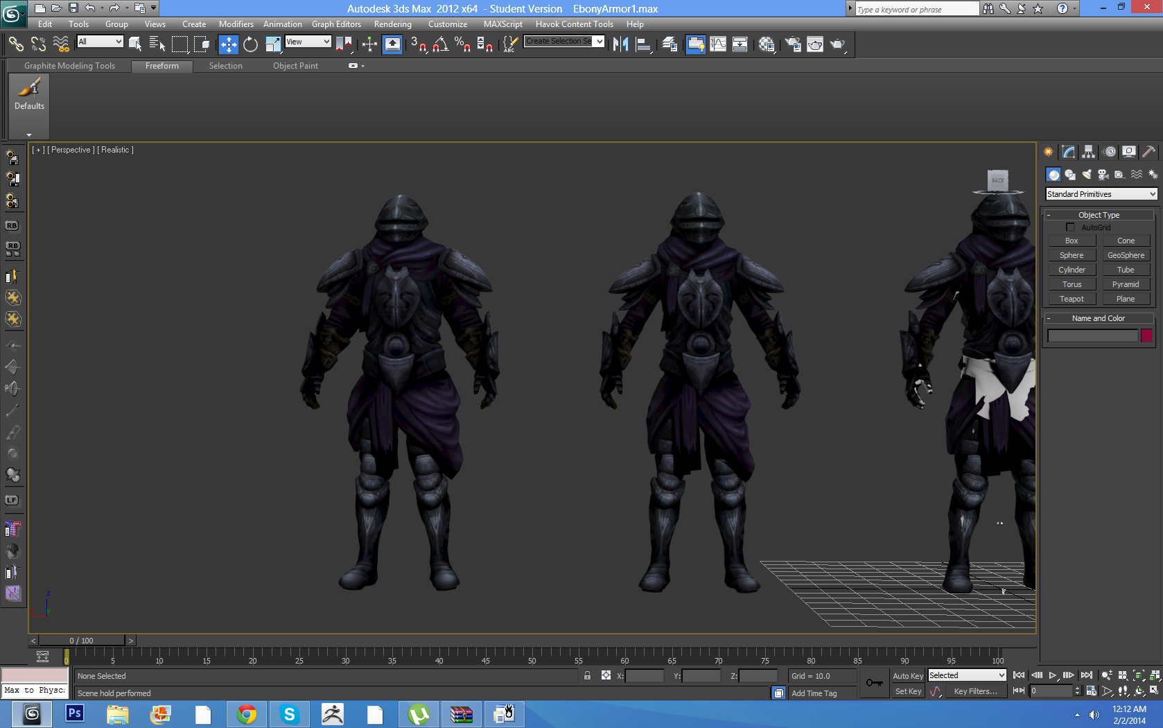
I'm afraid you're a bit late to the party, the armour has been already retopologized into low poly, implemented and merged. Any, even slight changes would give modellers weeks more of work.
Did they ever fix the... purple problem?
Yup, they did.
SechrimaDid they ever fix the... purple problem?
Ah, that is unfortunate. Thought it might be too late, decided to have my say anyway :)
Im sure it looks great
The real issue, in my humble opinion, was the concept and the poor choice of colors in it.
It just looks like a recolored redoran's guard armor, nothing unique, with some out-of-place purple. Of course the 3d model would just reflect that...and, considering from the comments, I'm not the only one that noticed that.
Other concepts are great, this one maybe should have been re-thought and re-done.
Just my two cents, do not take it personally.
Cool, any propositions on what could've been done instead?
Consider this, again, an opinion from a long time modder (and Morrowind's fan of course), and not from another concept artist - that's not my job.
I wouldn't have done it at all, I would stick with only a re-worked version of the vanilla's one.
You might say: we're going to do that too (I've seen the concept).
I'd answer: I wouldn't do two versions, I do not see the need of it. Plus, I wouldn't do something which looks identical to the redoran's guard armor, since it looses all its uniqueness.
But again, that's just me.
Since you're the lead of the concept artists, you came up with this custom and new idea, so it's kinda pointless to ask "what would you do instead" in answer to criticism.
Still, I understand there are a lot of people who come here just to do negative/destructive criticism...but, I assure you, it's not my case.
Again, really, nothing personal, I'm a long time modder myself, I know how much works it's needed and how much useless criticism there is around.
When the model is done, it takes too much time to do it over. Frankly, I do not see the benefit from redoing the models. Just too much time consuming when modelers could be using that time to create new armors.
There was a point and need to have two separate ebony armours. If you'd rework the original, please share with me what style would you go for. The original was just a generic style knight with black plates and gold trim. Now that is derived of uniqueness.
Reminder:
[External image]
Lore mentiones that Dunmer were processing and wearing ebony for thousands of years, so there would surely be remnants of their native ebony armours lying around. The Empire now took all the ebony and is producing armours for their high ranking legion officers - I thought it would be nice to see those too. The Dunmer ebony from my concept is clearly inspired by the Gah Julan, or even more - I wanted it to be a marriage of that armour and Skyrim's ebony. And even having that in mind, not sure what are you looking at, but to me they don't look the same.
All the similarities are justified by logic, since the latter one is a high ranking version of the previous, for the faction's leader Bolvyn Venim. Now imagine I decided to go with Imperial look for the rework of vanilla one. Would it make sense to see Bolvyn Venim wear an Imperial armour? Or should I really stick to a classic knight look, which would look just as absurd on him?
The choice of colours has been under a debate for ages and in the end everyone agreed that purple looked best. Maybe because it's a rich colour, maybe because ebony has a purple hint, maybe because a combination of deathly black and esotheric purple makes for a pretty menacing mix. People wanted to go with red for the cloth but then we had a Dagoth armour, or perhaps daedric. Red and black scream dark side of the force.
Thing about constructive criticism is that to give it you need offer advice on what to do, instead of just saying "x is wrong", even if you give proper justification of that opinion (which you did, although very vaguely).
Maybe I'm just overly sensitive about this particular one since it's been under battle for 5 months now, and there are just as many people who love it as there are those who are never happy with it.
So now, if you think a rework of the original one would be the best option please tell me how to rework it, because anything I tried before I came to the idea of a split looked either too Dunmeric, too Imperial, or too much like a tired, totally unoriginal generic knight cliché.
![[External image]](http://tesrenewal.com/sites/all/modules/ckeditor/ckeditor/plugins/smiley/images/regular_smile.gif)
![[External image]](http://tesrenewal.com/sites/all/modules/ckeditor/ckeditor/plugins/smiley/images/cry_smile.gif)


![[External image]](http://www.gameinformer.com/cfs-filesystemfile.ashx/__key/CommunityServer-Components-ImageFileViewer/CommunityServer-Components-UserFiles-00-01-02-44-90-Attached+Files/3250.534760_2D00_1321854738.jpg_2D00_610x0.jpg)
![[External image]](http://social.bioware.com/uploads_user/1880000/1879525/42756.jpg)
![[External image]](http://fc00.deviantart.net/fs71/i/2014/078/8/0/redoran_noble_by_swietopelk-d7asqgy.jpg)
![[External image]](http://fc05.deviantart.net/fs70/i/2014/016/b/f/champion_of_house_redoran_by_swietopelk-d72e1r3.jpg)
This is hot.
This is hot.