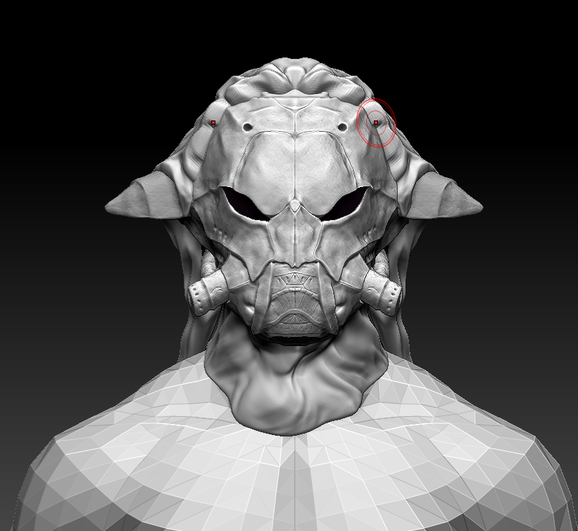
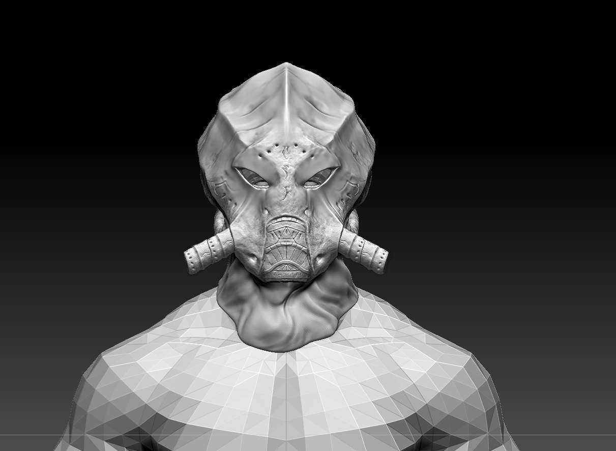
The Dust Adepts are Alteration-focused magical agents of the Great House Telvanni, trained and employed for their special skill at manipulating ash, dust, sand, and other particulate matter blown up and spread by the eruptions of Red Mountain.
Their wholesale departure from Vvardenfell, the only region of Morrowind that produces enough dust to actually make them dangerous to their enemies, was the result of a prolonged period of negotiations between the Empire, which greatly feared the notion of ash-wielding raiders and saboteurs ambushing the imminent wave of outlander colonists, the Great House Hlaalu, which shrewdly recognized the agricultural risks posed by Dust Adepts to their budding plantations in the Ascadian Isles, and the Great House Telvanni, the result of which was a treaty that enshrined in law the enslavement of Imperial colonists convicted of crimes in legal Telvanni holdings in exchange for the outlaw of all dust magic on Vvardenfell, as well as the exile of certain Telvanni Ash Lords of Molag Amur.
The one Redoran diplomat invited to the pertinent Grand Council session, the old and wizened Councilor of Maar Gan and the Northern Ashlands, was reported to laugh in hysteria at the fear and trepidation his esteemed colleagues held for "a gaggle of trifling dirt-mages."
http://www.reddit.com/r/teslore/comments/1z4wdc/telvanni_dust_adepts/
looks like the predator
http://fc00.deviantart.net/fs40/f/2009/014/8/b/Predator_Head...
still lookin good, love the alien esc feel to it
The more alien-looking shape is pretty cool. It looks very different from the original design, but not in a manner that is lore or immersion-breaking, at least in my opinion. One element that you could try to preserve from the original helmet is perhaps in the shape of the eyes. Currently the slits look too humanoid, like the skull of whatever that creature is fits too perfectly. Try to make them a little more vertical/run diagonally like in the original shot.
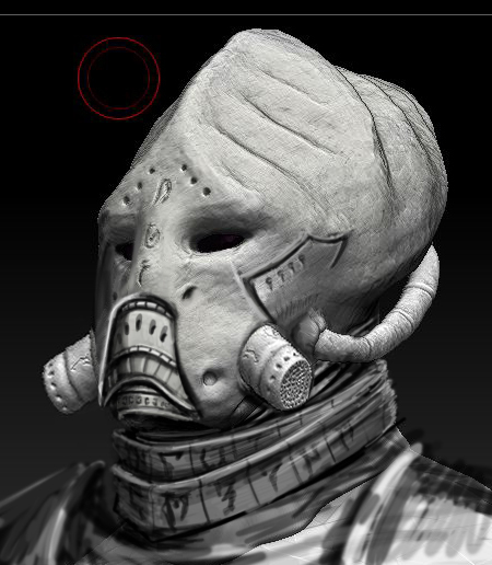
Good start Shushine, I agree with you about "sheep's head". This is speed concept how I see Telvanni Dust Adepts Helm (I hope it's will be useful).
RomanDubina wrote:
Oh, Roman...You are so right...This will definitely be useful.
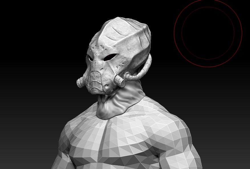
Current:

The man with the golden shoes strikes again!:-D
My reaction
I would slant the eye-holes more and lower that ridge on top.
I would also make the 'skull' of the mask thicker around the breathing part, only to give a bit of elevation between the metal piece and the bone, like in Roman's art. Also add that carved line to the side of the face. It helps pronounce the facial features quite a bit :)
The only thing I'd really add at this point is the head wrapping/hood. Right now it looks a bit like a ... Gray alien if you will. I do like the look of it as a gas mask though. The originally had that quality as well, mixed with a feline/swine shape.
That1Cactus had a concept of this that might be worth looking at
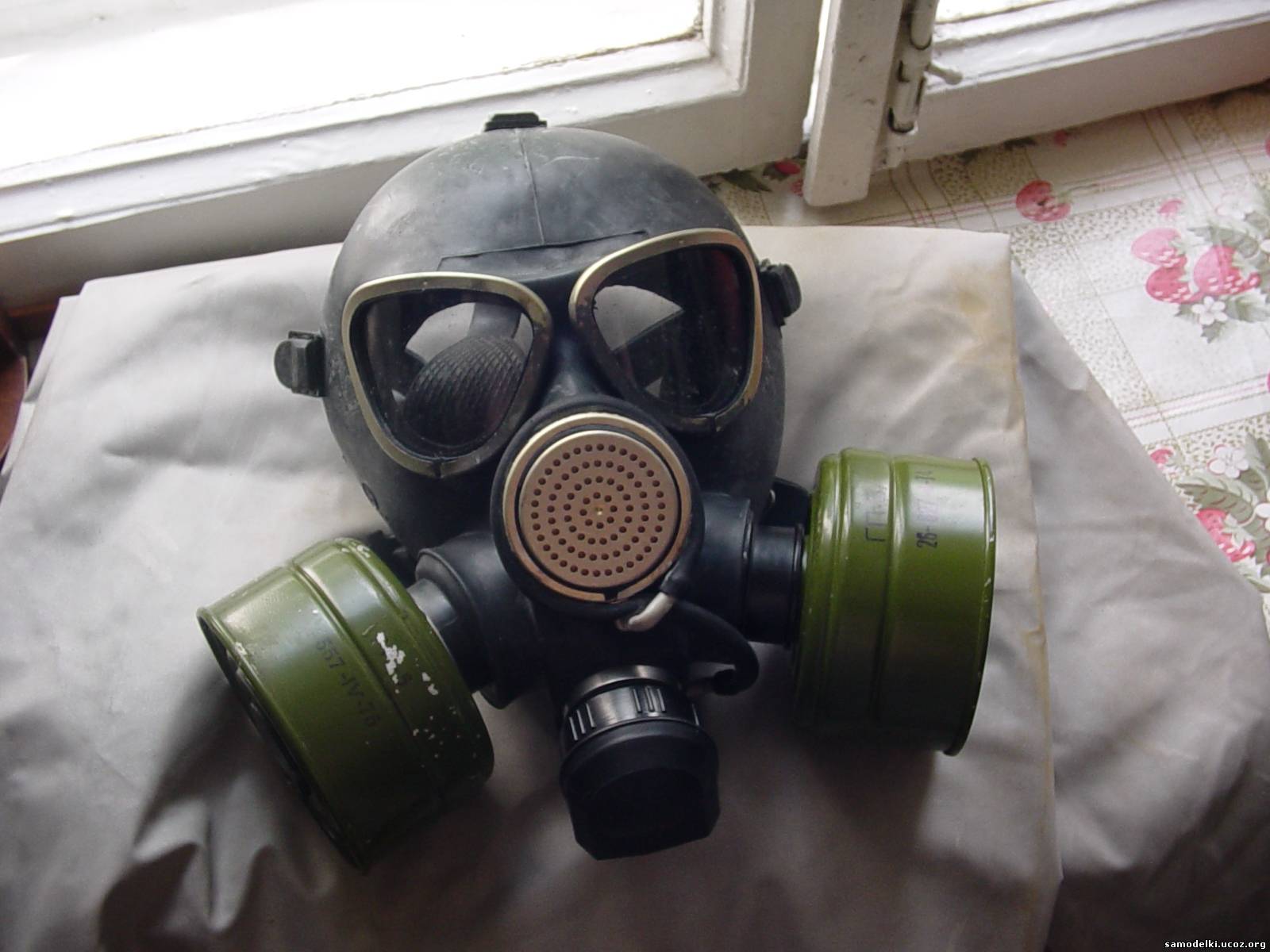
IMHO the WIP looks too much like a modern gas mask and not Morrowind enough, and here's why:
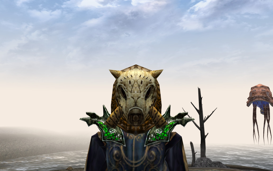
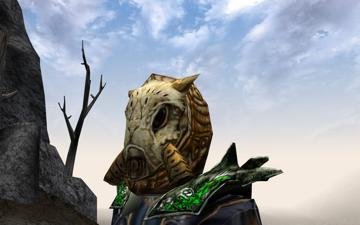
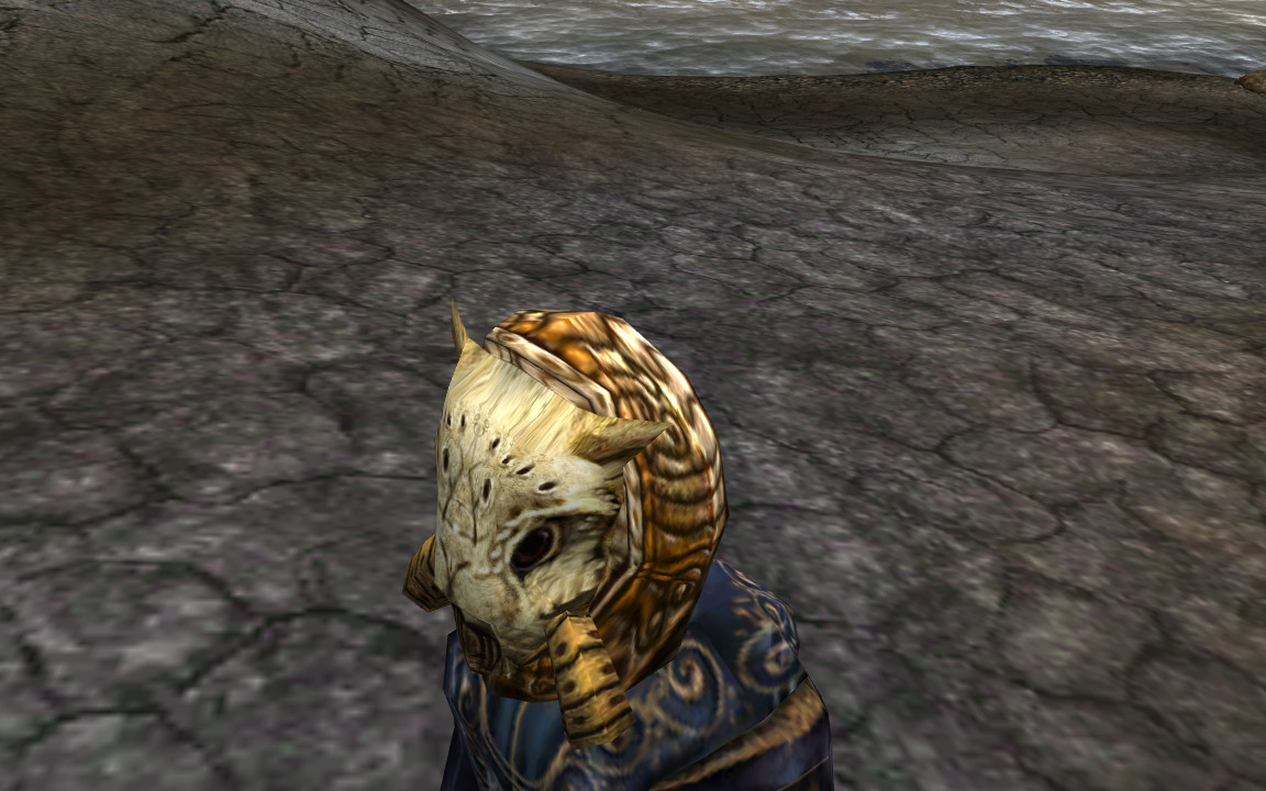
The Morrowind Telvanni Dust Adept helm looked like it was made out of a skull or a chitin shell of a beast. Note how the eye sockets are totally not designed for humans, and the patched-up hole where the mouth used to be:
It's part of the Chitin light armor set, so that plate on the front is probably a chitin headplate of some local giant insect. The WIP version does not have anything like that and looks completely manmade from the ground up, losing touch with the original concept. IMO "it used to be an animal skull" look is what made the original helm work and fit in the setting. The WIP looks clearly human-oriented, and therefore too modern.
You seem to have been following the rightmost MK concept, but that has become a separate helmet altogether, called Telvanni Cephalopod helm. It has those tubes on the underside and resembles the WIP shape more, but it's still clearly made out of insect shell and not human-oriented - same issues with eye socket placement, etc.
Bonus round of associations: the bridge of the "nose" on the Dust Adept helm looks very feline. Combined with something resembling ears on the top and the slightly darker base for the chitin plate that looks a lot like lion's mane... IMO this helmet resembles a lion's head a lot in the front view, but perhaps I've been drawing too many lions.
discoccult wrote:
It's over here in the first post. Personally I like it a lot, but the pic is pretty low-res. Try asking him for a more detailed concept - he mentioned he's not sure what exactly needs doing anymore.
You must be Bad_Mood_Larry! New member here on the forums, and you posted the screenshot on the dust helm and dunmer iron set on r/morrowind and asked for people's thoughts and opinions. :)
First off, welcome! Glad to have you around. You clearly have a good knack for thinking through processes, and even went to the trouble of taking screenshots!
You don't happen to have any sculpting experience, do you?
No, I'm Bad_Mood_Larry.
https://www.youtube.com/watch?v=bW7Op86ox9g
Like, they had some really good points and I think it's pretty crappy of y'all to dismiss them like that just because they're newer to the forums.
Listen I could draw up a pretty detailed/ higher res concept for this helmet in a few weeks once I've finished college apps, and I think I will. Because it would be really helpful for this one.
Shushine wrote:
Relevant
discoccult wrote:
Who dismissing who...I'm legitimately Bad_Mood_Larry
I tried to hold myself from commenting here for so long, but I actually loved the sheep's head... It's kind of disappointing that based on a helmet found in game, as well as some lore we're creating a new class of NPC, and then their iconic mask is totally changed. I never seen it as a sheep's head, but as a skull of a sea creature or some bug. I especially miss the slant eyeholes, they were a very defining element of that design, making it less human, and more beastly in appearance. Elongated face described as "sheep's face" made sense, since they'd put dust filters in there, like in actual gas masks.
I like the new design, but it doesn't have that Telvanni feel to it, and definetly won't be recognizable for people who know and love the Dust Adept Helmet from Morrowind. Welp, I have spoken my mind, no idea what's going to be done next.
I'm not a Morrowind scholar by any means, but design-wise I could see this model and another model that looks like the old one work together... As in same methods of crafting a dust helmet like that.
What looks weird to me is the "brain" of this model, it does look very grey hollywood alien-like.
Edit: I'm not very great and I don't draw very often, I still tried something though. Didn't make it look more like the original though, just edited. Lol, also disregard the typo in the filename.
Nice Marius, it's always the best thing to back your statements on design with visual experiments! ekhm... Yeah, that's what I forgot to do. So here's a little quick overpaint.

Don't want to be too much of a pain in the ass about it, but I really think this shape of eyeholes just works best, and instantly makes the helmet identifiable as Dust Adept's.
Nevermind.
Guys, both that MK's concept (Really Veloth, it doesn't help if you post it TWICE), and the lore quote are in the opening post. Is it that hard to look through it? Stop making this into another useless idea thread, let's just let the man work and think on the best way to tackle this helmet, that was in fact in Morrowind.
I do like the look but I'll be hesitant to do anything unless Eloth, Rav, or Happy tell me to do it...I can't really do much outside of zbrush for the moment because of my PC being messed up so it might be a good thing to play around with.
However the real issue with that design and the original design is the eyes make no sense. This is one of the reasons why I avoided the slant is because they look pretty good and they don't match up or they do match up and it ends up looking stupid. A person would have have fish eyes to see with eye holes like that. I did a quick slant and mock up of the art (I'm in the middle of making it right now) and I did it in 30 mins but I'm not sure how I feel about it.
the telvanni aren't really about practical designs. I think their content is definitely an area where things that don't make sense are allowed to be explored
also, this doesn't need to have eye holes necessarily. the original had some sort of lenses.
the elder scrolls hasn't always been one for realistic headwear design
What if the... tusk... things were a bit longer? I notice that on the original, they hung down past the chin.
Kinda like this? Might look a bit more bug-like, IMO. Just a suggestion.
I don't mind which one makes it into the game, all of them have looked great so far! However, I do like the eye slits in the last one more than any, it differentiates it a bit from a stereotypical alien, imo.
That looks nice, but will the ears return?
I agree with iceflame542, I think the ears would be a nice touch
for sure
they're kind of like little horns really, but they give the sort of lamb-eared appearance of the original.
I really do think that drago's paintover is a really solid representation of the eyes as well
I see Lamb being tossed around, but the original seems more canine in shape to me.
Honestly I think the original fits Elder Scrolls aesthetic better. The sculpt thus far just seems too sci-fi, like something an alien fighting some sort of space soldier would wear.
This concept I haven't seen directly posted here:

yesss this was the concept. It was really really good, it's god the sort of weird hood-like thing as well.
I could ask That1Cactus for permission to do a more detailed redraw of his mask concept, I don't know if he's ever on here anymore. If not I could just go ahead and do it this next week or so
No.
Ears? I don't think you'd want ash in your ears :P This mask was built for a purpose
No what?
Alright, I see Shushine is at the verge of his patience, so... Why not annoy him even more? :P

I'm not forcing anyone to do anything, but here's an idea on how to merge Cactus' sketch with Shushine model. And I'm well aware this would require remaking the whole thing, that's why I'm not pushing anything. Just an idea. Looking neither like a sheep, nor like a kitten. I think it's pretty solid.
Again, sorry for coming out so late, but nobody's asked me before if there were concepts or ideas for this particular mask before modelling started, so I thought it would be on Shu's shoulders to design it while modelling... But I'm afraid the roots of art and lore direction are reaching too far at this moment to have something done outside of it. Just a remark, I hope this discussion doesn't get ugly, like a few others did (remember Imperial Armours that never got finished, because the freaking shade of purple wasn't satisfying).
Dragomir wrote:
Yes plz.
Give me time....I'll see what I can do.
You got this. I also love that you're posting stuff on Reddit. My earlier post directed at Shnatsel wasn't sarcasm. :)
Skywind definitely needs to be hitting up reddit for marketing efforts and drawing in support (not that it doesn't already). I just like seeing the presence over on r/morrowind and r/skyrim. Keep up the good work, good sir!
Alright, nice. If you do find yourself following that concept, I made top, side and front views for an easier understanding of that shape. I think it looks pretty attractive from each angle.

Note however that these are 2D drawings and in 3D the shape might not exactly match up with all three at once, limits of my spacial imagination. But that's the shape I had in mind when making the previous repaint, and I believe it's more or less the lines and shapes That1Cactus made in the sketch.
alright I'm totally down for this one, I'm just not so sure about the tubes on the sides. that's more of a cephalopod helm thing
Dragomir wrote:
I can dig it. Looks good to me. Like a cross between a big cat's skull and some giant angry bug.
The tubes contribute to the shape nicely, I think they work well with both masks ;)
@Dragomir: Really good enhancement. But from what material/creature is this supposed to be made?
Still working on the shape.
Awesome! This is already looking dope. There are a few adjustments I'd do though, to make the shape even more refined.
The smooth angles in the concept for a big part decided on the attractivness of that helm, mostly because they made it look much more organic. Square angles are more of a man-made, industrial thing. It's very abstract to talk about, but lines and shapes are the base of every design - I hope it makes some sense.
Not sure what seems the most interesting looking to you and other guys, but to me those three red lines on the right pretty much sum up the shape of the idea I had in my head, so it might be good to try and match the shape to them.
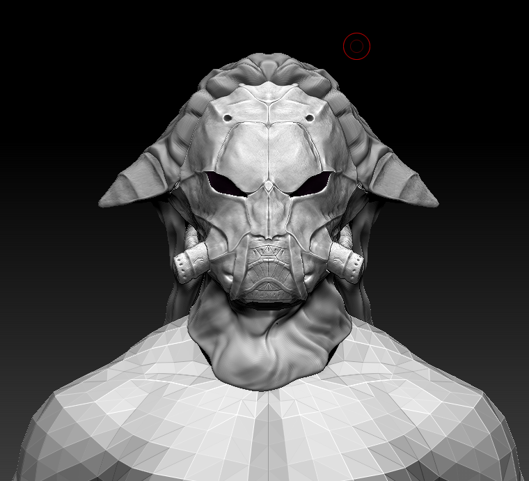
Here it is without the lines, mostly the ears changed, and eyes a little bit:
Another thing you might consider is separating and portruding the upper "lip" a little bit. That isn't as important though, so if you find it too hard or ruining your model it's probably not necessary (although would enhance a lot).
What it does though, is it creates a shadow under the upper part of the mask separating and "underlining" it a bit. Many modern fantasy games tend to put a strong, overlining frame around each plate of their armour (especially ESO) - I think it's unnecessary and can be done with lighting tricks easily. But in both cases it defines the shape very well, only with shadow it's much more natural. As you can see, the upper part of the mask, that "bug head", reads much better now and is more in line with the rest of the shape. It seems to give it more depth as well, dark cavities (like under the cheeks, where tubes come out from) always make a sculpture more interesting, because our curiosity puts our eye in there - we want to know what hides there.
I hope this all helps a bit, I go through a similar process with most armour modellers and they seem to appreciate it for a big part ;)
Okay, did the suggestion raised it, did the ears, eyes, etc...I liked raising the upper lip with most I could go either way, doesn't matter too much to me though.
I also modified the eyes again I could go either way on it.
Heres one more inbetween
This is absolutely gorgeous Shu, sexy as hell. I think the middle, second one has the most appeal, to me at least ;) Because it seems wider it also seems more insectoid.
Care to also throw in screenshots from a few other angles? We gotta keep an eye out to keep it looking good from each side ;)
Awesome work Shushine!
Pages