
Note that this will only be a temporary solution for a short amount of time
Hello everyone!
Mace is about to become PR guy, and this includes a make over to the well known 'https://tesrenewal.com/welcome-0' post. So to get the ball rolling he has entrusted me with getting some ideas about what we should do with this post while he is away for a few days.
Now this means we will be replacing that post with something fresh and updated. It must contain the following as to get the most accross. I will provide you with some links and stuff to get started. And since this post will be inside a forum post, you can design it here and it will look that way on the main page.
You should also take care as to not overburden your idea with images and text. Keep it short and simple, We want to stop people from being confused with what is going on.
Another thing to take into account is that we want to minimize scrolling as much as possible, Give everyone the brunt of info from the top. I was contemplating creating 3' Vertical' images, each holding a bunch of info from each project, These images would also act as links to parts of the forum. However with browser scaling these can be easily messed up.
We also want to keep images to a minimum, as they make don't add particularly much to the site. We do however need images, so its best to keep them one click away from the home page.
- Link to the Skywind forum
- Link to Skyblivion Forum
- Link to morroblivion forum
- FAQ Links
- A Link to the future blog
- Info on each project
- Social media links (Facebook, Twitter and DeviantArt)
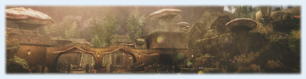
Here is an example that I made. Also excuse the crap image links and lack of formatting. For some reason its not centering properly
Looking to help out on skywind?
(stuff here about what kind of devs we need)
Link to Deviant Art here + Images
Find us on social media!
[External image] [External image]

Stuff about who is needed, Link to FAQ (I don't know much about these other projects, so its best someone else puts stuff here

Same as Skyblivion, Link to download would also help here


.png)
![[External image]](http://i.imgur.com/CGST0p4.png)
![[External image]](http://i.imgur.com/KYWKD6St.png)
![[External image]](http://i.imgur.com/Qz06mfNt.png)
I reaaaallllyyyy like that
I reaaaallllyyyy like that header image. I think we can put a nice and tidy project overview (i.e. our goals and what we are actually doing) should be front and center.