Hi!
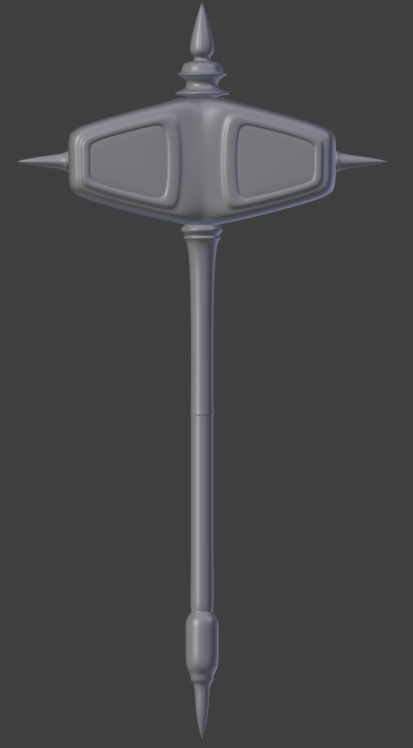
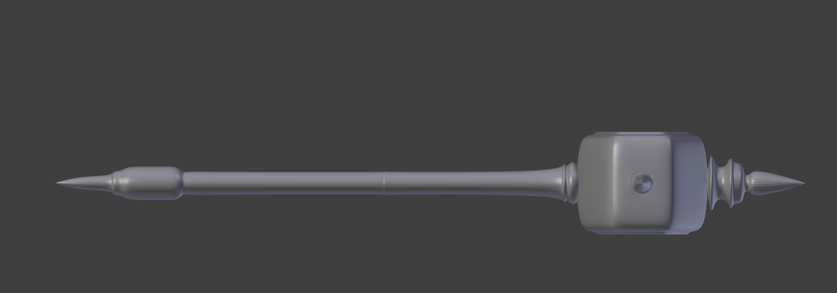
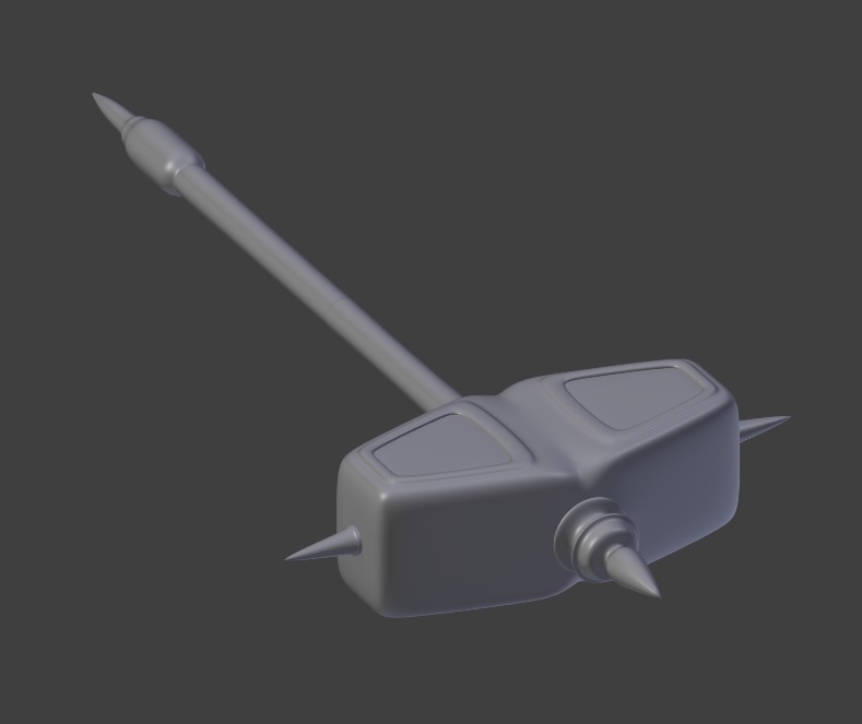
It's my 1st weapon for this project, i hope you like it ;) no texture atm but i hope i can make it asap ;) Any advices, tips are welcome. Also here is link to 3d model.
Last edited by czater on 9 Mar 2015 - 17:15.
Hi!
It's my 1st weapon for this project, i hope you like it ;) no texture atm but i hope i can make it asap ;) Any advices, tips are welcome. Also here is link to 3d model.
It's almost done ;)
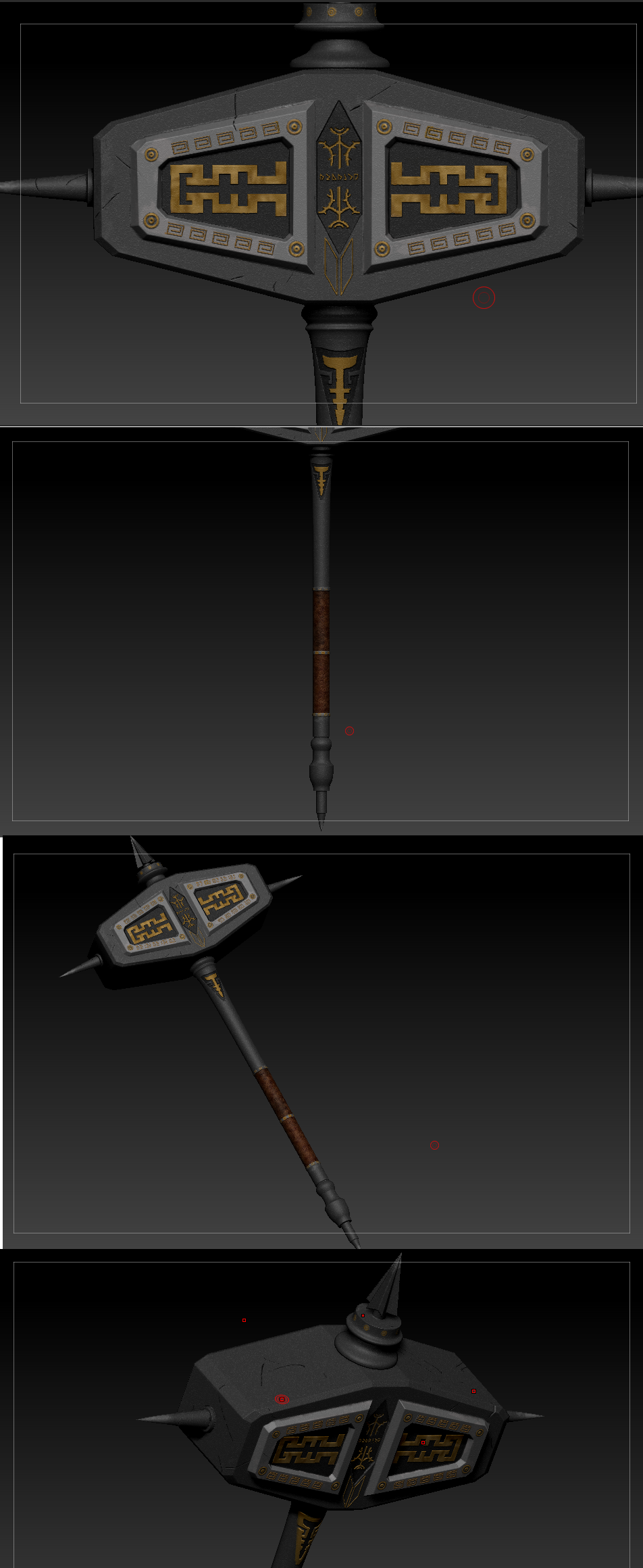
massive improvement. aside from the pointers i made in PM, i think perhaps we may need to beef up the lower end so the centre of mass is more central
wow, looking awesome!
Yep, this is looking pretty awesome. I think it'd look a bit better in proportion if the hammerhead was flattened a bit sideways, if that is still possible.
Niice. I can make these symbols for you in AI if you want to improve them
in AI? what is this? :>
Adobe Illustrator*
Little update ;) Fast render using low poly, tex and normal map ;) just want to let you know that i am still here and still trying xD[External image]
normal map ;)
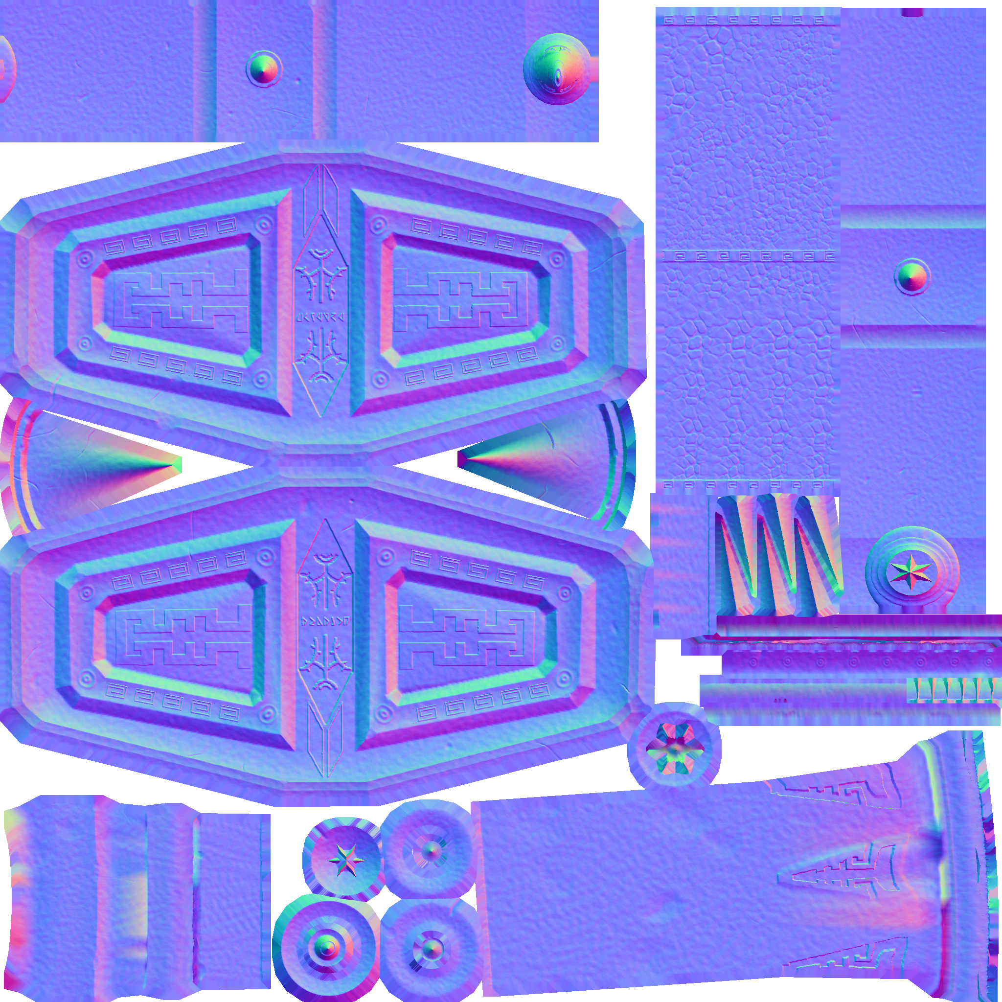
preview http://p3d.in/g47k2
I really like how your concept is getting along. Looks pretty great by now.
There's just two tiny bits of feedback I wanted to give you about your latest progress.
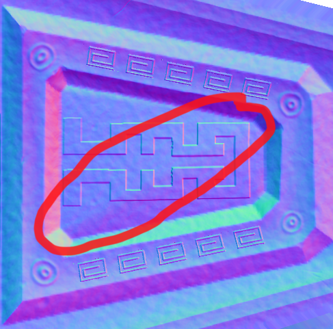
The first thing is: Something seems to be off about your normal maps in the ornate parts. This diagonal edge creates some kind of bump/fold/edge in the finished model, even though I think that part should be flat.
Another thing is that "arrow" below the inscriptions in the center, I think it is a tad too long and would fit the overall design of the hammer better when you cut it off a bit earlier, so it does not touch the rounded parts.
Quick sketch:
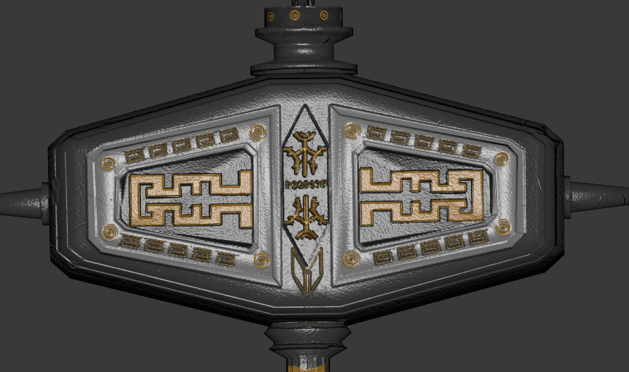
Now that I'm looking at it, they should probably be a bit narrower if you decide to make it shorter. However, that part is entirely subjective and up to you.
That said, again: The overall concept is coming along great. I'm really looking forward to swinging that thing around in the game.
i am now trying to fix this thing form 1st image but i have some trouble :s thanks for feedback ;)
Update ;)
http://p3d.in/fDPHu new normals
http://postimg.org/image/dz4cptpi5/
Overall design is great. Good job [External image]
I think it can be even better if texture will be less sterile. I've done speed photobashing to show what I mean. Despite poor execution.
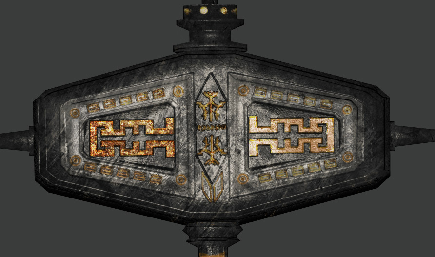
I just think it needs a bit some "dirt" on it, if you know what I mean. Now it's great. Then will be perfect IMHO.
Just play with texture, to get good result.
atm i want make normal map as good as possible ;) i will texture it after my normal map will be accepted ;)
[External image]dont be to shy czater u doing good work
http://p3d.in/sJaTP 3d preview ;) looks bit worst than in marmoset ;p
also i don't know how to separate diffrent shine (gold for dwemer parts and dark metal for ebony) ;s


Because it looked neither
Because it looked neither Dwemer (made by them), nor ebony (made out of it), nor orcish (artifact of Malacath). Gotta give some of these items more identity.