As I am currently working on creating the new UI elements Skywind will need, I'm going to start with the first new menu the player is going to encounter in game: The menu to pick the birthsign.
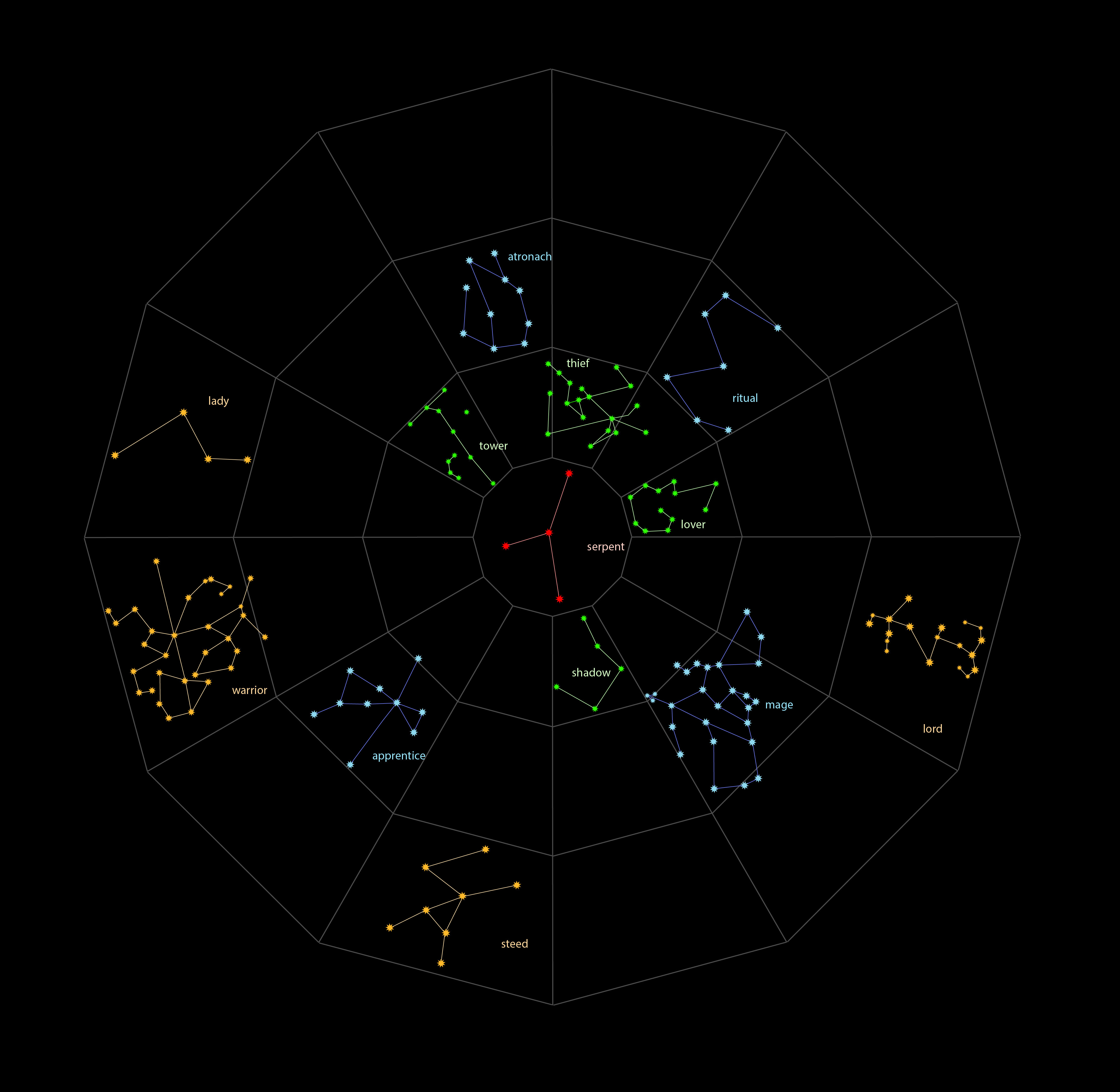
In the current stage of development, the menu looks like this:
It is fully functional, the symbol for the ritual is still a placeholder.
Lukkar will create the graphics that represent the birthsigns and post his progress here.
This thread is meant for feedback on his graphics and the overall layout of the menu. Any idea or feedback is greatly appreciated.
It is not meant to be a thread for ideas for the rest of the UI or for feedback on the visual style of the UI elements. Buttons, borders, colors and all these things are subject to change and will be handled independetly in a graphical UI overhaul.
Fantastic! Great job, instantly makes the game feel new!
that looks great! For a placeholder the symbol looks pretty good.
Is the menu going to use the black and white of skyrim or be brown\red\purple ect like some of the redesigns have shown?
I already love them. I'll start with the animation as soon as I have the files. Can't wait to do it.
TheDjango wrote:
The colors are still not final, however the black background will probably stay as it is. (My experience with UI design shows that using bright / saturated colors for background elements of the UI is distracting and doesn't contribute to a good user experience.) The graphical elements will eventually be changed to fit the style of Morrowind / Skywind better.
However, I have to cut the discussion off here, since I stated in the original post that this is not what this thread is supposed to be about. (Although I did not include the word questions in this sentence, I think it's pretty obvious.)
maxnosense wrote:
If you have some opinion on this or want to contribute in some way, I recommend you create a thread for that purpose, I want this one to stay on topic.
Apologies for being a bit thick here maxnosense, but what sort of feedback are you looking for regarding the menu layout, if not any of its UI aspects?
SpartacusMills wrote:
No need to apologize. The key in my statement was the word visual, so what I care for is the actual layout, someone could say I should make certain elements smaller or bigger, change the formatting or positioning of certain elements. Any stuff that could be changed in a simple mockup, instead of the actual menu.
Ok, gotcha, thanks. The only things I can think of then, is it might look tidier if the names of the heading & 13 signs were in total about the same height as the accompanying art, and if 'under which sign were you born?' was replaced with something shorter so as not to stick too far out past the longest of the constellation names.
I bet that was well worth your detailed explanation. :)
It's been a while since I last created a new Morrowind character, so I might not be remembering correctly, but wasn't there a description that accompanied each sign? If so, it might be nice to have that listed before the sign's spells/abilities.
I also think the sign's text/description could use a smaller point size. It feels a touch too big/close to the size of the sign's name. Or perhaps a bit more leading between the title and description would also fix that. :)
Forgive me if i am wrong but doesn't the Thief birth sign usually depicted as having a dagger in his right hand?
Lukker I do have to say I love all the images. but in my honest with lady symbol it looks a lot like a Japanese illustration with the umbrella. I don't know if they have umbrellas like that in morrowind but that's a small detail that looks a little off from the morrowind world in my opinion. Take what you will.
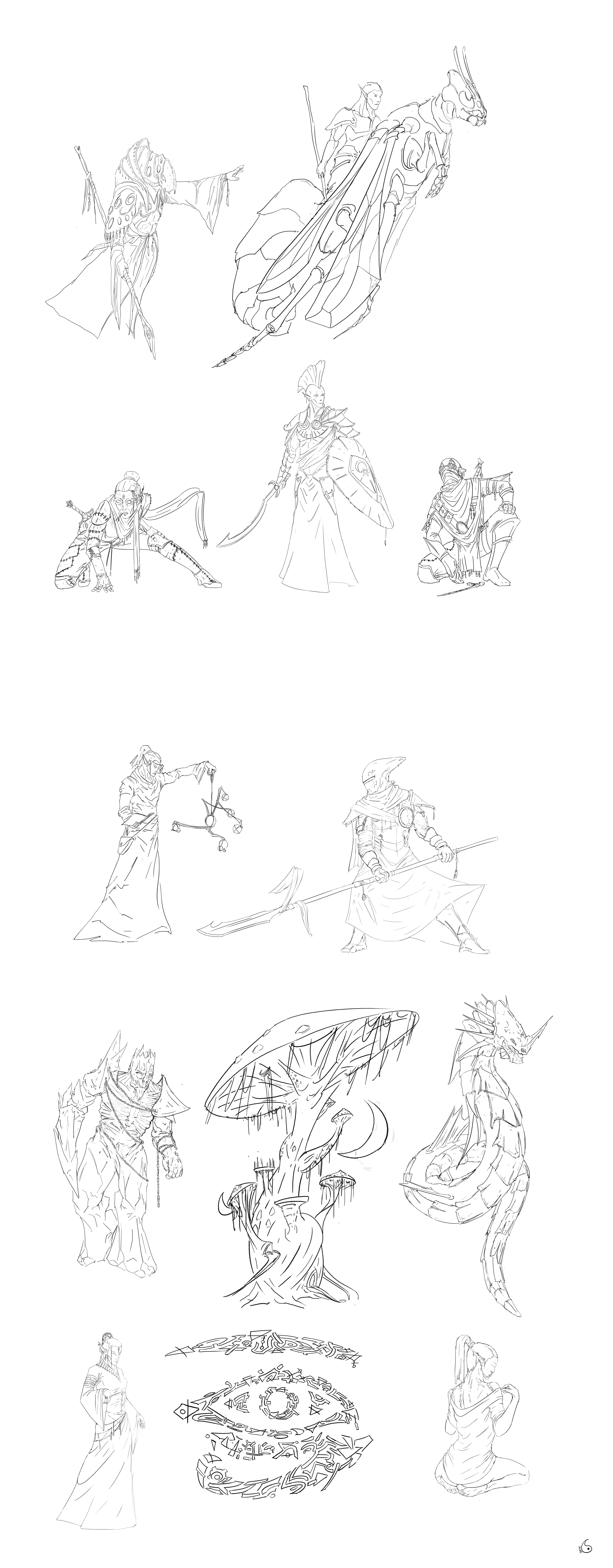
Took a small break from animation to do that. It's not pretty, but it's mostly accurate and clearer than daggerfall resources.
Warrior, Mage, and Thief really should be the Tribunes (Ayem, Seht, and Vehk respectively). Otherwise looks great.
Who would you propose to represent which constellation in that case?
Ayem the warrior, Seht the mage, Vehk the thief.
Some discussion on the topic here: https://www.reddit.com/r/teslore/comments/1v2hxz/thief_warri...
And, here: https://www.youtube.com/watch?v=Isx6dSLsQZQ
In that YouTube lore discussion, the Three Great Houses were also brought up as one of the primary 'enantiomorphs' in the game. I think we're safe with Redoran as Warrior, Telvanni as Mage, and Hlaalu as Thief. The Mage has been done and looks great, Redoran will become a bonemold-clad warrior, and Nexos will be able to draw from some early Hlaalu concept art to give the Thief a distinctive look.
A lot of the real-world constellations are named after specific heroes from ancient myth, like Orion. But there's also Taurus, which is just a 'bull'. The signs of ES seem to fit this latter category, for the most part. Though there are three signs with more powerful imagery - the Thief Warrior and Mage.
I'm keen on a fairly straight-forward approach to the star signs. People tend see what they're told to see, how they'd imagine it to be. I was never taught Ursa Major - for me it was the Big Dipper. I can't not see that thing as a ladle. For Westerners, a sign called 'the Steed' would probably be a horse. In Pakistan, however, they might see a camel instead.
So for the cultures of Tamriel, the Warrior would take the form of their quintessential idea of a warrior. For the Imperials, this is a man in Imperial style armor carrying an imperial style weapon - for Dunmer this will be a bonemold-clad Redoran.
Just as my night's sky is shared by ancient signs as Orion and not-so-ancient ones like "The Christmas Tree", Dunmer signs should allow for both older and more contemporary star signs. Just a matter of deciding how best to display them.
I found those on deviantart and i thought it was pretty ok to steal them and use them ingame.
Whaddya think, huh ?
High res, beware.
@Nexos
Meh....
Ok it looks better than mine examples and more lore-friendly than original but try to fit them to constellations.
The menu looks great, though I think you should increase the text size of the sign list on the left. There's a lot of empty space across the menu that could be filled :3
Damn son, dat Dunmer ass...
Hydralisk is great (this is really would be better than earthlings' Snake or Horse).
This set of signs have pretty same style and local flavor except of Eye.
---
Am i wrong to think that sign of the Tower must depict Regional Towers of TES world specifically?
these are quite nice! i like the fact that you've "dunmerized" the signs.
also, a random thougt, i've been seeing more and more similarities between edo japan and morrowind... maybe you could Ukiyo e them a tiny bit... just an idea...
I have an unpopular opinion here) The list of signs seems half-empty when placed like this (yeah, i guess it's a matter of resolution) but maybe you can try placing graphics above the list and center the list ?
However - looks great) Like it)
HopeBetrayer wrote:
Don't worry, it's currently being redesigned either way.
As promised, the whole thing.
I love this so much! thank you, you have my eternal respect!