Hi everyone,
My task is to make a new design for the Indoril shield.
Here is a reference board I did with some relevant images.

Studying the forms and lines, I came up with some of them highlighted here:

I did some rough sketches to define different shapes and lines accordingly.


Nice work! I really like sketch 6 or a mixed form of 1 and 4. Maybe the silhouette of 1 with the upper seam and inlay of 4?
I think keeping it more similar to the original would be a good idea. It's pretty iconic along with the whole armor. Another thing is that the upside down triangle shape is mandatory with this one - the Almsivi symbol is not just the hand, it's a hand in that triangle with Daedric letters in corners.
I agree with Dragomir on the fact that keeping the triangle emblem is mandatory on this one.
Yet, the original shape is not very iconic, especially for the very special Ordinators of the temple. I love the sixth shape you've chosen, which has a way more ceremonial look, and less easily forgotten. After all, the emblem is just texture. Focus on the general shape, and it seems to me that you're on the right path.
Keep it up!
Nexos
Thanks for the comments and advices. I haven't played Morrowind yet, many things are new to me.
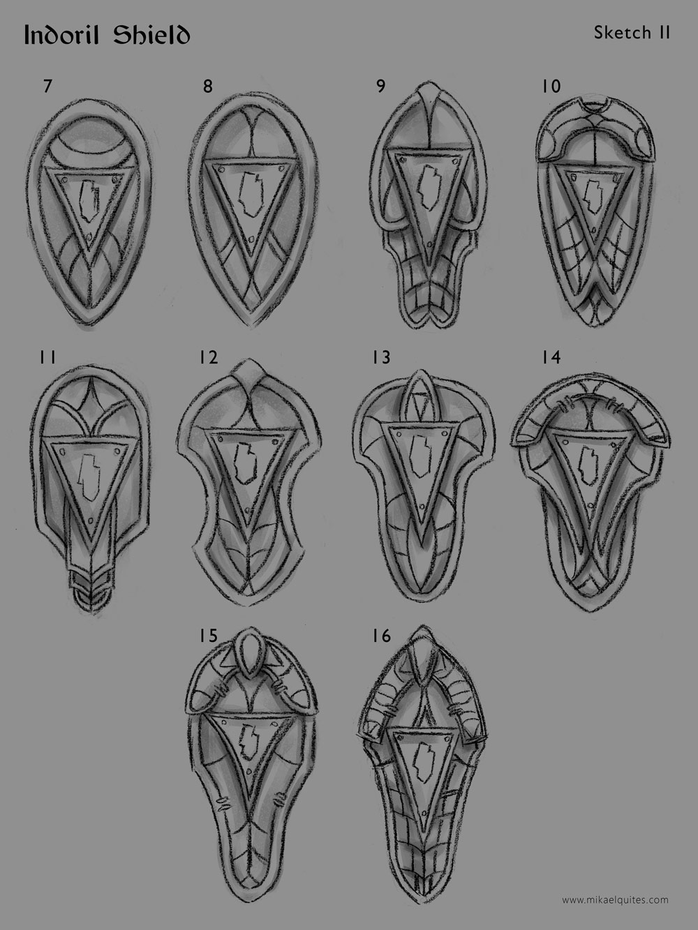
I did more variations based on what you said.
Sketches 7 and 8 are more oriented towards the original design.
Number 10, mixing 1 and 4.
Numbers 15 and 16 are based on number 6. 16 is 6 with the inverted triangle.
I tried variations on the triangle motif, trying to make it more central to the piece and in some cases, a bit curved to blend more with the design.
Definitely 16. The other ones remind me too much of ebony shields or come across as tribalish.
Couldn't agree more.
Go 16!
Yep, 16 is awesome!
Maybe this opinion is unpopular, but I really prefer the original design. It's simple and realistic, and if it seems tribalistic, then that's because the dunmer are at heart still a semi-tribal/clan oriented people. The shorter rounder shape complements better the nature of fighting with a blunt one-handed weapon as well.
10, 12 and 16 are my favourites - these are looking really fantastic Mikael, keep it up! For someone who hasn't played the game, these sketches look like they would fit in to the setting pretty well.
I agree with Ociee's general point though - keep it simple, realistic, not too chunky and heavy-looking (it shouldn't look like you'd need to drag it behind you in a fight) and un-messy in the modelling stage (so not like Skyrim shields) - this matches the dour, practical style of the dunmer. Decoration is best done through runes, simple engraved pictures and the like, IMO.
This seems generally what you're going for so...yay!
Thanks for the feedback and compliments, everyone!
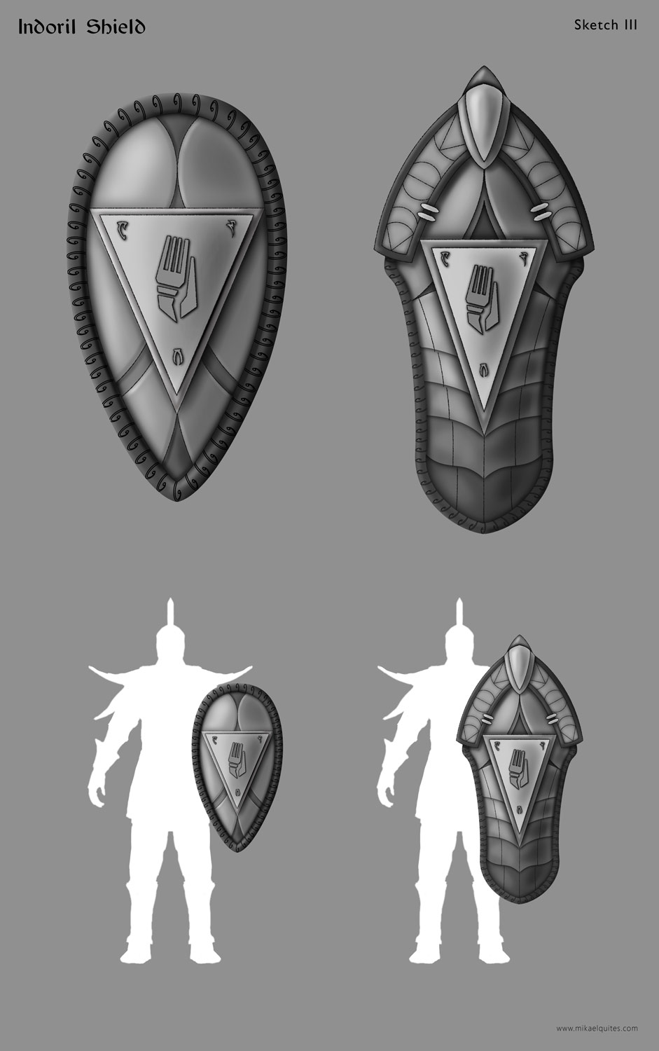
Talking to the guys from the 2D department and Nexos, here is the progress so far on two versions, a more traditional and other more ceremonial.
Very cool, I like them and I am very curious for coloured version!
I like them, especially the one on the right. Eager to see the final result!
Never been fond of the bathroom patterns on the original Indoril shield. I think they could be nicely replaced by dunmer runes. Could be the perfect occasion to tell some story. Or write your favourite recipe.

Other than that, i think the shield on the left could be a little thinner. And the one on the right could stand as a tower shield, just by making it bigger.
Great job!
Thanks everyone for the comments!
Nexos, I agree with you on the wave pattern.
I have just followed what was done on the modelled Armor Set from reference.
I have made some adjustments, making the left one thinner and the right one a tower shield, with the base a bit wider.
Tell me what you think.
looks good, sizes and shapes at all. Even when I liked the further- more slim - version of tower shields lower edge more. It looks more elegant and with new bigger size it will come out good I think
I really like them both, but the design behind the triangle on the small shield looks like ass cheeks. Unfortunately, what has been seen cannot be unseen, and it's annoying me mightily. Why not replace it with a design more true to the original one from Morrowind?
XD now that you said it, I see it too XD
You can make a vertical line there, will give an interesting Form for shield, when it´s creased in the upper half and curved in lower half.
FDT 2 wrote:
You think there should be something between the butt cheeks?!
Dang, those both look awsome.
goldenringmonkey wrote:
Say no more.
"Nerevar said he don't like 'em bony,
he want something he can grab."
- Almalexia the Lover in her #1 hit single "Tsaesci"
Now I know why they like ebony so much...
Okay, this needs to stop, back to work :P
You guys made me laugh :D
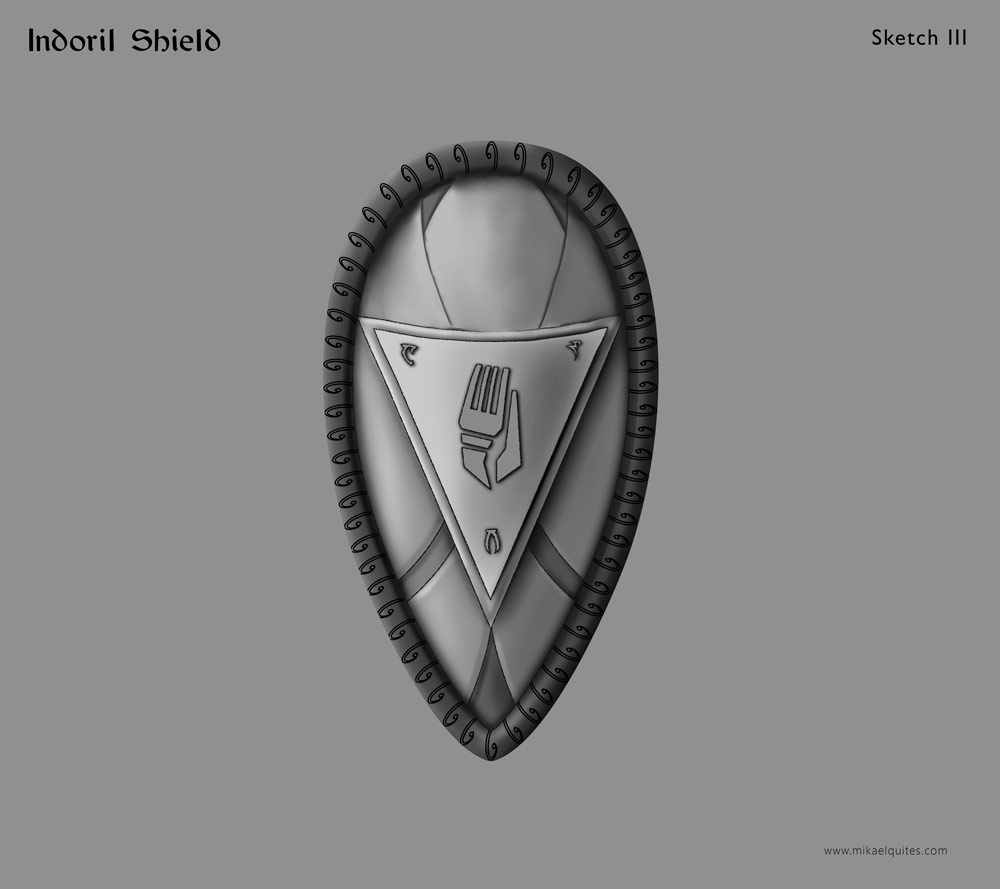
After all this rather unintentional pareidolia, here is another version.