
So I started this a while before the new concept art workflow was established, and since I was the one to design the armor set itself I bypassed the stages of considering "what was the thought process behind it". Feel free to crap all over it if you want anyway.
[External image]
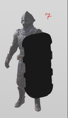
Obviously pretty rough, still need to polish it up if it's to be a final concept. For silhouette I picked simply a round shield. It was the shield shape in Oblivion, which in my opinion was the best rendition of that shield. I despise the idea of a big metal rectangle with oversized spikes. Here's the references:
Oblivion:
[External image]
Ottoman shields:
[External image]
Armor concept:
[External image]
Most likely your first complaint will be that this shield "too bland" and "not badass enough". I agree, I'm thinking about ways to break up the silhouette or adding something for a "wow" effect, but without losing its essence totally - I still want it to be full metal and large, which simply goes well with the "steppe" style of the armor. I also incorporated some decoration the armor has. Feel free to post your ideas, but keep in mind at some point decisions will have to be made.
![[External image]](http://i.imgur.com/mEDKtSS.jpg)
![[External image]](http://vignette4.wikia.nocookie.net/elderscrolls/images/2/20/Orcish_Shield_%28Oblivion%29.png/revision/latest?cb=20130827222904)
![[External image]](https://www.davidmus.dk/files/3/a/533/K14.11-11-1965-Skjold.jpg)
![[External image]](http://img05.deviantart.net/23d6/i/2014/065/a/2/orsinium_noble_warrior_by_swietopelk-d7974o0.jpg)
![[External image]](http://p2.la-img.com/361/19612/6679833_1_l.jpg)
![[External image]](http://i.imgur.com/zfTPEYV.jpg)
![[External image]](http://vignette4.wikia.nocookie.net/elderscrolls/images/9/9e/OrcishTowerShield.png/revision/latest?cb=20120513051548)
![[External image]](http://vignette3.wikia.nocookie.net/elderscrolls/images/3/39/DaedricShield_MW.png/revision/latest?cb=20140315141621)
![[External image]](http://www.visualphotos.com/photo/1x6221967/no-ancient-traditional-theater-mask-the-national-museum-in-ueno-shelters-some-of-the-most-famous-masterpieces-of-japanese.jpg)
I think its fine, only thing
I think its fine, only thing that stand out to me is the color palette when compared to the armor. Some red trims might be enough to make it look more like the armor.