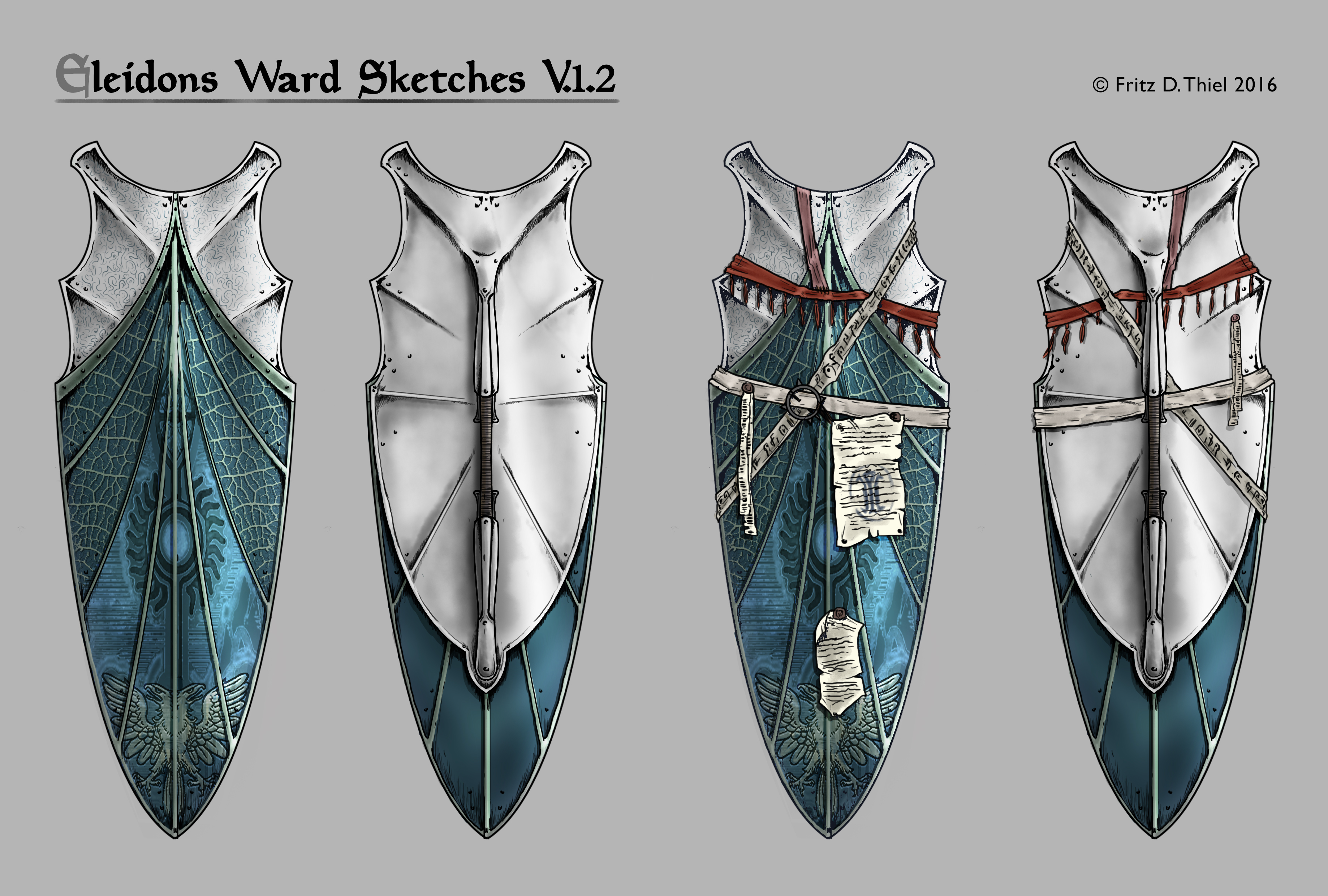
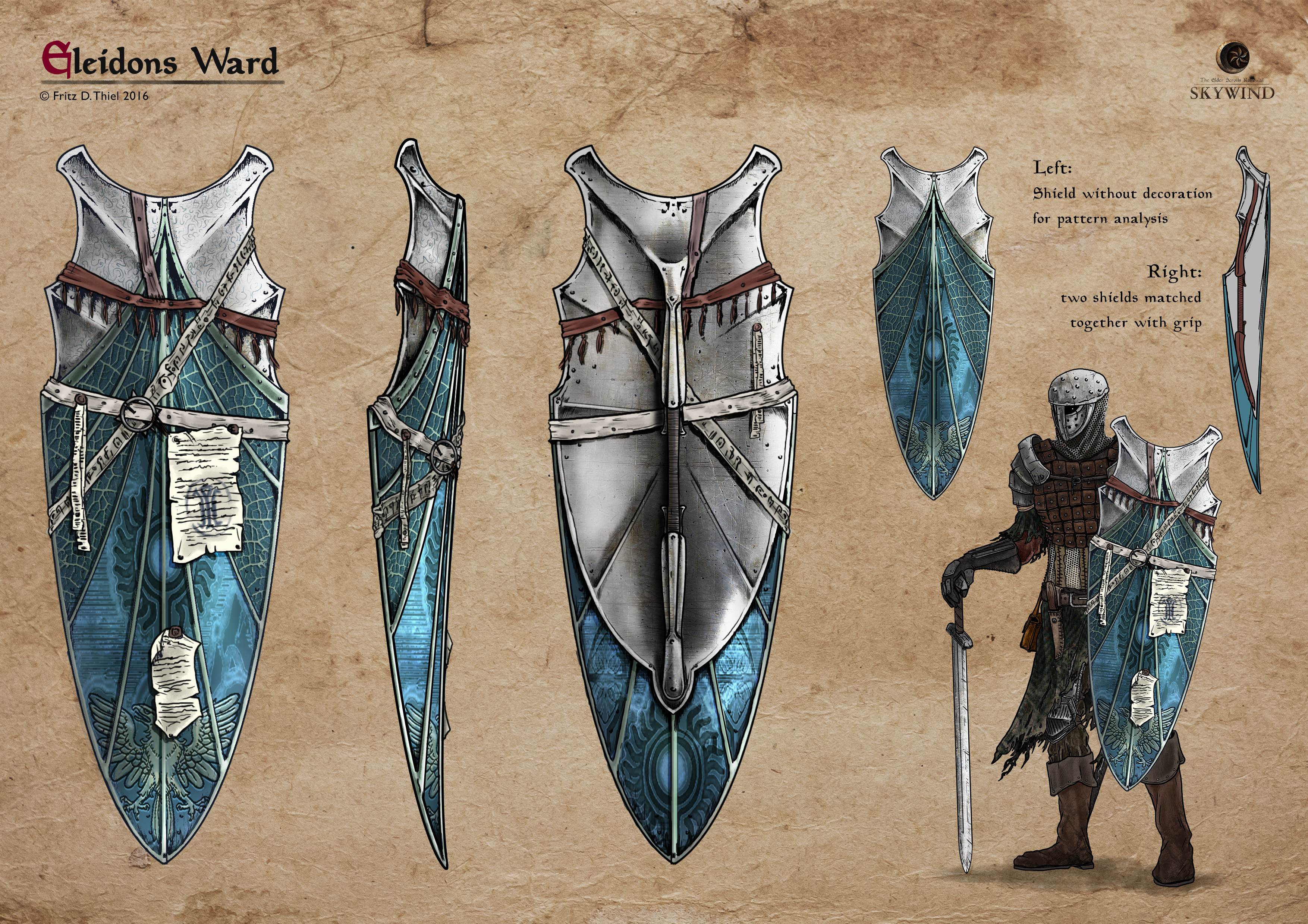
EDIT : Final design

Hey, after a long break due to final exam, I´m back with new stuff: Concept for Eleidons Ward!

I´ll have the honour to finish the great work of snapi (https://tesrenewal.com/forums/concept-art/armor-concept-elei...). Here are some first ideas, how I think about this shield:

My favourite is A, it´s mostly common, but for a breton knight I would think about a shape like that. There can be vein inspired patterns or some runes be added later. Another idea for A was this:

As in fact, Eleidons Ward is a sworn knights´shield, I can add bands with the restore health symbol or some prayers and knightly symbols...
What do you think?

Looks good. I personally like sketch D the most
Good designs, If I had to choose, I would take A or C, because they follow the original design, with curves and symmetric and of course with much more ornamentation. That's what I think :D
I'm really digging A!
Lookin' good, D's probably my favourite.
Really digging A too. Keeps just enough of the original design while giving it Morrowind-ish (but not Dunmeri) look and feel. And it looks practical to boot.
Well, after counting the votes from here and from discordapp.com, A definitely has won! I have a few ideas of decorating elements on A. Maybe a bit over the top, but decide at yourselves:
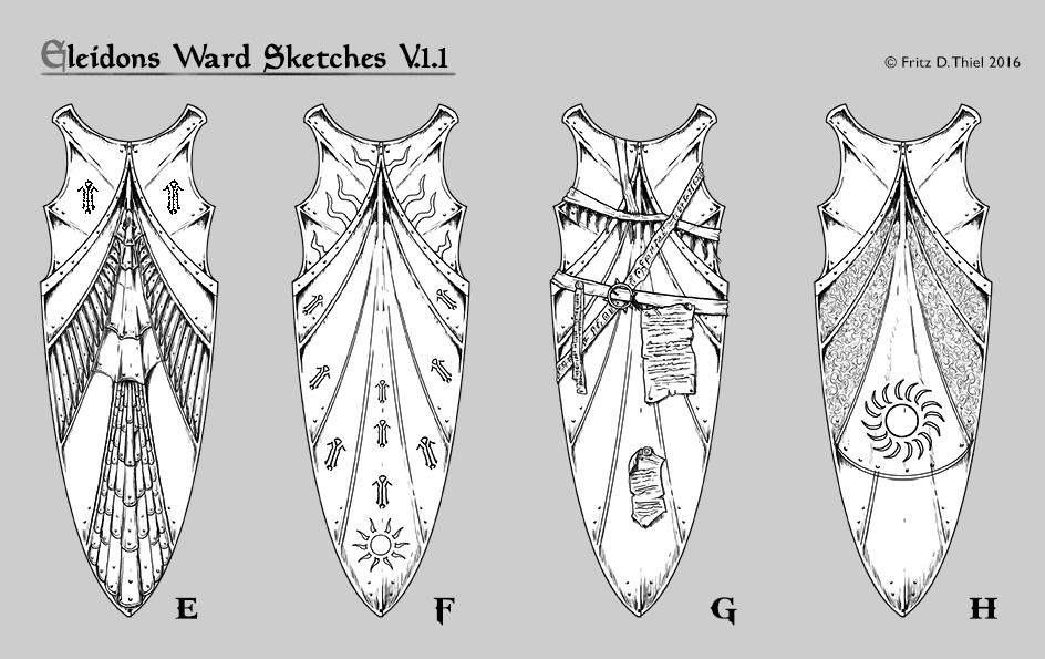
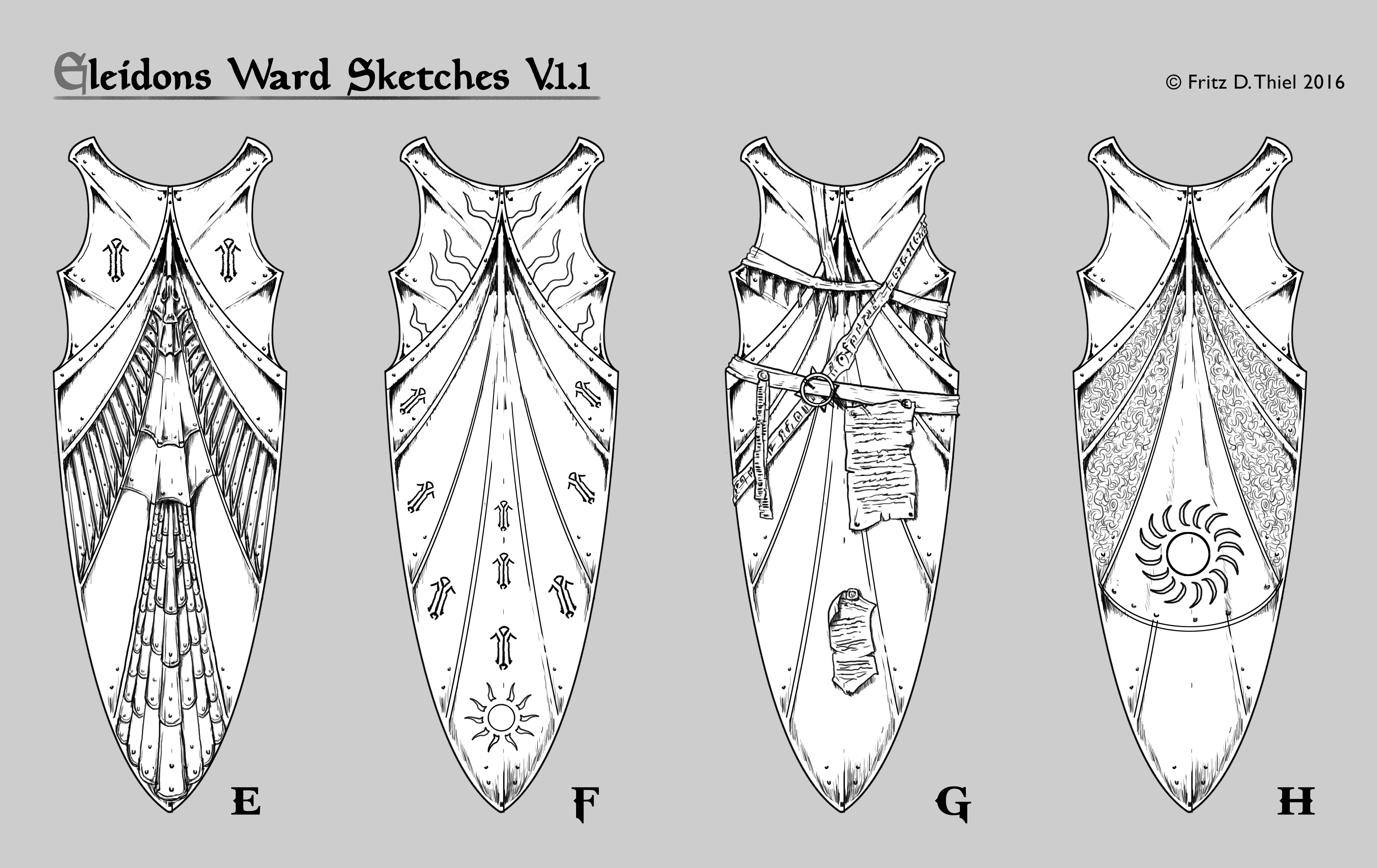
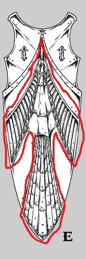
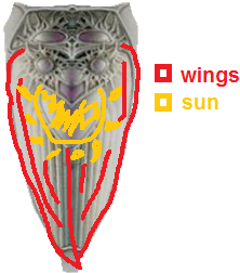
A has a bird made of metal scales - because I saw, that the restoration symbol in Oblivion&Skyrim is a phoenix, a breton knight would probably like a heroic bird more than just a rune ;) Watch over these variants and tell me, if there is a fav or if some parts of these elements can be selected or mixed together.
I really like the two tone thing going on with H.
C, it looks really sacred and old, with signs of old owners like those texts. A legendary shield :)
I'm gonna go with E
H looks nice.
Very nice pattern on H, but I'm not so sure about the sun thingie in the middle, it looks kinda out of place.
G is beautiful, but way it's too Dunmeri
Eleidon was a Breton, and Bretons are half-elves, I like the shield E because it reminds me of the elven style
I like H the most, but perhaps it could in some way include the "restoration" school emblem the original had?
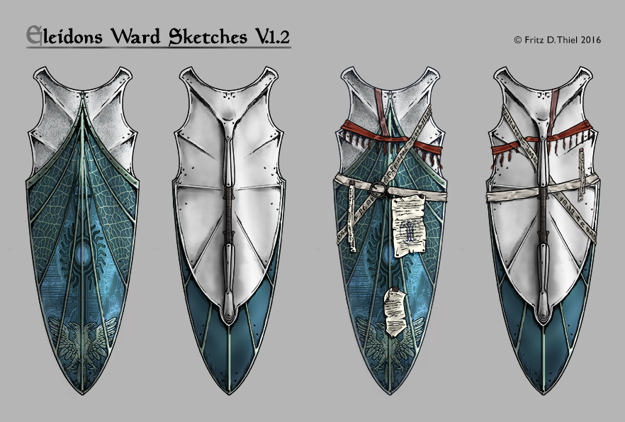
G with it´s wraps made the race! Here´s a WIP of colors/ details. I designed it to be made of 2 different parts and materials - steel and some stuff to give the magic power of healing ;)
Feedback welcome pls
This looks awesome! I especially like the shell or leather-like texture on the shield, and how the bottom portion almost appears to be some kind of turquoise suede. Great work!
They're both gorgeous, but I think I like A the most.
I'm still liking the C style, with the scrolls and all that stuff xD, A or C anyway
A!
colored now I also like H
I would remove the bird with two heads, it appears the flag of Albania
MattiaElia92 wrote:
Go educate yourself https://en.wikipedia.org/wiki/Double-headed_eagle
Two headed eagle is very nice detail and looks awesome on that shield (imo), and saying it looks like flag of Albania is same like saying,... .well you clicked on that link and read everything right ? :)
but in the world of elder scrolls the symbol of imperial power is the dragon of the Septim Dynasty
however, I would not put a symbol that resembles the real world, I would use something that would address the Breton culture
This was mentioned in the other thread that got abandoned, but why not use some of the symbols from Morrowind's restoration school?
These to me look very reminiscent of the Daedric runes, so I'd risk a theory that they're Dunmer symbols.
If the idea is to produce the bird of the restoration school I suggest E, I do see the silhouette of a bird.
alternatively, we can only take the wings, the symbol of the sun over the wings is nice.
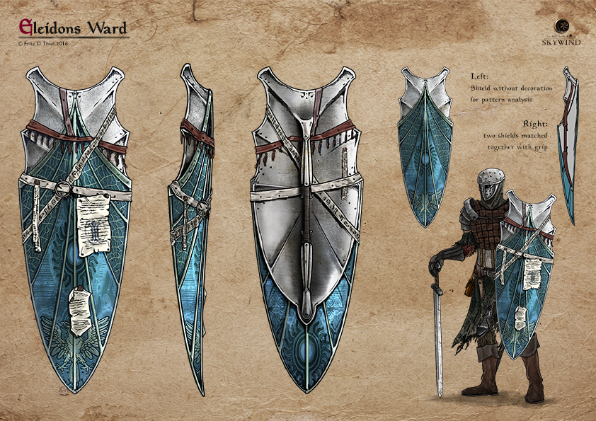
Soo, it´s done!
In development we still left the eagle, many ppl liked it anyway. We have two shields of different materials and they are fixed together with a set-in grip. The letters and belts from previous owners are secured with nails on the shields´ surface, so they wont move (what would offer new modeling problems I assume).
that s very nice, but paper would be destroyed after first battle.
maybe paint/scribbing/graffiti would be more persistent
alysander wrote:
My thoughts exactly. Anyway very nice shield, hopefully there will be some armor in game to match it.
Perhaps the notes could be placed inside the shield? That would make more sense for practicality and that's where they would be if they were intended to be read by the owner. Just my thoughts.
Yeah best place for the scribbles would really be the inner side, I would also maybe use more durable material something like guar or goat skin, not just easily torn stuff like paper
Thank you all for your input, but the last picture you saw is the final design.
Great job FDT 2 :)