Pages

131 posts / 0 new
Last post
jk
jk's picture
Contributor
Offline
Last seen: 10 years 11 months ago
Joined: 02/17/2013 - 12:30
Karma: 242
[RELz] High Fane Remodel

Hey folks,

I took a first shot at remodelling the High Fane of Vivec, but I think I got carried away with my obsession for huge buildings and probably drifted too far away from the original style of Morrowind. The attached image shows what I have done so far in comparison to the regular canton model from the game.

Let me know if the work I am doing is acceptable, so in case its not, I can redo it before going into too much detail.

AttachmentSize
Image icon arch_concept_01_high_fane.JPG118.68 KB
Edited by: grumpycat on 12/08/2014 - 12:41
eloth
eloth's picture
Moderator
Offline
Last seen: 6 years 3 weeks ago
Joined: 07/16/2010 - 06:12
Karma: 1237
what about this:this is how

what about this:

this is how vivec was supposed to look like, but game was rushed for release, and no powerful hardware was available in 2002 to display this much stuff :)

Hope this will be of inspiration :)

You can probably leave high fane in the same style as original, just a little more grandiose, otherwise your on the right track.

jk
jk's picture
Contributor
Offline
Last seen: 10 years 11 months ago
Joined: 02/17/2013 - 12:30
Karma: 242
I had precisely that image as

I had precisely that image as a reference, and I thought 'damn, that building on the top left must be impressive!' and thought that High Fane should be something more than what it was made to be in Morrowind. I do agree that the rest of Vivec should be looking dirty and unstructured as in the concept art, but I really want to give the seat of the Temple something that would be inspiring.

Anyway, I will see what I can do to make my model closer to the original.

eloth
eloth's picture
Moderator
Offline
Last seen: 6 years 3 weeks ago
Joined: 07/16/2010 - 06:12
Karma: 1237
it would be cool to have the

it would be cool to have the platoe larger and higher, so that you would have to climp up more steps to get to the high fane. and the temple would be even larger.

Maybe you could make 2 versions of it

jk
jk's picture
Contributor
Offline
Last seen: 10 years 11 months ago
Joined: 02/17/2013 - 12:30
Karma: 242
Quick update before going to

Quick update before going to sleep.

The big middle tower seems to add a lot of velothi feel to the building, I like the result.

A second version will have to wait for some time, I would like to shape the version I have into something usable before the creative spark runs out.

p.s. I will try to do an update every day, it is easier to concentrate on the work that way for me.

eloth
eloth's picture
Moderator
Offline
Last seen: 6 years 3 weeks ago
Joined: 07/16/2010 - 06:12
Karma: 1237
Looking very good i think
Looking very good :) i think your on to something spectacular here :)
jk
jk's picture
Contributor
Offline
Last seen: 10 years 11 months ago
Joined: 02/17/2013 - 12:30
Karma: 242
Update of the day

Thanks, eloth, I hope I will be able to turn it into a great building ;)

New side tower made today.

eloth
eloth's picture
Moderator
Offline
Last seen: 6 years 3 weeks ago
Joined: 07/16/2010 - 06:12
Karma: 1237
are you going to make the

are you going to make the base larger, and make a stairway up to the main entrance? :)

jk
jk's picture
Contributor
Offline
Last seen: 10 years 11 months ago
Joined: 02/17/2013 - 12:30
Karma: 242
(No subject)


Just kidding, I am trying to come up with a decent creative solution for the stairs. It's a bit tricky to make them without making a false illusion of scale.

grumpycat
grumpycat's picture
Moderator
Offline
Last seen: 7 years 3 months ago
Joined: 12/08/2012 - 06:41
Karma: 3383
You could have them going

You could have them going back into the entrance way quite a bit, so there will be a lot of overhang as you enter up.

Or you could just have the floating transport system found in Tel Mithryn house in Dragonborn...you know up, up and away :-P

jk
jk's picture
Contributor
Offline
Last seen: 10 years 11 months ago
Joined: 02/17/2013 - 12:30
Karma: 242
An attempt to make the

An attempt to make the stairs, which will not really be stairs, but a large ramp, because adding stairs would blow the polycount to heavens.

happychappy, is this in any way similar to what you had in mind?

eloth
eloth's picture
Moderator
Offline
Last seen: 6 years 3 weeks ago
Joined: 07/16/2010 - 06:12
Karma: 1237
wow this is looking awesome

wow this is looking awesome :) looking forward to redecorating in CK with these meshes :)

Maybe some pillars under the ramp? :) in the same style? like square?

also the cantons need to be redesigned a little now, in the same style as the concept art :) A city like this will make skywind to viral, even at bethesda`s offices lol

grumpycat
grumpycat's picture
Moderator
Offline
Last seen: 7 years 3 months ago
Joined: 12/08/2012 - 06:41
Karma: 3383
Actually I was talking about

Actually I was talking about the entrance in the middle and the fact that you can't get up to it at the moment. But the ramp up to the base looks awesome :)

Vivec architecture on the whole is about the simplest polycounts of anything in the TES series. I'm sure you have a handle on it, but I wouldn't be worried about adding stairs for that reason. However I like the concept of the ramp as it sits in space better than stairs would. I like it :)

NotMarki
NotMarki's picture
Member
Offline
Last seen: 11 years 10 months ago
Joined: 02/16/2013 - 12:53
Karma: 27
wow.. i wish i was able to do

wow.. i wish i was able to do stuff like this.. but alas i will stick to face gen lol

jk
jk's picture
Contributor
Offline
Last seen: 10 years 11 months ago
Joined: 02/17/2013 - 12:30
Karma: 242
Thanks guys, glad to know

Thanks guys, glad to know that you like where this is heading :)

NotMarki - you can learn. Everyone starts from zero, I learned to model by creating very simple concept art models for an open-source project called Vega Strike. I had one of the members show me the ropes, and had people give feedback to me, which helped to keep the motivation to learn going. If you wish, I can teach you what I know step by step, as long as you are willing to learn.

eloth - I agree that the cantons need to be redesigned, it's on the list of things to do, but a long time onwards from now. Remaking the High Fane alone is probably the most ambitious project I have ever done in game modelling, and it will take some time for me to get just the first model right. I feel like I'm already taking a much bigger bite than I can swallow. Then again, it would be good if Vivec exteriors would be left for me, to keep the art style consistent. We'll see..

eloth
eloth's picture
Moderator
Offline
Last seen: 6 years 3 weeks ago
Joined: 07/16/2010 - 06:12
Karma: 1237
if you dont suddenly

if you dont suddenly disappear like many else without a trace, the whole city is yours, and take your time, we dont have any time limits for the next 6 months atleast :)

grumpycat
grumpycat's picture
Moderator
Offline
Last seen: 7 years 3 months ago
Joined: 12/08/2012 - 06:41
Karma: 3383
Vivec exteriors will be

Vivec exteriors will be booked in for you if you want...but only if you keep working and updating us with your progress. Sorry we have had too many people semi-commit and it just leaves us back at square one with most things.

However take your time with it, we would prefer it to be just right rather than rushed, and we are in no hurry for results as many things have to come together before we have a finished game.

stijmunkey
stijmunkey's picture
Contributor
Offline
Last seen: 9 years 10 months ago
Joined: 12/11/2012 - 15:30
Karma: 1354
Donor
this is looking great if you
this is looking great if you could get the rest looking more like the concept little shacks and stands lining the walls, little merchant stands or something, and a few extra npcs to make it look a little busier then this would be one awesome city
digitalparanoid
digitalparanoid's picture
Member
Offline
Last seen: 9 years 8 months ago
Joined: 03/31/2011 - 06:37
Karma: 1219
looks god !

looks god !

grumpycat
grumpycat's picture
Moderator
Offline
Last seen: 7 years 3 months ago
Joined: 12/08/2012 - 06:41
Karma: 3383
looks god ! Its the city

looks god !

Its the city digitalparanoid, not Vivec himself :-P

I see what you mean about the Redesigned Vivec its pretty similar to the concept art. Only it would need the stalls, etc.

digitalparanoid
digitalparanoid's picture
Member
Offline
Last seen: 9 years 8 months ago
Joined: 03/31/2011 - 06:37
Karma: 1219
lol. I can't type

lol. I can't type

jk
jk's picture
Contributor
Offline
Last seen: 10 years 11 months ago
Joined: 02/17/2013 - 12:30
Karma: 242
..

I'm reluctant to do an update today, but here it is. I found that the existing architecture very much limited what I could do in terms of adding detail, so I will be going for a more vertically full and smooth shape for the model. It is extremely messy at the moment, so I don't expect to get any meaningful feedback yet, but hopefully I will get the time to get it closer to completion on the weekend.

jk
jk's picture
Contributor
Offline
Last seen: 10 years 11 months ago
Joined: 02/17/2013 - 12:30
Karma: 242
Update of the day

Update of the day :)

eloth
eloth's picture
Moderator
Offline
Last seen: 6 years 3 weeks ago
Joined: 07/16/2010 - 06:12
Karma: 1237
hmmm, now your going over the

hmmm, now your going over the top maybe ;) previous style was more clean organized and simple, i`d say make the base structure(platform) much larger in radius, and add another ramp/stairs up to the upper door.

finndo77
finndo77's picture
Member
Offline
Last seen: 13 years 4 months ago
Joined: 02/13/2013 - 14:22
Karma: 16
jk, I think your work is awesome

I do have a question though, are you guys (those of you working on the exteriors) working within the existing worldspace as far as city wide dimensions? or do you intend on increasing the existing landmass to fit the project? (asking as, from what I have found online, Bethsoft modified the landmass, possibly to fit in with the current timeframe vs. Morrowind's timeframe and as such not all of Morrowind will fit, without modifying the overall size and shape in Skyrim).

***edit

ok, nm question answered in another thread...

http://morroblivion.com/forums/skyrim/skywind-development/3902

Araedi
Araedi's picture
Member
Offline
Last seen: 11 years 7 months ago
Joined: 02/22/2013 - 11:58
Karma: 18
Actually, I like this one the

Actually, I like this one the best:

It just seems cleaner, more aesthetically pleasing to me.

Anyway, your work so far is amazing!

stijmunkey
stijmunkey's picture
Contributor
Offline
Last seen: 9 years 10 months ago
Joined: 12/11/2012 - 15:30
Karma: 1354
Donor
I dont mind the latest

I dont mind the latest update, its the high fane of the busiest and richest city in vvardenfell and the home of a god it should be a bit over the top and anything from simple at least thats what i think, although i did like the two little towers in the front from the previous version, plus in that concept art it looks like its part of vivec backing up into the high fane which is just a massive wall gong out of frame, isnt it suppossed to be massive and over the top? just my opinion although i do agree a lot of people will like the more simplistic version, personally im happy with either all of it is simply amazing work, all we need now is all those little stalls and extra npcs to make the place really look like the heart of vvardenfell

jk
jk's picture
Contributor
Offline
Last seen: 10 years 11 months ago
Joined: 02/17/2013 - 12:30
Karma: 242
I guess I should post this as

I guess I should post this as a warning. I had a discussion with eloth about the way I'm drifting away from the original design, and here are some conclusions we had.

What I'm trying to make here will NOT appeal to the purist that wants to see exactly the same art as in Morrowind. I have not seen the Dragonborn expansion of TES5, but what bits I have looked at here and there, I do agree with Bethesda in their art creation - we need to move on to new designs. As long as they follow the established lore in a meaningful way and have a good quality standard, it should be acceptable. I, for one, do not want to see the exact same art being used in Skywind as in Morrowind. I want it to be done the same way as Bethesda would have made it, if they had the graphics processing power and resources as they have now. The issue with the current Velothi architecture is that it is too 'perfect'. It has very stylish and distinct shapes and forms, but they do not leave the imperfections needed to add small details. Which makes a lot of sense in 2002/3, when the computers of that day would not be able to handle it. Things have changed now, and I want to make my models take advantage of that change. If it means disappointing the purists, so be it. For those, who want no changes, you have Morrowind Overhaul for that, which has already done fantastic work.

foullows
foullows's picture
Contributor
Offline
Last seen: 8 years 6 months ago
Joined: 02/14/2013 - 14:44
Karma: 97
I agree.  It's my opinion

I agree.  It's my opinion that your newer versions look great.  As long as they more or less keep the same style so as to not be confused with something else entirely.  Might as well bling it up a little bit and use that extra horsepower that everyone's computer has.  I mean, we're all running Skyrim, right?  Then I would think we could make meshes on par with Skyrim complexity rather than rely on the simple old meshes of Morrowind.

Shadow
Shadow's picture
Member
Offline
Last seen: 9 years 10 months ago
Joined: 12/11/2012 - 15:30
Karma: 1160
I do kind of like the

I do kind of like the original before you added a lot of that fluff, but you are the artist, and we'll take what you give.  :)  I'd like to suggest that you do make the base bigger and more to scale with the original though.  We want to be able to add you mesh without totally changing the design.  For example,  there is no room for the statues with the base at its present size.

jk
jk's picture
Contributor
Offline
Last seen: 10 years 11 months ago
Joined: 02/17/2013 - 12:30
Karma: 242
Shadow - you would see why I

Shadow - you would see why I moved away from my original design, if I included some screenshots from the sides, not just the front. It was looking ugly, and there was nothing I could do about it without changing the design.

And yeah, the base will have more space. I'm not sure yet how I will make that happen, but I will.

Shadow
Shadow's picture
Member
Offline
Last seen: 9 years 10 months ago
Joined: 12/11/2012 - 15:30
Karma: 1160
Alright, I'll take your word

Alright, I'll take your word for it. :)  That's good about the base.

Your model looks amazing by the way.

jk
jk's picture
Contributor
Offline
Last seen: 10 years 11 months ago
Joined: 02/17/2013 - 12:30
Karma: 242
Update of the day. I wonder

Update of the day. I wonder when people are starting to throw bricks at me for braking the rules of the original design :P

Also, note that the front tunnel is not done yet and will be reshaped soon :)

foullows
foullows's picture
Contributor
Offline
Last seen: 8 years 6 months ago
Joined: 02/14/2013 - 14:44
Karma: 97
jk I think it looks very

jk I think it looks very badass.  My only complaint, and it's a small one, are the support thingies on either side of the middle entrance and directly above the side entrances.  I'm not sure getting rid of them and leaving an empty void there would be good either though.  

Edit:  These thingies to be precise:

jk
jk's picture
Contributor
Offline
Last seen: 10 years 11 months ago
Joined: 02/17/2013 - 12:30
Karma: 242
It's as you said - removing

It's as you said - removing them does not work either. So unless someone comes up with something better to fill the empty space with, I would prefer the support beams to stay as they are.

Here's a shot of how it looks like with the supports removed.

Smerk
Smerk's picture
Member
Offline
Last seen: 9 years 11 months ago
Joined: 12/11/2012 - 18:00
Karma: 344
well you could try putting

Well you could try putting drapes up. They have allot of drapes allong the walls and the bridges in the city so I think it would stay consistent with the original design. If stuff like that isn't used very often then it could stick out like a sore thumb. But I could very well be wrong.

stijmunkey
stijmunkey's picture
Contributor
Offline
Last seen: 9 years 10 months ago
Joined: 12/11/2012 - 15:30
Karma: 1354
Donor
i say keep the support struts

i say keep the support struts and put a banner on either side in front of the struts, best of both

jk
jk's picture
Contributor
Offline
Last seen: 10 years 11 months ago
Joined: 02/17/2013 - 12:30
Karma: 242
Update of the day. Started

Update of the day. Started working on the back, I'm not happy with the proportions or shape of the spire, but I will get it right soon.

jk
jk's picture
Contributor
Offline
Last seen: 10 years 11 months ago
Joined: 02/17/2013 - 12:30
Karma: 242
Nothing much done today, I

Nothing much done today, I needed a break to let my blood pressure return back to normal. Anyway, I made some progress at making the main tunnel exit on the rear side. Still have not made the pillar look any good, hopefully it will be done tomorrow.

foullows
foullows's picture
Contributor
Offline
Last seen: 8 years 6 months ago
Joined: 02/14/2013 - 14:44
Karma: 97
" . . .  blood pressure

" . . .  blood pressure return back to normal"?  I hope modeling that beast isn't frustrating you too much!  If it helps at all, it's lookin' real good so far.

jk
jk's picture
Contributor
Offline
Last seen: 10 years 11 months ago
Joined: 02/17/2013 - 12:30
Karma: 242
Nothing too serious, just a

Nothing too serious, just a caffeine overdose combined with slight hypertension. I tend to treat it with an extra hour of sleep or two :)

Ravanna
Ravanna's picture
Contributor
Offline
Last seen: 9 years 6 months ago
Joined: 02/19/2013 - 12:21
Karma: 2596
Donor
hope you're drnking tea, and

hope you're drnking tea, and not coffee.

DO you have extra previews of the HD textures on the building?
Or does that only happen in the CK?

jk
jk's picture
Contributor
Offline
Last seen: 10 years 11 months ago
Joined: 02/17/2013 - 12:30
Karma: 242
I have not UV mapped the

I have not UV mapped the model yet, and I did not reuse any of the existing meshes, so it will take some time until I can put any textures on it. Once I have all the remaining parts of the main building done, I can do some initial mapping to see what it looks like.

jk
jk's picture
Contributor
Offline
Last seen: 10 years 11 months ago
Joined: 02/17/2013 - 12:30
Karma: 242
Nothing much done again, but

Nothing much done again, but I'll post it anyway.

Working on the rear side base and a smooth transition from the side tower to the wall. Needs more detail to fix the awkward shading.

Winterdragon
Winterdragon's picture
Member
Offline
Last seen: 13 years 1 month ago
Joined: 12/11/2012 - 15:30
Karma: 138
It looks so good, now I'll

It looks so good, now I'll never be able to play Morrowind again without thinking how it could have been.

jk
jk's picture
Contributor
Offline
Last seen: 10 years 11 months ago
Joined: 02/17/2013 - 12:30
Karma: 242
Winterdragon - thanks, much

Winterdragon - thanks, much appreciated :) I hope the final version will live up to your expectations.

Rework of the back side done today. Heavily inspired from the temple building in Mournhold.

Let me know what do you guys think. Does anything need changing?

Winterdragon
Winterdragon's picture
Member
Offline
Last seen: 13 years 1 month ago
Joined: 12/11/2012 - 15:30
Karma: 138
Well, it still needs the

Well, it still needs the statue's obviously, maybe it would be smart to remodel those as well instead of using the original ones, if that's possible. The original ones are starting to look quite outdated now. Maybe a larger base around the temple like in the Morrowind version would be good too, since those statue's are big. I don't know, the building itself looks great though.

jk
jk's picture
Contributor
Offline
Last seen: 10 years 11 months ago
Joined: 02/17/2013 - 12:30
Karma: 242
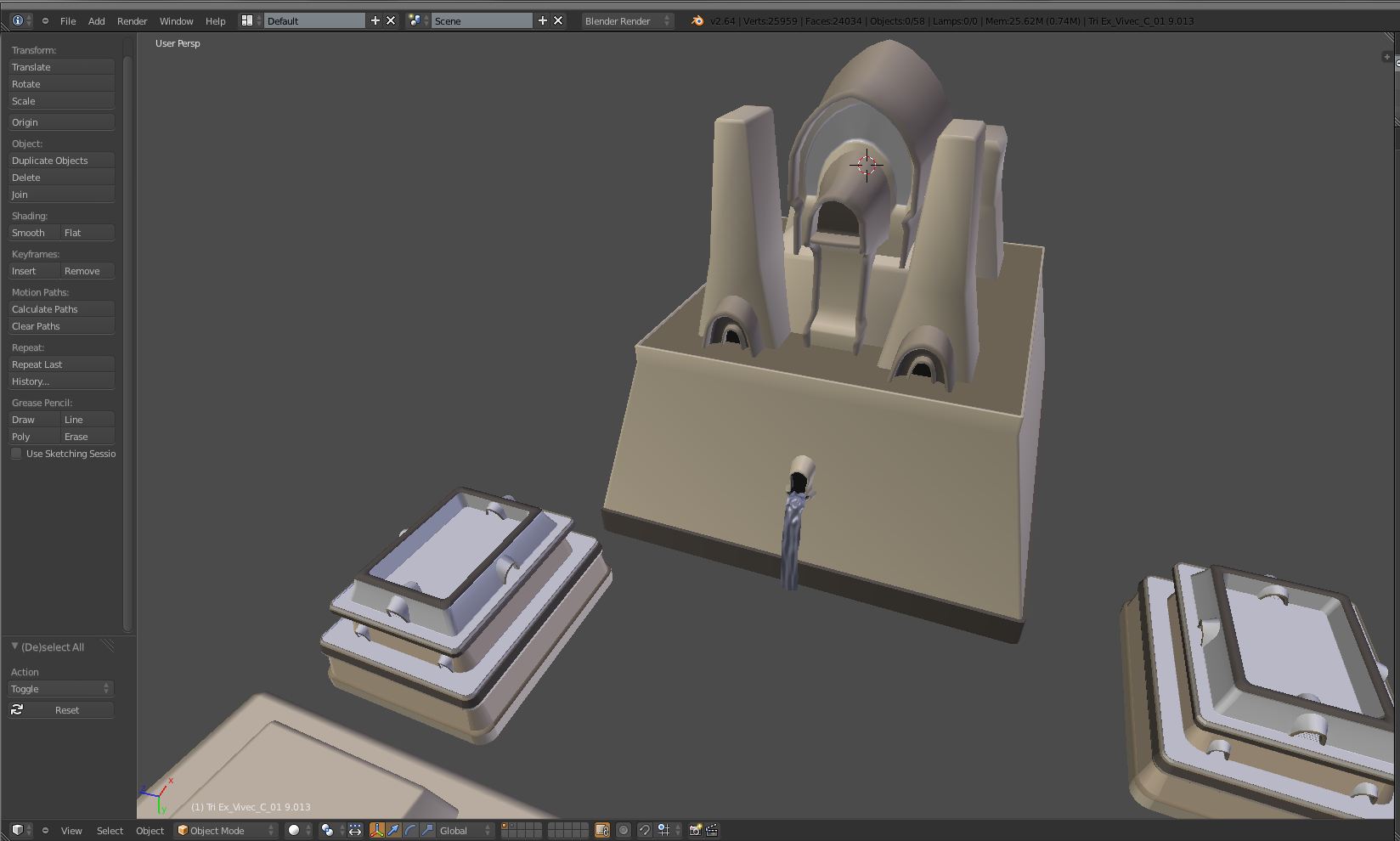
Changed the front. Is this

Changed the front.

Is this better or do you folks prefer the old version?

jk
jk's picture
Contributor
Offline
Last seen: 10 years 11 months ago
Joined: 02/17/2013 - 12:30
Karma: 242
I-am-not-dead-yet update. I

I-am-not-dead-yet update. I am fully aware that the platform warps the sense of scale of the model, and it looks quite tasteless as it is at the moment. So please, go wild with suggestions and ideas for improvement, as I have recently run out of inspiration.

grumpycat
grumpycat's picture
Moderator
Offline
Last seen: 7 years 3 months ago
Joined: 12/08/2012 - 06:41
Karma: 3383
I'd like to get a sense of

I'd like to get a sense of the high platform that you were working on originally with the ramp leading up to the high-fane base.

But rather than a ramp, id like to see a stair case so that the angle can be much steeper. Maybe like a 45 degree leading up. Water falls cascading from the sides of the stairs would make it very impressive. Forgive my lack of artistry :-P


Inwah1408
Inwah1408's picture
Member
Offline
Last seen: 12 years 9 months ago
Joined: 01/08/2013 - 16:16
Karma: 61
happychappy wrote: looks

happychappy wrote:

looks god !

Its the city digitalparanoid, not Vivec himself :-P

I see what you mean about the Redesigned Vivec its pretty similar to the concept art. Only it would need the stalls, etc.

whoa.... I like it!

Pages