Custom Skywind HD Mainscreen Images
Last edited by grumpycat on 14 Mar 2014 - 22:32.

Custom Skywind HD Mainscreen Images
I will do more of loading screens but with actual skywind models & assets
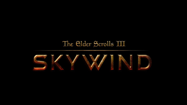
LASentryI probably should have posted my concepts on this thread but i posted them on the other thread called Skywind Youtube Channel. Here is my latest design, no effects added so it's a pretty rough copy.
I Like it... can you use leather (dark brown) texture in backg?? and letters and logo change to bronze texturing..just an idea
Handdraw effect is easy to create for any of the skywind/skyrim/morrowind models

Hmmm, could you go over the hand drawn part with a thin brush and just add some strokes here and there to make it look more like a sketch?
SheepDogWoofHmmm, could you go over the hand drawn part with a thin brush and just add some strokes here and there to make it look more like a sketch?
Yes i can... and i can add some wireframe...
marin.maltaricSheepDogWoofHmmm, could you go over the hand drawn part with a thin brush and just add some strokes here and there to make it look more like a sketch?
Yes i can... and i can add some wireframe...
Perfect (:
Really impressed by pretty much everything you have done so far.
SheepDogWoofmarin.maltaricSheepDogWoofHmmm, could you go over the hand drawn part with a thin brush and just add some strokes here and there to make it look more like a sketch?
Yes i can... and i can add some wireframe...
Perfect (:
Really impressed by pretty much everything you have done so far.
Thanks.... :)
concept w.i.p. something like this....

This was made in Photoshop not a 3D modeling software. Yeah I'll change the colour scheme to a more god/brown colour.
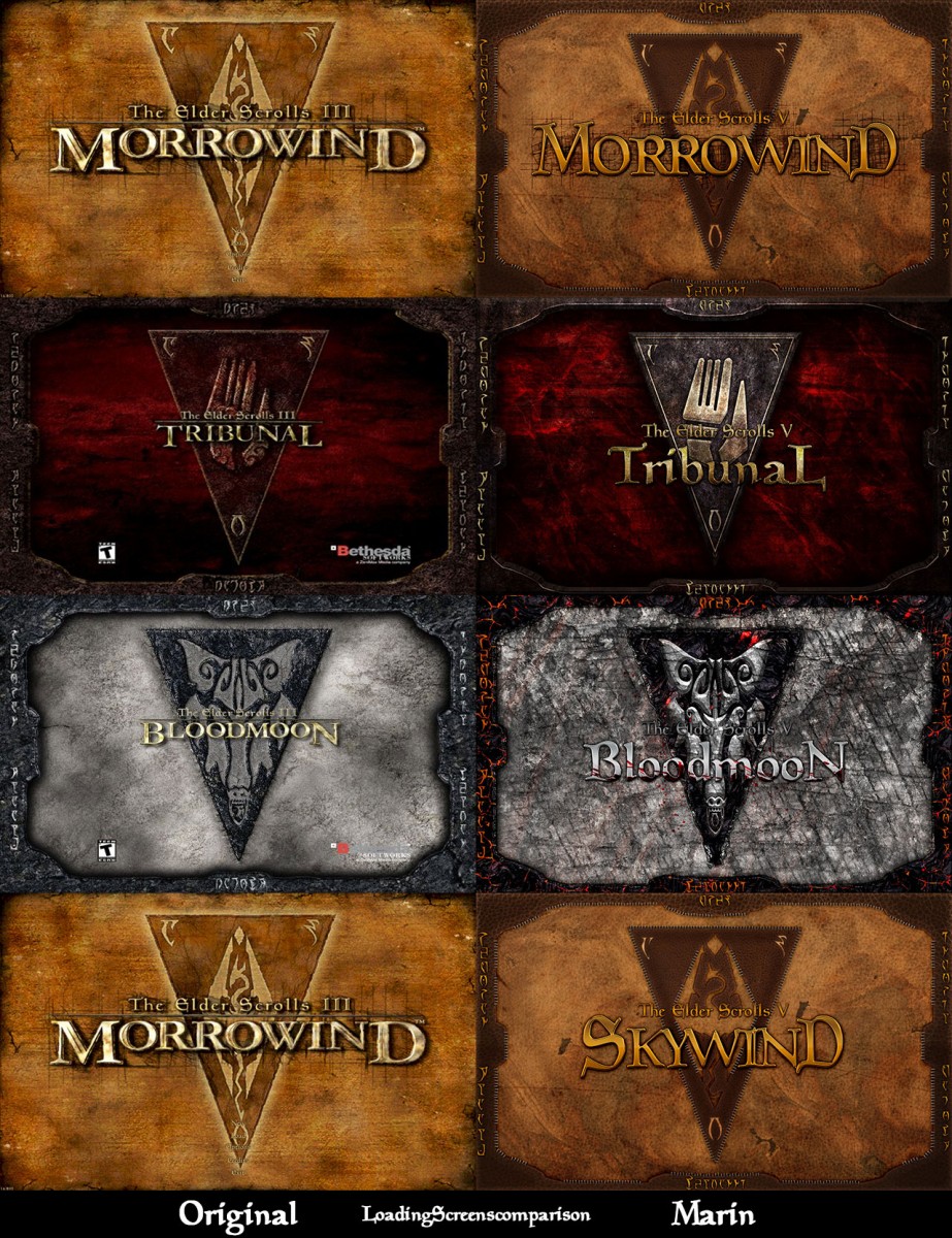
ALL DONE: Those Are FINAL's
Downloads:
http://www.mediafire.com/download/pta6jwbxi4c7qfx/loadingscreens.rar
http://www.mediafire.com/download/7ngh0fbfpsnd6us/Skywindmainmenu.rar
good job :)
digitalparanoidgood job :)
Thanks
What about maybe some cool Morroblivion.com ones?
Those are sweet Marin; really nice stuff.
Threw this together using some of Iniquity's stuff in the artist resource page. Always liked the idea of trying to combine the logos. Went for sort of a metallic inlay of the leather. Just an idea for someone to try that's much better at photoshop than I am ;)
| Attachment | Size |
|---|---|
| SkywindSketch_1.jpg (external) | 1.05 MB |
That actually looks nice Flavius.
Marin, THANK YOU. I will use the Tribunal one, as I love my crimson!
ZeroSbrThat actually looks nice Flavius.
Thanks!
These are magnificent, but I am curious as to why the redone Bloodmoon and Tribunal logos aren't in caps? I hope I'm not being rude, I'll state right now that I have no artistic talent whatsoever and they still look magnificent, so maybe it's purely a style choice or because it signifies that they're the 'secondary' parts of the game and so the main Skywind/Morrowind logos deserve bolder letters, or some reason that's none of my business? I have no idea and I feel bad for even mentioning it, but I'd hate to think it was accidental and I didn't mention it. I should probably just stick to lurking...
This topic is just so damn old... I don't know why people are digging up old graves.
absolutely not! I think you definately have a good point and it was worth mentioning. In future please don't hesitate to post your feedback, comments and questions. As long as it's not questions about NPCs being naked ;) I think we all want to gather as much of constructive feedback as possible.
E/ LAsentry was first ;) Well i can really understand why people answer the thread that was dig up by someone else a while ago - you usually look at the last person that responded. Anyway i think theres no harm in posting your opinion in matter like this. Take indoril armour thread as an example.
Yeah I guess haha
LASentryThis topic is just so damn old... I don't know why people are digging up old graves.
I just wanted to bait the curmudgeon out of his cave 
It worked...
So my first ever post was pretty much the last one in the download thread before it got closed down (at least I think it was, I never got to check) and my second one helped to drag up an old thread; solid start. :)
I guess I was just being careful, I don't really know anyone here (although it turns out I was already subscribed to some of the forum members' YouTube channels, which made me feel a bit Adoring Fan-like) and I can appreciate that a newcomer being critical of creative work when unable to do any better themselves isn't the best way to start off...
On the other hand; I'm well aware of the naked NPC bug, I'm not going to ask where the download link is and I'm not going to start a new thread to ask for my laser jet-pack mod idea to be incorporated into the game, so hopefully that works in my favour. :)
People keep saying naked NPCs is a bug... it's not... we just don't have the clothes to give them.
My bad, I did know it's not actually a bug (rather it's just that the lack of clothing is down to an incomplete feature so far) and I guess what I should have said is that I'm well aware not to complain about the naked NPCs whatever the reason for it; I'd watched some of Rebelzize's let's plays before I first came to this site so even if it was a bug (which it isn't, of course) I wouldn't have complained anyway as it was pretty clear it was something the devs/modders knew about and would not be there in the finished game.
I'll shut up now, this thread is supposed to be a main screen art thread rather than my personal apology thread. :)
Yeah, that's fine. I just wished everyone knew that. Anyway, are you still working on these or are they done?
I know it's been know as Skywind since inception, but The Elder Scrolls V: Morrowind is the best title in my opinion.
There's so much controversy over it. I think that the project being called Skywind is sort of the whole point, hence, it should stay Skywind.
These are coming along nicely. :) Since I`m doing promotional art, wich one can I use as the official one? Need to know that and we have to stay somewhat consistent after that or we confuse people eventually.
This has become a very touchy subject for some reason and I'm not sure why, but I think that for promotional purposes, we should come up with an official logo for Skywind and stick with it. MontSKew has came up with some interesting concepts however because he suggested to change the name, he got a lot of unnecessary hate. He has good intentions, he wants to come up with a unique logo for Skywind so that we can actually have something to put on our promos and etc. to strengthen the project. His work is very professional and It would be nice to finally have an official logo that everyone can use for this game. While we should focus on development, there is no reason that someone new cant come in and offer his skills on something else. So hopefully if he hasn't been scared off, we can collaborate with him to come up with something that will best represent Skywind.[External image]
I was working on SKYWIND logo font:
[External image]
but the thread was shut down by happychappy. The font needs a lot of refining and tweaking, so if you want to use it just let me know.
I`m still holding onto my comment from the closed thread that something with stronger accentuated serifs would be more suitable, but whatevs. What might be needed is that you smooth out some of the bevel effects (as they are becoming a bit jittery on curves like S and D). For a cleaner and more precise result you should do effects like these not with PS layer styles, but by hand and use the styles only for small accents here and there (or maybe for color correction, but this is kinda up to debate).
Can u create smth like that but with Castelar font + Vendome SH font :)
DavidS: The styles have nothing to do with the "jittering". It's just my lazy ass, cause I had to import the vector file, which at this point is not compatible with PS, instead of exporting the file to .png, which is a raster image. Those graphics doesn't not represent the final product ;)
And by "more accented serifs" you mean slab serifs? The other day I bought the SCHWAGER font, and it'd look like this (I've messed up the style, sorry):
Iniquity: No offense, but those fonts are badly drawn, and for use in other circumstances. With Skywind logo I wanted to achieve the look of gold forged letters. Your letters are too thin.
MontSKewIniquity: No offense, but those fonts are badly drawn, and for use in other circumstances. With Skywind logo I wanted to achieve the look of gold forged letters. Your letters are too thin.
I think we must to try to save morrowind style. imho
I would like a middle grounds, the ones so far here are not the most suitable for Skywind, maybe an altered version of the Nerevarine font or something else.
actually thinking about this font or something similar http://modernl.com/images/screenshots/cambria-font.gif
Original font is magic cards you could tweak that a bit or use it as a base or something?
Was Magic Cards used in the original logo/mainscreen? I'm not saying we shouldn't use it, but maybe we could explore other alternatives first?
Im not saying use it, but maybe use it as inspiration for a new font or something
I think that something somewhat inspired from magic cards or the nerevarine font you used earlier. The latest one is not very fitting for Skywind.
Yes, this is starting to look better. In terms of change, what might make it look better is making the K separated like this: I< The W definitely needs some changes, but I'm not sure what at the moment. The D could be a little more curved rather than straight. The Elder Scrolls III should have a pointed line under it and moved up quite a bit (you could look at Skyrim logo for reference on that). Otherwise, I'd say it is looking pretty nice!
Ok, I'll take this into account, thanks :)
Looks really nice, I like the idea for the "K" too.
Here is the latest models (WIP):
Hope you dont mind MontSKew[External image]
You know my position on fonts already, so I wont repeat myself ;) . But please no Volkswagen W. Otherwise it is fine. Might want to play with a secondary, reddish light from the bottom. I mashed something together to show you what I mean:
| Attachment | Size |
|---|---|
| 107ns1wl.jpg | 27.41 KB |
.jpg)
![[External image]](http://tesrenewal.com/sites/all/modules/ckeditor/ckeditor/plugins/smiley/images/regular_smile.gif)
![[External image]](http://i.imgur.com/afxTLQZ.png)
![[External image]](http://i.imgur.com/U7W5B9Q.png)
![[External image]](http://i.imgur.com/wdNrb4Z.png)
![[External image]](http://i.imgur.com/wQVZvnJ.png)
![[External image]](http://i.imgur.com/lUcEkft.jpg)
![[External image]](http://i.imgur.com/IQinJCt.png)
![[External image]](http://i.imgur.com/HgOKtFf.png)
![[External image]](http://tesrenewal.com/sites/all/modules/ckeditor/ckeditor/plugins/smiley/images/wink_smile.gif)
I probably should have posted
I probably should have posted my concepts on this thread but i posted them on the other thread called Skywind Youtube Channel. Here is my latest design, no effects added so it's a pretty rough copy..jpg)