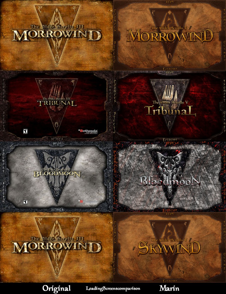
Custom Skywind HD Mainscreen Images
Last edited by grumpycat on 14 Mar 2014 - 22:32.

Custom Skywind HD Mainscreen Images
I actually Kinda like the volkswagon W LOL we need to make an official voting post or something
I think that "Volkswagen W" adds character to the logo. It also goes very well with the Garamond font, which is often used in the TES promo materials (TES Online font, ya know), ergo we can use that font to complete the overall Visual Identity.
DRAGOMIR:
I like your idea, but there is one problem. If we stick your logo to 3d model render, or concept art, logo will be to cluttered. We have to keep it simple.
okey, so why don`t you try something that works with the Garamond on a broader scale? Then you can keep the W without it looking too modern. :)
Here are the 3 choices that we were thinking about that MontSkew made so please vote on the favorite so we polish it up and if you have any other ideas feel free to let us know:
"Too modern" you say? How about the Dragon Age Inquisition or The Witcher 3 logo? How about the UI in Skyrim? If the setting is or resemble fantasy, that doesn't mean that we have to have gothic font, or rusty look :)
So you have tried it already and concluded it looks best with the modern font? No problem then. Would just have been nice to see it.
I go for 1 or 3. If you guys come to a decision today, I can slap it on the wallpapers tonight.
To be honest, I really don't like the modern route layouts took in new RPG's. It looks really out of place and very much so in Skyrim. The font should really tell us something about the project. There were some unforgettable font choices in games before, remember Diablo, or Planescape: Torment logos? Those were very well suited for the artistic style of the game.
What is Morrowind like? It's organic, curvy (like Daedric letters), dreamy, quite a bit crazy and full of surprises. A font that is too angular and "modern" looking doesn't seem to evoke this kind of impressions in me. I really like how Andoran project did their graphic identity:
[External image]
By all means I'm not saying we should copy their style, but it seems to be capturing the style I feel fits the world of Morrowind best.
But then I only rather basically educated in graphic design, I know much more about painting, so if others decide otherwise I won't complain, just a loose suggestion, that may be worth trying out.
I agree with Dragomir. It helps that the Daedric alphabet is very closely ingrained with Dunmeri culture, being the official alphabet of their language. Perhaps a Daedric-inspired font would help give it that unique Elder Scrolls feel, while still having its own identity.
Andoran's logo is poorly made, mostly because it is a fan project, and they lack professionals (not their fault). Every logo guide will tell you that the logo should be simple, yet original. Think about the logos of big brands. You'll see that all of them have really simple, and memorable logos. Even Coca-Cola promotes their "bottle" symbol nowadays. That's why I created rather simple logo, but those edges, and angles create picture of a strong and outlandish project. New RPG's have simple logos not because their teams are no longer creative - it is because they have basic branding knowledge.
Look at the Enderal's logo. They are Germans, and, stereotypically thinking, they have a good taste when it comes to design (Bauhaus, Futura and everything).
We will most certain get crazy when we will design the symbol (Moon and Star).
Enderal? It looks like they slapped some simple bevel and emboss on a Trajan (nothing is really wrong with Trajan. I love it, but I believe that using it in a "clean" way is more effective) : http://media.moddb.com/images/articles/1/146/145811/400px-Enderal_Logo_DE_01.jpg . The current 3 Skywind logos you did are better (layer effects on a logo is usually a big turn off for me, but you pulled it off in a nice way).
So anyways, I did a quick test to see number 3 in context to the wallpaper. It works nicely so far, and for the sake of moving forward I think we can use it as long as MontSkew is doing a Moon-and-Star logo to accompany it at a later point.
| Attachment | Size |
|---|---|
| skywindwallpaperlogotest.jpg | 92.19 KB |
That looks cool :D And yeah DavidS, that's exactly what I thought when I saw the Enderal logo :P
yeah, that Enderal logo is really nothing to show if you want to promote German graphic design. :/
Anyways, one feedback I got was that the W is okeydokey, but it sticks out as it is very bright and overpowers the rest of the logo. I can darken it a bit myself, might just be happening on the promo, so maybe it doesn`t require any touching up as a standalone.
Montskew is working on a final version, it will be finished by tomorrow.
Awesome! :D
I'm not saying that Enderal is really top-notch. The point is, that they don't feel the urge to make it more fancy and weird.
Okey, so I'm pretty much finishing the logo. This is the penultimate version. So this is the last chance to submit your suggestions :)
I really like it.
But quick question, Shouldn't it be The Elder Scrolls V: Skywind?
I can barely make out the Y in SKYWIND. Can you brighten it up?
I think it suppose to be "III" instead of "V", but I'd like to see a word of confirmation :)
@aretea
Is your monitor properly calibrated? Cuz I don't see any problems with the brightness.
Because all the older logo's say TES V: Skywind, but I'm not sure what the devs want it to be.
Oh and I don't have any problems reading the letters, I think it is your monitor.
The "Y" is fine. And I would be up for either "III" or "V", I just think both would fit.
Yeah, the prefix will be III because it gives the impression that you are playing in the world and story of Morrowind. In regards to the logo, looks great!
^^Sorry, bad judgment[External image]
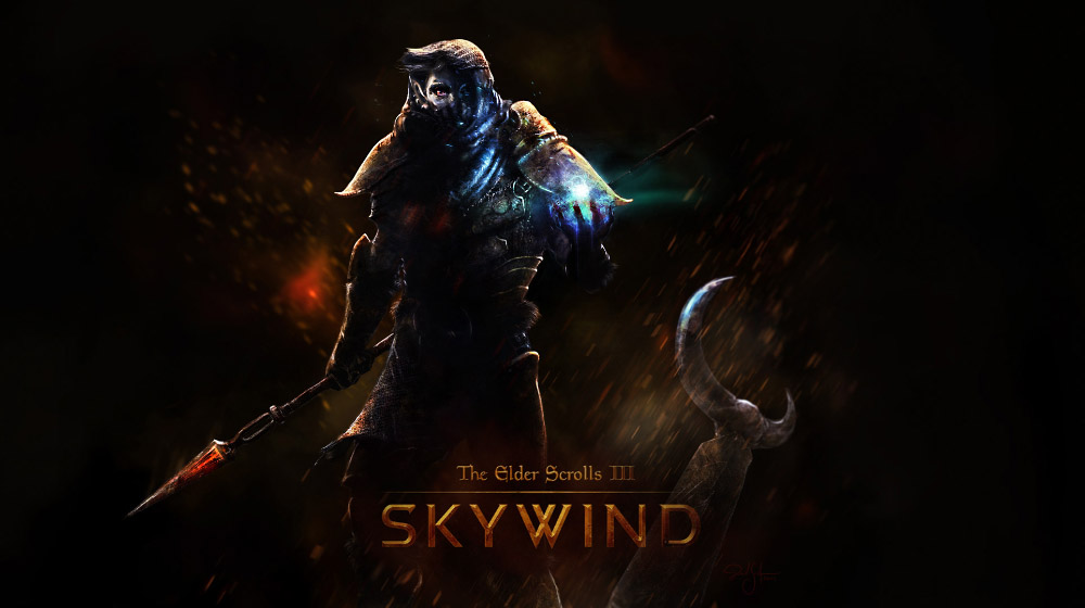
Yeah, so this is my version of the wallpaper:
[External image]
And since the logo is pretty much done, we have to work on the symbol. As I've mentioned before, the best idea will be to make a really cool version of the Moon and Star ring. Here are my ideas.
Does anyone have other ideas?
good composition. Feel free to edit the wallpapers as soon as they go online. never hurts to have additional ones.
2nd works best.
I like both 1 and 2 but leaning more towards 1 so I decided to throw together a rough concept of it and essentially what it should look like but it is far from what I imagine it to be. I'm not very experienced in making these so this is just an idea:
.png)
There was a discussion about III vs V a while back. V won out, if my memory serves me.
mb?
| Attachment | Size |
|---|---|
| untitled-122.jpg | 95.14 KB |
I don't get it why you guys insist on putting TESIII instead of TESV. From what i remember it is (as Twisted Logic already pointed out) TESV. Some of the devs already decided it should be that way and changing that right now just cause "i think it looks better and i'm making the logo" is not an explanation. Also this:
"Yeah, the prefix will be III because it gives the impression that you are playing in the world and story of Morrowind. In regards to the logo, looks great!"
I'm sorry, mate - did you talk with eloth, happy, digital and other guys that make an actual core of the project about that or did you decide it yourself and you are now writing how it will or will not be?
If i missed something and an actual decision to switch to TESIII was made, then feel free to boo me and let me know how wrong I am.
Tbh, I don't care whether it is III, or V. mspeed101 ask me to do version with III, so your argument: "i think it looks better and i'm making the logo" is pretty much invalid.
I also think that everyone seeing V will expect story set in the same time period as in Skyrim, and that is not true.
Sorry Tommy, I was under the impression that it has never been discussed, it is not my intention to tell you what to do I'm sorry for coming off that way.[External image] I'm also not the one making the logo, I was simply giving tips and suggestions so don't put it on me... I suggested that MontSKew put it in the logo and I thought it looked good and made more sense so I said thats what we should use because I didn't know it had been discussed before. DavidS is going to be gone for awhile so I can't get the wallpapers changed for a while. Again I'm really sorry, I didn't want to come in and tell people this is how it is.
EDIT: I'm going to cut myself out of this part of the project. I was just the organizer, so I gave some of my thoughts on what I, along with a few others who decided to help, thought would make the logo MontSKew made for us look better. Its also not fair to get aggressive with us being that you didnt get involved when it was being made. You have a good reason to be upset with the way it looks but I dont want to be mocked just for trying to help put this together for everyone, I'll just work on my stuff from now on.
@MontSkew - It's all fine, but my argument is pretty much still valid. The devs that are actually working their asses off on the project decided its TESV. If you didnt know thats the way it works, it's okay - but don't try to turn this around. And i dont think you are the one to judge how it works.
@mspeed101 - Please don't feel discouraged by my comment. I (as one of the member of this forum) appreciate all inpunt and im pretty sure every single developer appreciates it as well - but i feel its important to respect the decisions that were already made. Other than this - i really love all of your work guys.
EDIT: Oh, and Mont - as long as you really care about this project - you actually should care about every single thing.
Cheers
Delete, please
Delete, please
Ok, mate - I'm glad we agree on something. I do appreciate your work and i wrote so before. I know how much time something like this can take in Photoshop, Illustrator and whatnot. But still - and please don't take it personally - if i am to compare work like this with work of some of the devs that spend tons of time on this project (not for one month, but for years already) - then for me its them who work their asses off - not us really ;) As much as i would love to have a real influence on the looks and style of this mod, i believe it's really important to respect and appreciate the vision of guys that started this project and still work on it tirelessly.
That being said - i would never treat or compare you to a child playing in the sandbox and something like this was never my intention.
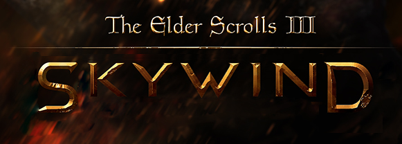
Ok, I will continue to help out with this as I was being a bit too hasty. There are two options, the logo by MontSKew that we have been working on lately with the V substituted:
Or this new one i just made that is in the style of the logos we have been using in videos:
Personally, I prefer MontSKew's but some have suggested that we use this instead which is also fine. I want to use whatever most people prefer. Please vote for either 1 or 2 in the comments and spread the word so we can get a good idea which is best.
It should be "The Elder Scrolls Renewal Project", that way there is no need for the BS controversy between V and III
I prefer MontSKew with some edits.
About 3 and 5.
We can use:
The Elder Scroll R3
The Elder Scroll Renewal 3
The Elder Scroll 3 Renewal
The Elder Scroll RP3
The Elder Scroll 3 Renewal Project
The Elder Scroll Renewal Project 3
What about: The Elder Scrolls III Renewal Project ?
TES Renewal: Skywind
Ehrmehrgehrd, brehrnd mehrkehrtehrng!
Just drop the number. People will know what it is. Numbers just serve to confuse - especially when you're not dealing with chronology. Xbox, Xbox 360, Xbox 1... what? Just... just Skywind. Toss the site's name in there, too.
Ok, so here's the V (pun unintended):
Mont, can i recieved ur logo on transparent? :)
Completely flat, or with texture?
with textures )
SmitehammerI find myself agreeing with this TES Renewal SKYWINDTES Renewal: Skywind
Ehrmehrgehrd, brehrnd mehrkehrtehrng!
Just drop the number. People will know what it is. Numbers just serve to confuse - especially when you're not dealing with chronology. Xbox, Xbox 360, Xbox 1... what? Just... just Skywind. Toss the site's name in there, too.
real quick, haven't got time to fix some issues
hmm :) logo on black looks more cool, this one strange sometimes:)
Here, i fixed it:
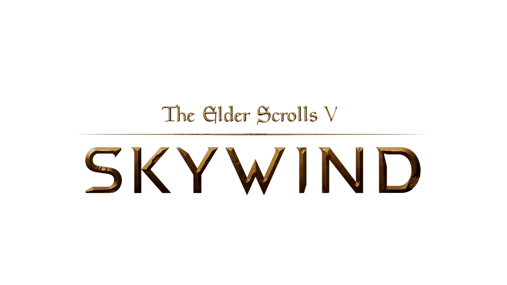
I'm backing up the "TES Renewal SKYWIND". Drop da numba! [External image]
About the above logo design. I'd like to see it more.. meaty, a bit thicker perhaps. Those really think, sharp looking letters somehow remind me more of some s-f, cyber themes. Not really Morrowind. But that's just me...
It's already a good thickness, leave that area as it is.
![[External image]](http://i.imgur.com/5M3oWv5.jpg)
![[External image]](http://i.imgur.com/SjeGw2E.jpg)
![[External image]](http://i.imgur.com/DL0YJWi.jpg)
![[External image]](http://s5.postimg.org/f2ur4pluv/Andoran.png)
![[External image]](http://i.imgur.com/kIfzr9s.jpg)
![[External image]](http://tesrenewal.com/sites/all/modules/ckeditor/ckeditor/plugins/smiley/images/sad_smile.gif)
![[External image]](http://i.imgur.com/qoRs3kq.jpg)
![[External image]](http://i.imgur.com/pTDd5bc.png)
![[External image]](http://tesrenewal.com/files/untitled-122.jpg)
![[External image]](http://tesrenewal.com/files/mspeed101/images/Skywind_Old_Logo_2.png)
![[External image]](http://i.imgur.com/2u9UI2y.jpg)
![[External image]](http://i.imgur.com/mEEyXaY.png)
![[External image]](http://tesrenewal.com/sites/all/modules/ckeditor/ckeditor/plugins/smiley/images/angry_smile.gif)
I was thinking, it might look
I was thinking, it might look good and give use identity if we actually do something special about the W. It's central, and also close in shape to the holy triangle, that is the symbol of Tribunal. I made a quick sketch, not sure if it should be used for anything, just a loose idea:
[External image]
Making it too much triangle-like will make it look like V though, and we probably want to avoid that.