Custom Skywind HD Mainscreen Images
Last edited by grumpycat on 14 Mar 2014 - 22:32.

Custom Skywind HD Mainscreen Images
Try putting Renewal in it... why has nobody done that...
Why not just do Skywind and leave all the tes and number business out...I mean we aren't a actual official tes game [External image]
That's true... plus, TES's logo is probably registered so technically we could get in trouble for using the same font and separator. I like the new Skywind font though, but as for the Elder Scrolls bit, I don't know.
Yeah, to be honest I also preffer version with SKYWIND only. I started the design without any TES prefixes, cuz I think that way it look more 'confident', and stronger.
Whatever we choose - please be sure that we all agree on one version, have developers' blessing and then start showing off the wallpapers and whatnot. I don't think it's a good idea to create ten different version and give them to people - we must be consistent about the logo.
How about o poll then? Anyway I go for simple, clear "Skywind"
Ok, yet another variation:

Yeah, that one's nice
We need more feedback, if everyone is on board with using just Skywind like above.
Ehrn-behrd!
Skywind like above. If some pre-title gets introduced later it is better to add it than to change or delete one.
I say either make a big community voting or leave this open for another day and make the decision. :)
Yeah, the last one is the best. We just need an animated outro/intro for videos and such. I was thinking something with particles but I don't have the assets. Could you send them to me?
As the letters have a strong lighting/shading I think one should use this and just rotate/fade them in because the will look pretty good in a decent light. Just my 2 cents, but I'd not over do something here.
LASentry:
Give me a moment. I'll clean it up a lil bit (technically wise).
version 2.0
[External image]
LASentry
I was planning on making an animation when we decided which logo we are going to use but if you'd like to make the animation for the logo that'd be fine.
MontSKew
Nice job, looks even better!
The W with the triangle under it? I didn't think that works particularly well with the logo...[External image] However if everyone wants it, we can definately do it.
And again, still need more feedback from more people...[External image]
OK, I generally like the new logo. Excluding maybe the letter Y. Something seems wrong to me with the upper left tip of this letter. Looks like it's been eaten away or smth. I'd rather see that tip made in similar manner as the upper right tip only slanted left side (a mirror image if you will).
Its supposed to look broken but maybe it could be tweaked a bit
mspeed101The W with the triangle under it? I didn't think that works particularly well with the logo...[External image] However if everyone wants it, we can definately do it.
And again, still need more feedback from more people...[External image]
Ya i liked it, maybe could be tweaked a bit but i think it fits well, centers the w and if we remove the top prefix part i think it will make it stand out a bit more as a logo instead of just script
mspeed101Its supposed to look broken but maybe it could be tweaked a bit
How about moving this dent a little lower down the tip of the letter then?
There is already enough feedback from various people. You can make the decision. :)
Ok guys, I have bad news.[External image] The Devs had already made a decision on the logo and as much as some of us do like this new logo, we must respect their decision. It is a bummer we hadn't found out about this a while ago. Sorry to everyone for the work and suggestions, for everyone wondering what we will be using, here it is: http://tesrenewal.com/files/staraya-bumaga_1920x1200-Recovered4.jpg
Yeah, so this looks rather 2002 :/
Sorry MontSKew[External image], I know you put a lot of effort into that logo.
Well that thing's too big to fit on trailers and promotional artwork anyway, plus it's got that oh-so-sue-able Elder Scrolls V attached to it. Might it not be safer to go with the new one anyway? From a standpoint of legalese?
The new "SKYWIND" part looks amazing, I think the others just don't want to let go of "The Elder Scrolls" or whatever on the top.
Sue-able indeed. Bethsoft has sued over just using "Scrolls" before: http://www.forbes.com/sites/alexknapp/2012/03/16/bethesda-and-mojang-settle-scrolls-lawsuit/
Yep. It seems the main reason were making everything from scratch is to keep away from legal ambiguity. Same should go for the title.
The triangle beard on the W was a bit weird.Maybe having a triangle behind the logo, framing the W? Or between the little 'x' made by the crossing of the two 'v's that make up the W... This is hard to explain. Something like this... upside down. Using one of the elements, the frame or the triangle in the cross.
Well, when I talked to him, he seemed to be certain that we would "NOT" use the new logo so maybe you could ask him about it, he doesnt seem to want to talk about it atleast with me...[External image]
Not that my opinion matters, but coming from a complete outsider, the new logo is x10 better and more professional looking. I can't stress that enough. It's more professional, more pleasing, and all around superior.
(And if we want to get into a conversation about professionalism, I work in advertising for a living, so I stand by that as a personal opinion, as well as a professional one.)
mspeed101Ok guys, I have bad news.[External image] The Devs had already made a decision on the logo and as much as some of us do like this new logo, we must respect their decision. It is a bummer we hadn't found out about this a while ago. Sorry to everyone for the work and suggestions, for everyone wondering what we will be using, here it is: http://tesrenewal.com/files/staraya-bumaga_1920x1200-Recovered4.jpg
Is this sue-able?
Well I'll release the Latest wallpapers with the logo but no sense in putting time into it if we aren't going to use it. I'll post them tomorrow. I am also already working on the sites logo animation for videos and in game, I was just organizing this. You can follow that here: http://tesrenewal.com/forums/general-development/logovideo-animations
I'll post progress on that soon but I want to get this sorted out and finished.
Makes me wonder if there's any sense of discussing anything here if after all's done and said some dev comes up and throws everybody's ideas and work away. Actually not even wasting his time to come here on the threat to personally explain his decission. And I thought this project is a open group effort...
There WAS a voting on a logo you say? Well how long ago took that place, how many people (devs?) give votes and how much material was available then?
Anyway, my sincere thanks to mspeed101 and otheres for all the amazing work on the logo, however it may look.
No offense, but in the scheme of things, the logo is about 0.0000000000000000000000001% of the project. I'm not even exaggerating. We still have probably over 10,000 man hours left of work. So trying to put things in perspective, we have to change our videos, etc, which is a pain for not much, if any gain.
If you were working on the project a year ago, we went through this whole process, voting and all.
Agreed, but running around with a logo and "background image" to it, pixely as hell, the font more fancy than professional and too childish looking, that's just not labeling the project correctly. Going besides all law related stuff.
Monts logo is just well proportioned, professionally looking and of a high resolution (as I assume).
Anyway I'm in no position to discuss it, but just as thegentlemancaller I really just wanted to point it out.
Well, tbh, that whole situation is just ridiculous. I understand that renaming the project was controversial and all, but this thread's goal is to discuss the new logo, since the official logo wasn't published not even once. So why on earth 'the devs' didn't write a word in here? It is a FAN project, it is OUR work, not OUR + THE DEVS'. I know that they had more impact on the project but creating the elite group of 'the devs' is not a way to go. I want to help, I really do, but I'm starting to regret this decision since 'the devs' don't even want to say a word. I spent 10+ hours on this, goddammit, and 'the devs' didn't stop me not even a single time. So at the moment it was a time wasted.
HAPPYCHAPPY
You always use this argument. But this is MY time, not your's. I'm not wasting anyone's time. Graphic design, and branding - THIS is my area. I don't know how to use CK, and even if I did, I would never had the skills you have. You don't put a dancer as a manager in a big corporarion and vice versa. I did mention before - I want to lend you my skills to present this project properly. I want to create professional visual identity, cause this is what I do on a daily basis.
>So why on earth 'the devs' didn't write a word in here?
I said that we need morrowindish style of logo, and u ignored it.
I haven't been on this project for long but it seems obvious there's a lot of malarkey about this logo- I think we can all agree that you're never going to please everyone, and everyone is going to have a say in how it can be improved. But the point is to get it to a good standard (which it is) and be sure that it's in keeping with the theme of the project (which it is). Constantly updating it and making new versions all the time is just an exercise in futility. There are plenty of areas of this project that need attention and love, and going over old stuff all the time doesn't get any new stuff done. This mod team has a lot of great artists, it would be a shame to see any focus lost at this stage. :)
We'll I'm not going to defend the logo any longer as it is apparently too much of a touchy subject. Yes I can agree that it may not be the best representation of Morrowind but its enough to the point that quite a few seem to like it.
I also would like to say that I want the project to get as much help as possible to take on the heavy work you guys put into it. While a logo is just a mere fraction of the focus, this is what will attract others to help with the project and get things going faster and better. I think that if we have a very attractive logo to accompany our promo it will really spark some flames out there. It could be worked on more and made more "Morrowindish" if that's what you'd like which would not take much time to drop some suggestions.
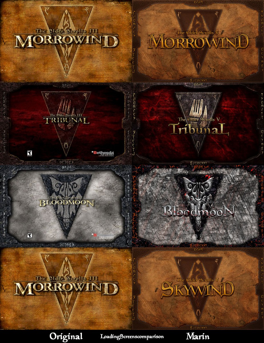
Here is a comparison for you guys as to keep in mind:


I have no words for this situation except that the dev approved logo is a step down from Morrowinds original.
Not that it matters, but I feel like taking a clear position here: You can put that logo on my artwork, but I don`t like it and rather have MontSkews logo on it.
I'm not a dev so my opinion probably matters little here but MontSkew's version looks considerably better than the one that the devs have gone with.
![[External image]](http://tesrenewal.com/sites/all/modules/ckeditor/ckeditor/plugins/smiley/images/wink_smile.gif)
![[External image]](http://i.imgur.com/snFuQVJ.png)
![[External image]](http://i.imgur.com/fXgiHyB.jpg)
![[External image]](http://tesrenewal.com/sites/all/modules/ckeditor/ckeditor/plugins/smiley/images/tounge_smile.gif)
![[External image]](http://tesrenewal.com/sites/all/modules/ckeditor/ckeditor/plugins/smiley/images/sad_smile.gif)

![[External image]](https://d1v2xm8p2pd3wl.cloudfront.net/feeds/4651/mint-m-triangle_logo_copy_best_square.png)
![[External image]](http://tesrenewal.com/sites/all/modules/ckeditor/ckeditor/plugins/smiley/images/confused_smile.gif)
Here is a version without any
Here is a version without any numbers, maybe we could go with this approach?