
| Attachment | Size |
|---|---|
| screenshot2.jpg | 3.03 MB |
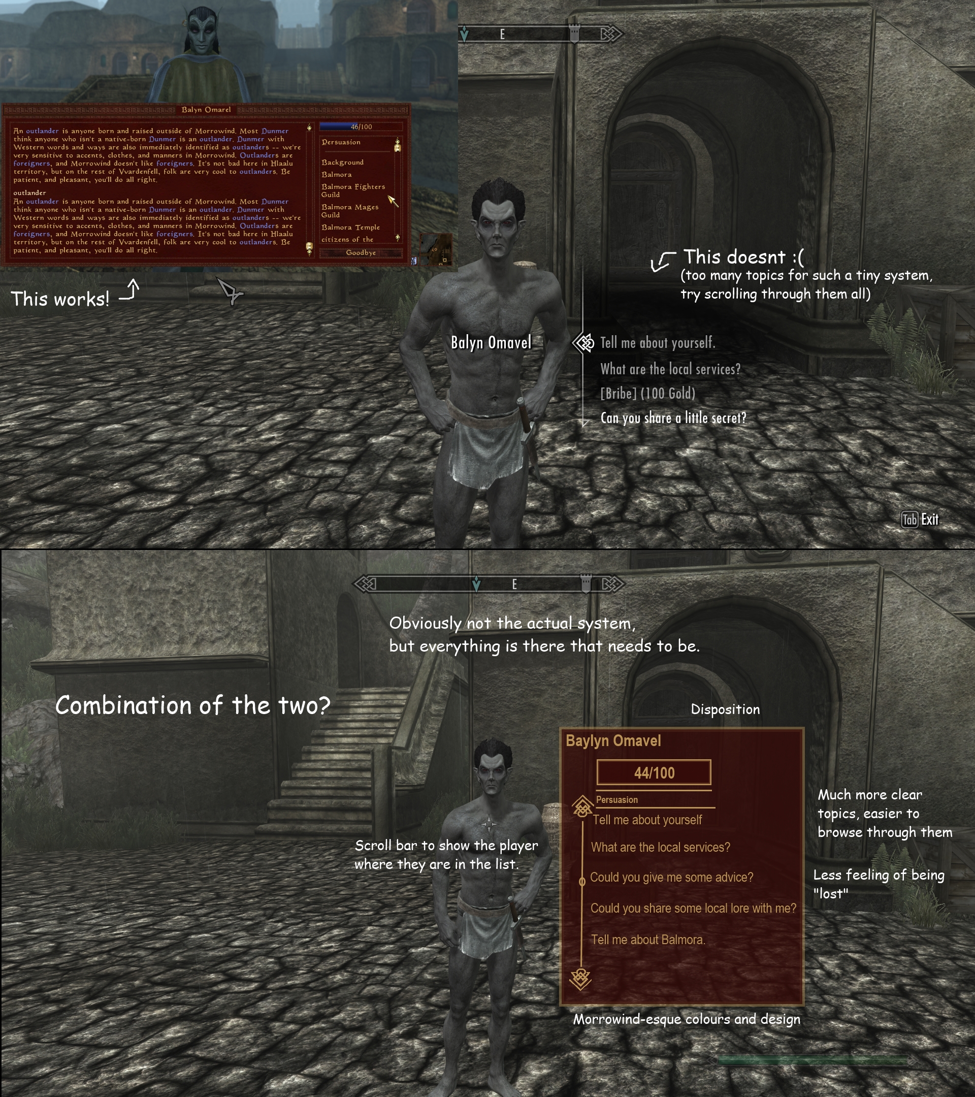
Skyrims conversation UI is about as basic as it can be. Its designed for skyrims npc's who lacked a relationship system, and had only a few topics of conversation.
This doesnt work in skywind. That "Gradient" effect that makes topics fade as you scroll makes you feel lost in fog when looking for the right one. The solution is obviously not to cut out all those topics; they add to the depth of the game, something skyrim lacked. the solution is to redesign the UI. No more fade effects, no more B.S.
Here is a design I came up with (yes I simply dicked about with paint and a screenshot from my Morrowind, but you get the jist ;) )
This system is much more coherent. A scroll bar has been added to show the player exactly where they are in the list, there is no more topic-fading, and overall things are much more clear and in-depth. The finished thing should have fonts more reminiscent of Morrowind too.
Constructive criticism is welcome, along with other concepts :D
Mhm. Skyrim's system won't
Mhm. Skyrim's system won't work well here. Yours looks better.
EDIT: I just noticed, your proposed system looks a lot like Oblivion's.