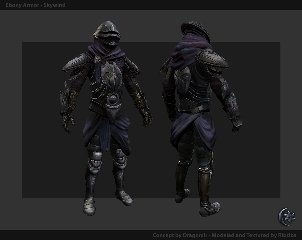
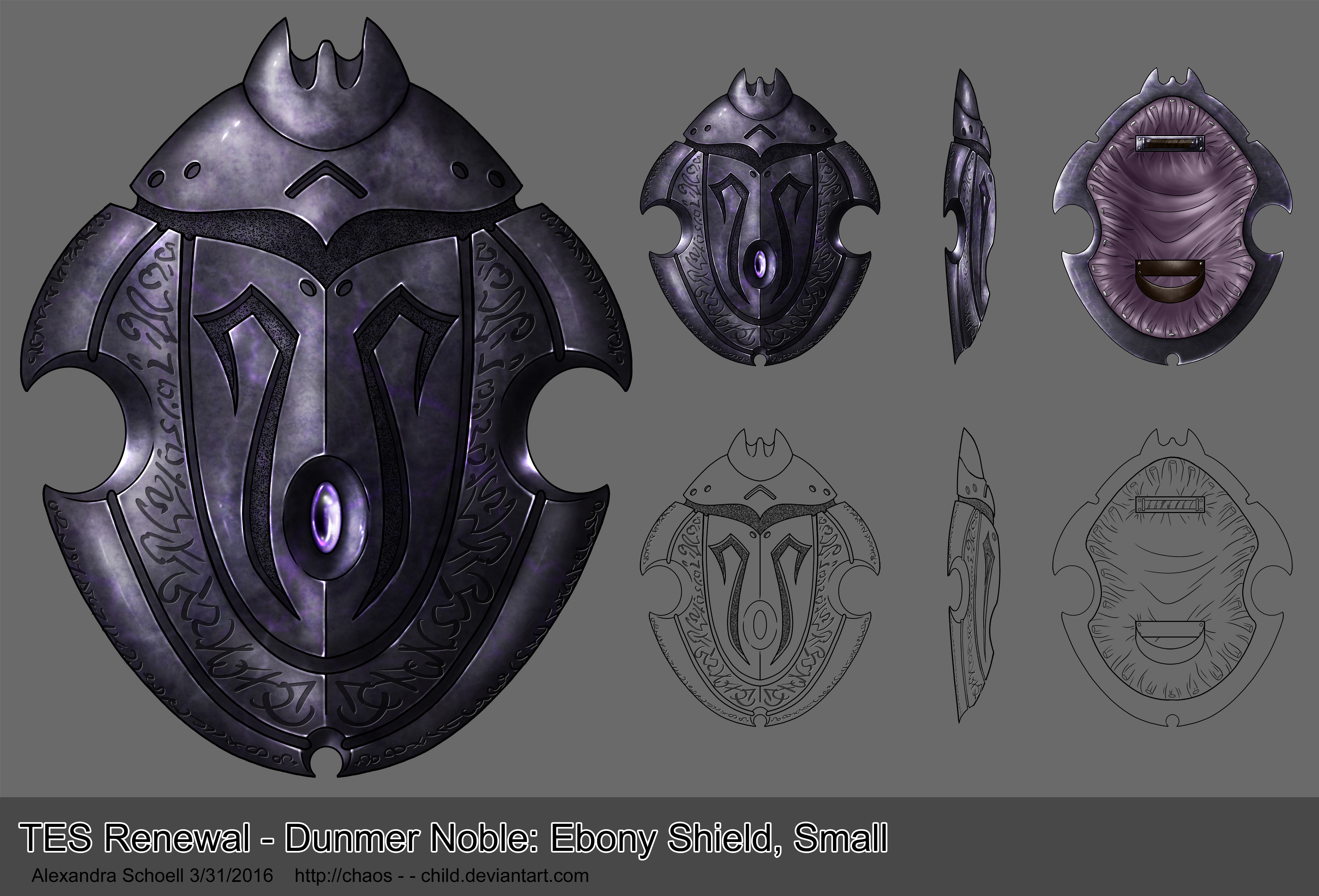
Completed designs for the Dunmer Noble Ebony Shield.
Small Shield
Tower Shield

Hello all! My name is Alex and I will be designing a shield for the Ebony Armor (Dunmer Noble) set seen above.
Unfortunately Dragomir's concept process is not available so I do not know where they drew their inspiration for this set from. As such my primary reference will be the armor itself, along with the versions from both Skyrim and Morrowind as secondary references, to keep the designs consistant.

There is a very large difference in design from Morrowind to Skyrim. The Morrowind Ebony set contained both a small shield and a tower shield (image unavailable) while the Skyrim set has a single shield, sized somewhere in the middle. The Skyrim shield appears to be much heavier and sturdier than Morrowind's, looking almost to have been carved from a single slab of material. The smaller Morrowind shield seems lighter and better suited for someone intending to move quickly or dodge more often; the tower shield is sturdier but is ill-suited for anyone not intending to stand still or move very slowly. As the Ebony set is heavy armor and will slow its wearer down considerably, the small shield doesn't seem up to par. While the tower shield might be a better choice, this set is meant to be worn by nobles (or their guards) who would likely only be encumbered by such a large shield. The Skyrim version is a happy medium, it's not so big that it gets in the way but not so small as to be redundant.
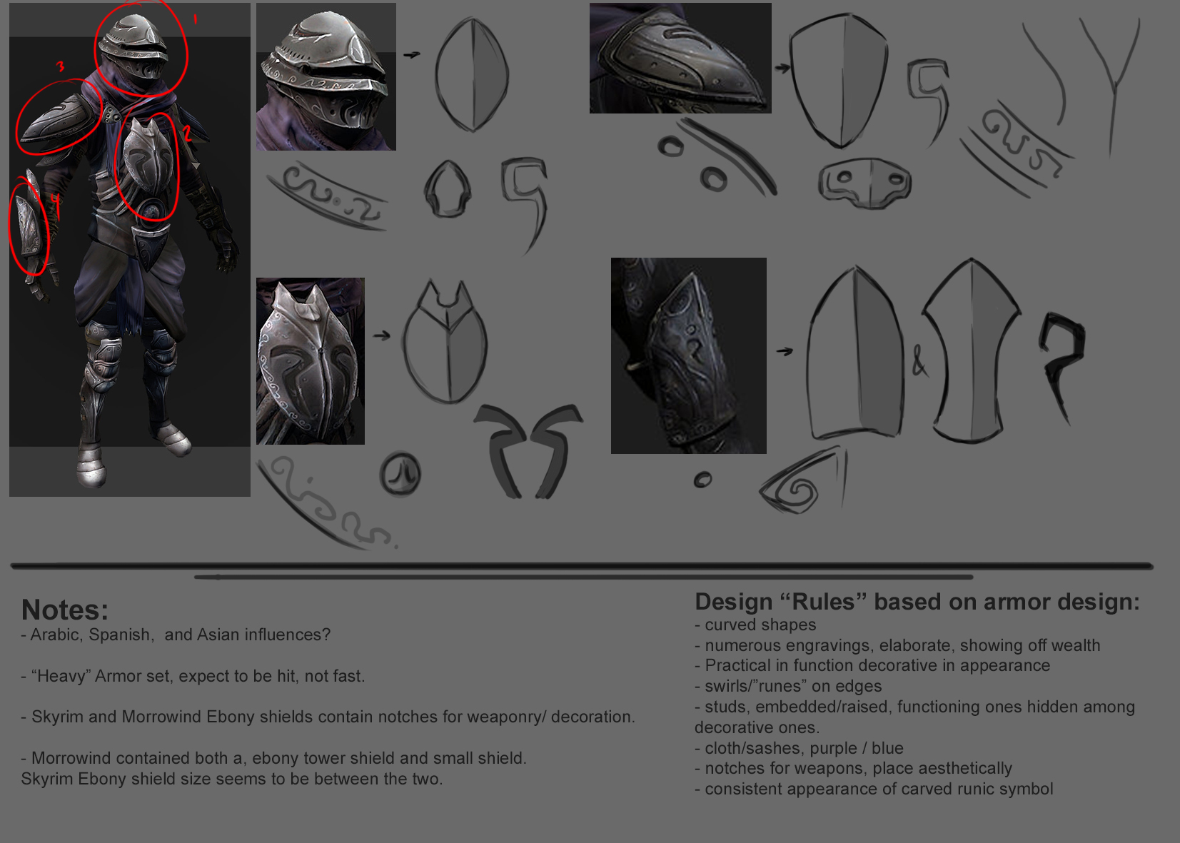
Without the work process of the armor's concept artist, I will draw my inspiration primarily from the armor itself. But the very nature of the armor would require that regardless. The set is made for nobles (or their guards), so it must not only protect the wearer but must also display their house's prestige, power, and wealth. As such all pieces from the scabbard to the shoes must match. Interestingly enough, several pieces of the armor itself have shapes and designs suitable to be shields all on their own: The helmet (top down), the chest and back piece, the shoulder guards, and the arm guards. Each have the same composition and drawing from this I have created a set of "rules" for the shield. (in case they cannot be read from the sheet above) They are:
- Curved shapes, avoiding sharp points or edges
- Elaborate engravings, displays of wealth and status
- Practical in function, decorative in appearance
- Swirls/"Runes" on edges
- Studs, embedded/raised, functioning ones hidden amongst decorative ones
- Cloth/sashes, purple/blue (optional)
- Notches for weapons, placement is esthetically pleasing and decorative
- Carved runic symbol, singular placed in center or duel mirrored on sides
Hopefully you will find my thought process to be clear. Next time I'll have some silhouettes/basic shapes and perhaps some quick sketches. Thank you in advance for any feedback. For those unsure how to give a proper critique, please feel free to consult this easy guide :)
~ Alexandra (Chaos)
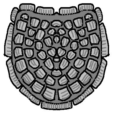
When I was designing this armor, my idea for the shield was to make it look somewhat like a schematic shalk - like I did with some of the armor plates (chest especially). I wish I had more time to write a proper post with ideas, I'll get back here later with references and so on ;)
That's very helpful thank you :) and yes it would be wonderful if I could see what you used for references. I asked originally if there was a way and was told that there was no reference and that you'd left o.o I'm glad you didn't.
This is a "typically dunmer" armour. You're lucky to have other very dunmer armours. Bonemold shields could be an interesting start for shapes. After all, it has the flavour of Morrowind. Just have them more refined so it looks richer, or with multiple layers (like skyrim's shield).

Don't forget that you have both tower shield and regular shield to design ;)
Great work so far. Keep it up.
Nexos
Chaos Child wrote:
What the hell, who told you that? O.o Technically I'm still a concept art lead and I'm pretty active at least in terms of commenting in design threads, while only having little time for actual painting...
Here's the link to the original concept:
http://swietopelk.deviantart.com/art/Champion-of-House-Redor...
References I used for this particular armor were frankly rather few, but they were a big influence.
Overall, I wanted a mix of Skyrim ebony armor and Gah Julan bonemold shapes. I knew that if some Dunmer culture has an ebony armor, it would be Redoran, I also decided to use some scarab shapes, since ebony feels similar in texture (black but shiny, with a hint of purple). I made two concepts for Ebony, one for Imperial, and one for Native - this one's the native, and my concept for the other one was scrapped. Anyway, to the point.
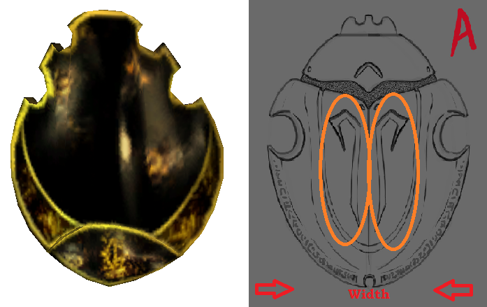
This:
Mixed with this:
Mixed with this:
Smooth refined shiny texture, runes and embelishments similar to the armor - possible use of amethysts ;) If it's to go with the armor, I'd definetly have it look similar to a beetle.
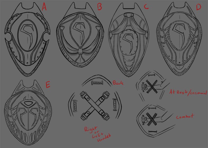
One thing to note - as it is a typically Dunmer shield I would change its orientation in relation to the arm:
That's at least how I was planning on doing it before this job was assigned to you. Anyway, it seems to be a recurring theme in Dragonborn shields (not so much original Morrowind), but I think it'd make it just a bit more interesting.
Quick reminder that the following designs are meant to match the armor seen above.

These are the first iterations of designs for the small shield (the tower shield will be based on the final design) testing various elements with from the initial post. I will be mixing and matching these based on feedback. I also played with a suggestion from Dragomir, who thought the shield would be more protective on its side. The hypothetical backing allows for both right and left handed users, able to be held vertically when at rest or for ceremony and horizontally when in combat.
Thank you in advance for any feedback. Again, if you are unsure how to give a proper critique, please feel free to consult this easy guide :)
~ Alexandra (Chaos)
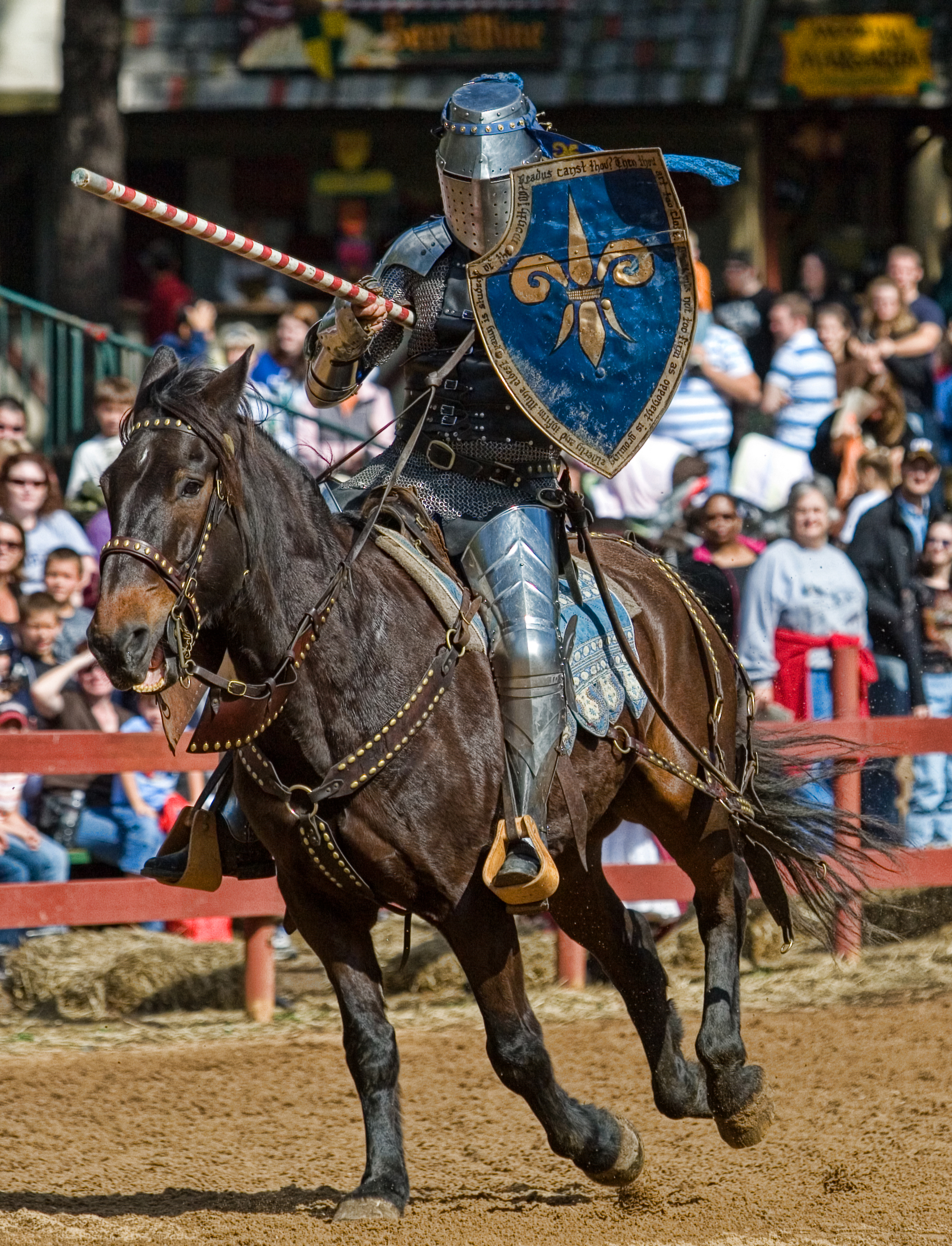
I guess the thing is that it's too much of a copy of the front breast plate, and a bit "S"uperman.
Don't worry about the back of the shield right now. No one actually cares about how the shield is carried, and the engine will determine that anyway.


The shape has to remain believable, fluid. It doesn't mean you have to reuse a shape that's already on the armor. The purpose of this task is to force you to re-interpret the work of the designer.
As you pointed out (and Dragomir confirmed), most of this armor's pieces are meant to remind of elytrons. It's compound of smooth and pinched shapes. The whole armor is slightly layered, a bit like ladybug wings/elytrons ( sorry for the manliness, Drago ^^ ).
In my opinion, you've described these aspects pretty well, but that's not something i find in your designs and shapes.
You could actually check for insectoid shapes. Some of them already look like shieds!
and so on
https://www.pinterest.com/luisnelson68/insectos/
Keep it dunmer, too. Use, for instance, bonemold shield shapes.
Don't worry about writing stuff at that point. Lore masters will annoy you soon enough.
EDIT: just added a few bad guys
Shield D with Es logo
Pretty much agree with all the points made here, except that the shield has to look big and heavy compared to the morrowind version - I think a shield would be used more actively to deflect blows than cover the owner's already well-protected body (the owner of such a suit, after all, is likely to be quite a skilled warrior, interested in being protected while dealing damage than being over-encumbered). I would say think more samurai than stereotypical world of warcraft tank.
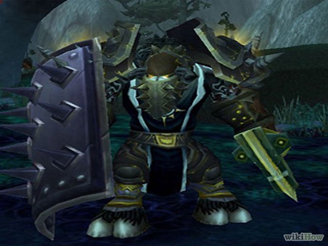
I found the following image of a jousting knight; the shield is large enough to cover the parts of the knight's body under threat from his opponent's lance, but light enough that even while bouncing up and down on his horse he's able to hold it out and keep it in place - using to deflect a blow rather than take and absorb its full force. This, IMO, looks way more badass than the alternative, below. Also IMO in skyrim all the heavy stuff was too bulky to the point of looking silly - historically well made suits of armour were pretty but extremely practical, streamlined and as light as possible without compromising protection.
Badass knight:
Warrior with huge shield, compensating for masculinity:
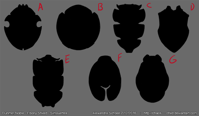
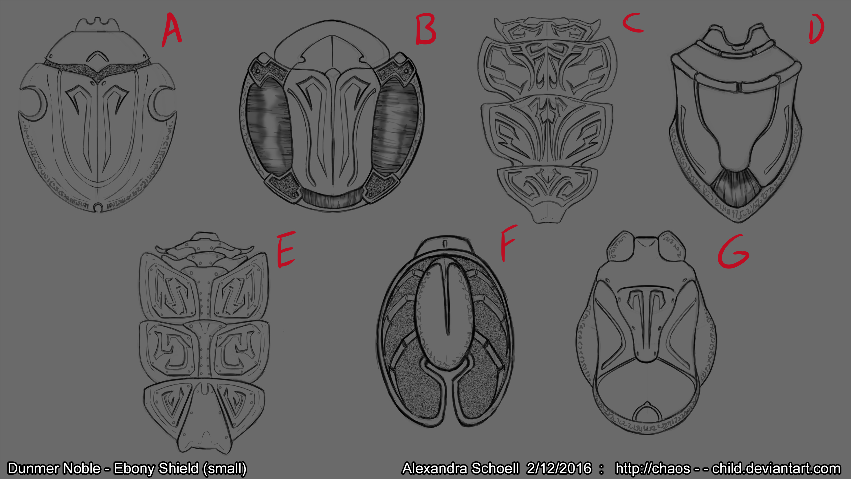
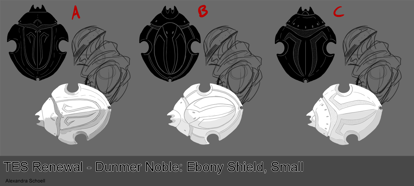
First revision of shields, tried new shapes based on a multitude of beetles:

Silhouettes :
Sketches based off of the silhouettes (I like A the most) :

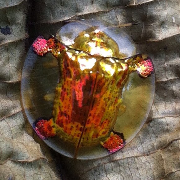
Bonus, my two favorite beetle refs:


Extra, not a beetle, I just thought it was cute.
Thank you in advance for any feedback. As always, if you are unsure how to give a proper critique, please feel free to consult this easy guide :)
~ Alexandra (Chaos)
Yeah, I like A the best as well.
Editing this in for clarity's sake. I prefer A because it looks the most similar to the armour set and seems like it could be a functional shield despite clearly being modelled after the shape of a scarab.
Perhaps C doesn't fit the armor's design theme, but I'll be darned if it isn't cool looking!
In my opinion "A" is the best. It is very similar in shape to the old shield but it keeps new armor feeling. If I could I would change it's width for narrower one and delete/change those strange shapes at the middle. Maybe it is worth considering single one more connected to the lore.
Anyway, very good job. You're getting closer to the final design.
I agree with A as the most fitting in armor design. but C and F are more interesting imo. When you merge this forms to a bit more compact way, I think they could be the next favourites ;)
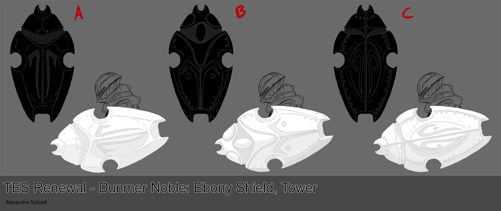
A quick set of silhouette for the small shield and tower shield.
Thank you in advance for any feedback. As always, if you are unsure how to give a critique, please feel free to consult this easy guide :)
C for the small and C for the tower shield!
B for small and C for tower.
I like B for small and C for tower.
Could you guys be slightly more specific about what you like/dislike?

Also, bear in mind that they'll be held like this.
So you have to imagine them rotated by a faire counter clockwise 90°.
I like the fact some of your designs keep the "spear holes" of the original one, while i liked the fact that they were not in the exact middle. Still not very fond of the two pointy ends at the top of B, which could be replace by sth rounder.
They really look like bugs, it's neat !
I like B for small, but I agree with Nexos and think that the little pointy things should be replaced with something else, or just removed. About the tower shield, I like C best, but would make a rounder head, again, and maybe a different kind of hole at the bottom, even though I don't exactly know how^^.
I think the small shields are fine. For the 'tower shield' I would go with a shape like this... http://animalsadda.com/wp-content/uploads/2015/04/Beetles-9.jpg
Not bulky, but tall and sleek.
A suggestion for the small shield. Holes are closer to the end, like in vanilla's design. silhouette and ornaments looking a bit more like a bug.

My two cents.
hmmh, I like it. But I would change the knob at the front edge into something else. My suggestion: simply erase it and a notch will come up at the front. Would even make sense, in real life you could hit and retain swords with that shields front...
Selected the basic shape for both the Small Ebony Shield and Ebony Tower Shield. Below are some simple mock ups of basic construction. Complex decoration will come after. Please let me know what elements you like, and why, and what elements you dislike and why.

SMALL SHIELD
TOWER SHIELD
Thank you in advance for any feedback. As always, if you are unsure how to give a critique, please feel free to consult this easy guide :)
I like C for the small shield and B for the tower. I was thinking it would be cool for the shields to have a sort of sandblasted glass look where most of the shield could be a bit glossy and then certain parts would have a matte sandblasted look. C and B look like they have elements that would work nicely for that. Anyway, that's my two cents.
Still not fond of the two pointy ends at the top of the shield. The rest is going the right way. I'd be going with A.
Thank you very much. :) That's actually a really cool figurine. I'll save it as a reference for the final details. Maybe it could be something like when artisans apply charcoal and wax to metal and heat it, leaving behind a pattern burned into the metal.
For the small shield: I prefer the design of shield C. It highlights the nobles sense of protection of self; it complements the base armor's built-in body "shields" (on the head, the shoulders, etc.). However, the points on the top (toward the hand) appear bat-like, with a small head and two ears flanking it. Perhaps try to something akin to the Egyptian scarab head:
http://animals.nationalgeographic.com/staticfiles/NGS/Shared/StaticFiles/animals/images/800/scarab.jpg
For the tower shield: I prefer the design of shield B. The ovalish orb at the top leaves room for some type of gem or- perhaps- another layer on which you could paint specific Great House symbols. The "pincers" on the top of the shield almost harken back to Egyptian sculptures and paintings of their holy scarabs. However, the bottom of the shield is too pointed and stiff; it feels as if it were put there to add some balance to the top of the shield (which I think is good). Perhaps making the bottom points smoother and less jagged could prove helpful.
Thank you for working so hard on this; and thank you to everyone else contributing to this project. I know it is a huge time commitment, but I am always excited to see your progress!
My favorite for the regular shield is C, seems most flowing, while keeping it somewhat compact at the same time. Decorations in there serve a visual purpose in highliting the shape, rather than just being there. I don't mind the pointy things at the top, but perhaps you could experiment a bit more with their shape. After all, since they stick out they are important for the general silhouette. Making them pointy though implies that this shield is also used for punching, and the way it's mounted on the arm I think it's safe to imply that :D A bit like Uruk-hai shields from LotR, blocking just so you can punch at the same time.

For tower shield I'd go with a combo of all of them :P Let me paste it together roughly in Photoshop:
Mandibles of C, top of A, and main abdomen of B, with the bottom changed a little bit and an experimental gem placement. I think it works as a nice accent. But of course, feel free to use any other ideas you might have, this is what I'd consider "best of all worlds" ;)
I agree with Drago about the regular shield and I like his proposed design, too.
Ebony is supposed to be one of the more valuable metals in Tamriel, so it definitely fits the noble motif. Instead of a gem on the tower shield you could try a different type of metal such as malachite to go for that "gem" look since it is a common metal in decorations and jewelry (IRL).
The armor itself already has a gem though, look at the model and concept ;) Ebony is so expensive compared to amethysts that I doubt someone able to afford this armor would mind risking it being chipped or something. Perhaps making it a bit more subdued in looks would be okay. Or make it ebony too. After all it comes in many different variants, from oily jetstone metal to crystaline obsidian-like, and in different colours - Amulet of Kings is said to be very rare sort of red Ebony. So yeah, a purple shiny transluminent ebony crystal would fit in there and it'd still be strong.
I did not notice the gem in the armor. Now that I see it, I think the gem in the shield could still work; it gives a nice complement to the main armor set. But, a crystal-like version of the ebony metal could work just as well.
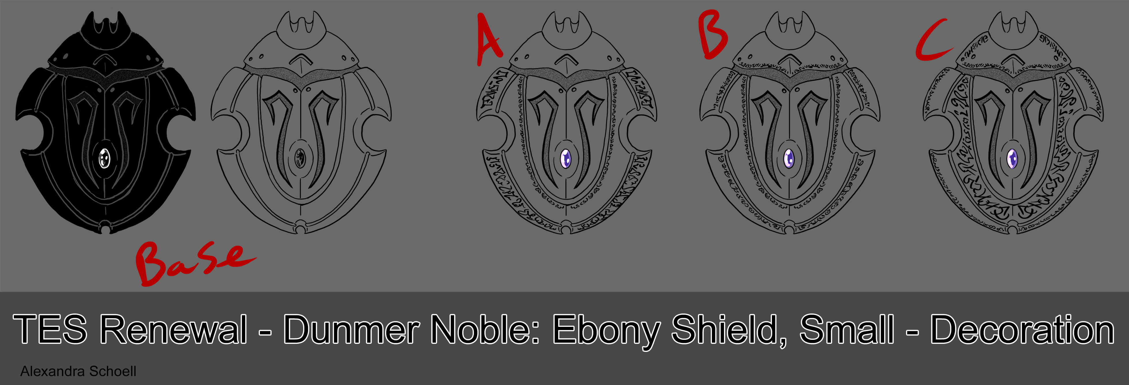
With the final basic setup decided its time for the decorations! I really liked Drago's suggestion of an emended Amethyst, and to prevent it from being damaged in battle I have had it deep set in both shields.
The decorative elements are the runic script (they will most likely be acid etched in the end) like designs seen on the main armor set and the sandblasted like texture set into various parts of the metal.
First up is the small shield:
Next is the tower shield:
Thank you for any feedback! Remember you can suggest to mix and match elements!
~Alexandra
Very nice, I prefer C for normal shield. For tower I would mix the upper half of C with the lower half of B.
I think in both cases I'd be opting for option C. Though that'd make the shields much more ornate than the armor is, but I still wouldn't mind it ;)
I'm with FDT - C for the small shield, upper half of C and bottom half of B for tower.
Very good work!
I prefer B for both, makes the ornaments less pronounced but still there.
I'm really digging both Cs.
Can't make a choice for the tower they're all looking really great. For the small shield it's an easy B for me
Next up are some color options for the shield. The swatches were pulled from the rendered armor set.
Small shield
Tower shield
B feels the most like Ebony to me, but A is probably closer to the armor, and C has a nice contrast to it. Its going to be hard to choose X)
Thank you in advance for any feedback! ~ Alexandra
Keep it the same as the armour, I guess? Would look bad in-game if the armour and the shield had different colour schemes.
Yeah, when this shield is modelled the colour in concept art won't matter much, as it will just be the same colours and shaders. I'd leave the official concept as something between A and B, it'd the most readable - not too dark but somewhat contrasted ;)
Perhaps B with more glow would be even better. Keep in mind the armor in-game right now looks much different than that final render.
At long last the Ebony tower shield is done! (and its not even May yet! ;P ) Hopefully I'll have the small shield done by Sunday.
A quick note for whichever 3D team member is assigned to this one, if you need a larger resolution of the image please let me know. And please, let me know if there's anything I can/should do in the future that would make your job easier! ~ Alexandra
Pages